roopa vasudevan > media artist & scholar
🖼 artwork.
Click on each heading to expand.
Artificial Abundance [Exhibition]
Collection of 5 projects
Featured in a 2025 solo exhibition at SPACE in Portland, ME
Artificial Abundance is a body of work which contrasts the escalating hype surrounding artificial intelligence with the realities of its implementation. Through a series of mixed-media artworks spanning digital and analog prints, stained glass, code-based animation, and interactive systems, the artist unpacks the requisite assumptions of limitlessness and omnipotence inherent to our current conceptions of AI—which stand in direct contrast to the finite, tangible resources necessary to support it.
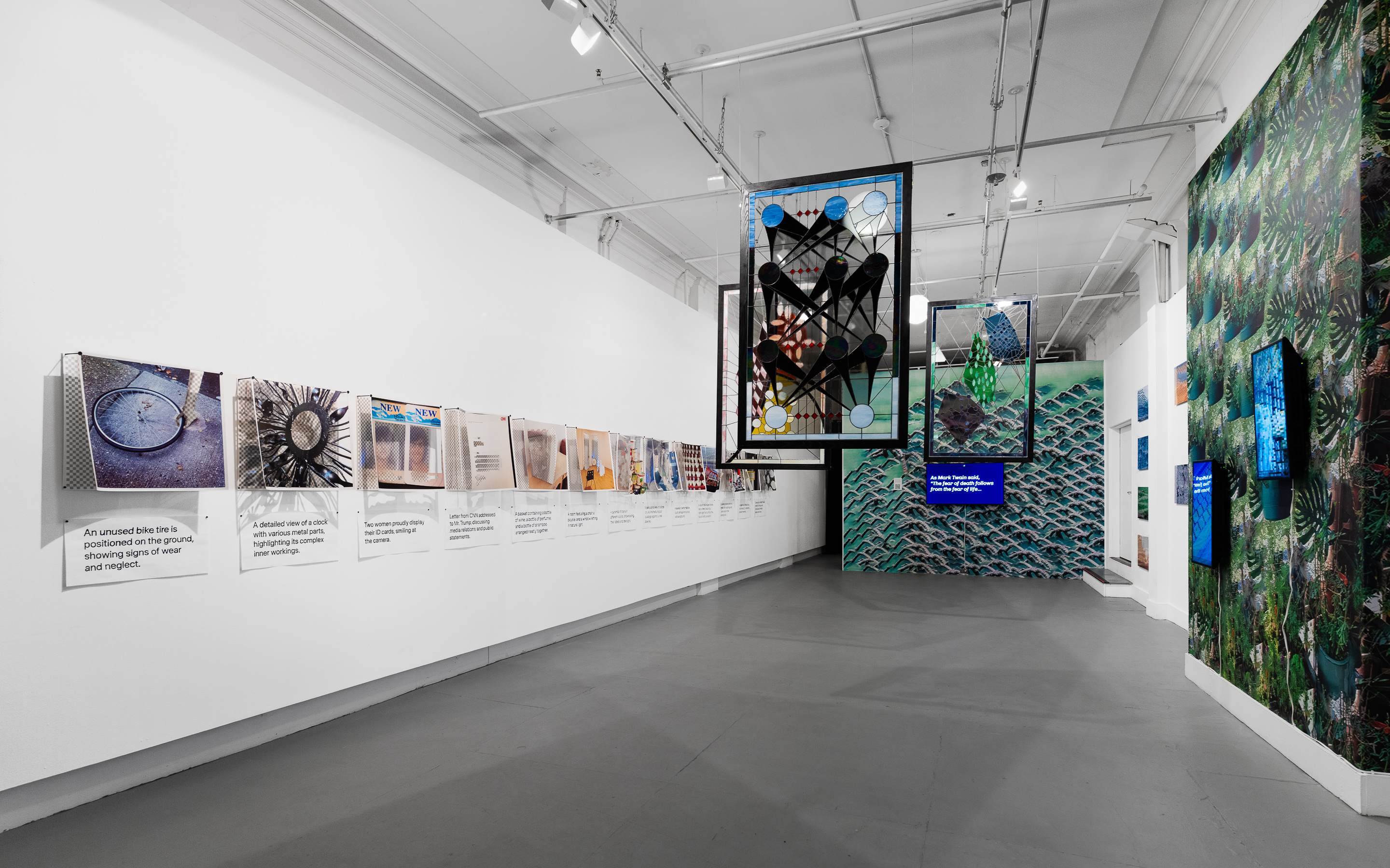
Eschewing controversial large language models (LLMs) and image-generation software in favor of more mundane, everyday instantiations and representations of AI technology, I attempt to surface the metaphors, anthropomorphism, and fears that have both driven the development of these tools, and which also inform our understanding of their future roles in society.
By pointing to constructed ideals concerning what AI is (and is not), I asks what we are implying about the more ineffable qualities of life, learning, and humanity — the things that cannot be encoded into 0s and 1s — when we are faced with the rush to classify, quantify, and automate our existence into infinity.
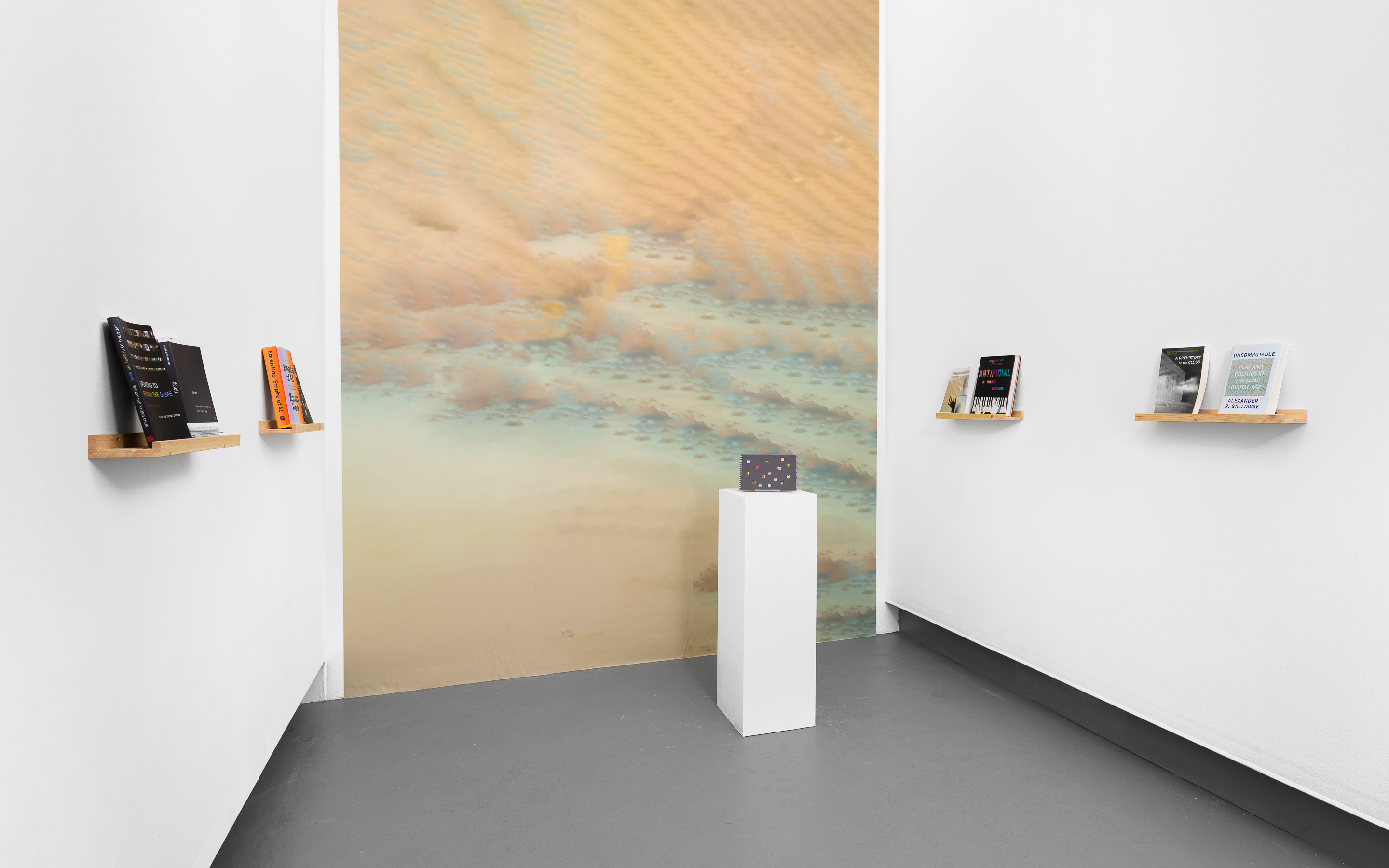
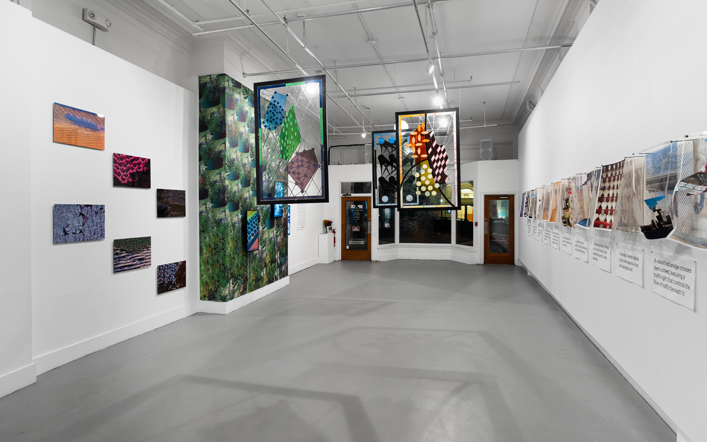
A solo exhibition entitled Roopa Vasudevan: Artificial Abundance was on view at SPACE in Portland, ME from September 5 through October 11, 2025. The exhibition was supported by the Culture Council at Emerson Collective and the College of Humanities and Fine Arts at the University of Massachusetts Amherst. In conjunction with the exhibition, a limited-run artist’s book was produced featuring new writing and print versions of the works in the Artificial Abundance series. Read more about the book here.
The exhibition was reviewed in the Portland Press Herald in September 2025. Read an interview with SPACE about the exhibition on the SPACE Reader.
Works in this collection:
False Idols
2025
Stained glass windows in oak frames
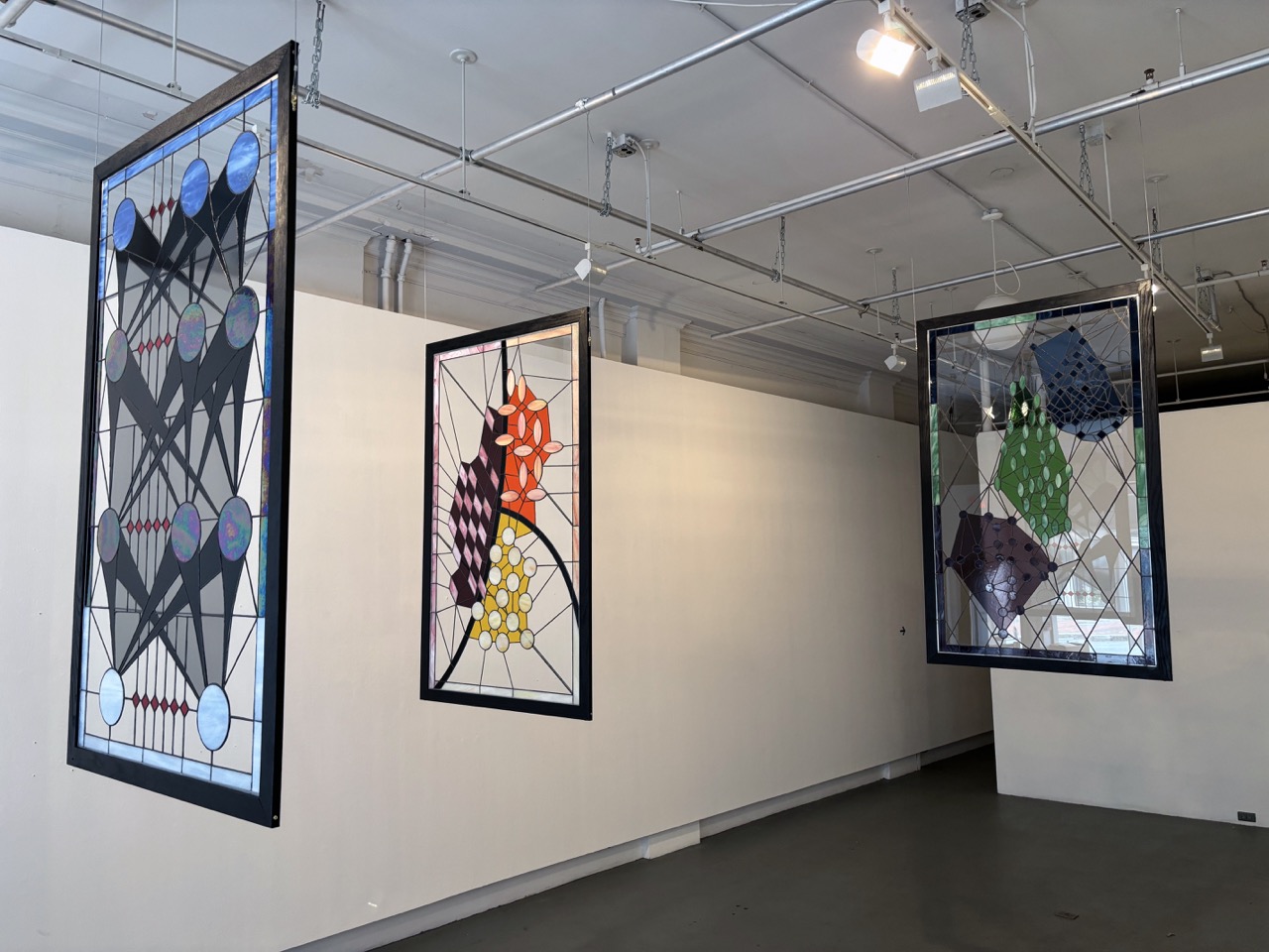
Each window measures 39.5” W x 63.5” H x 0.75” D
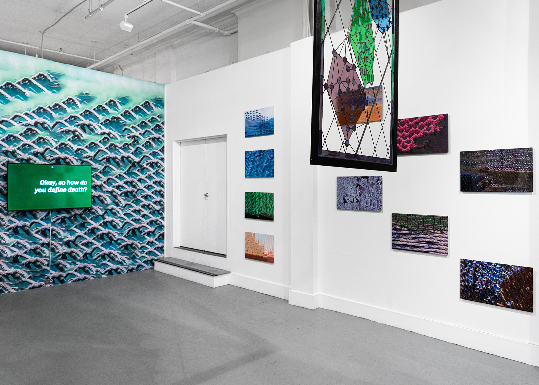
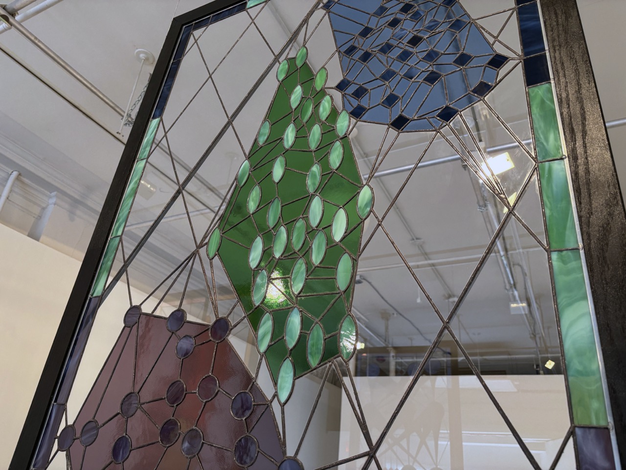
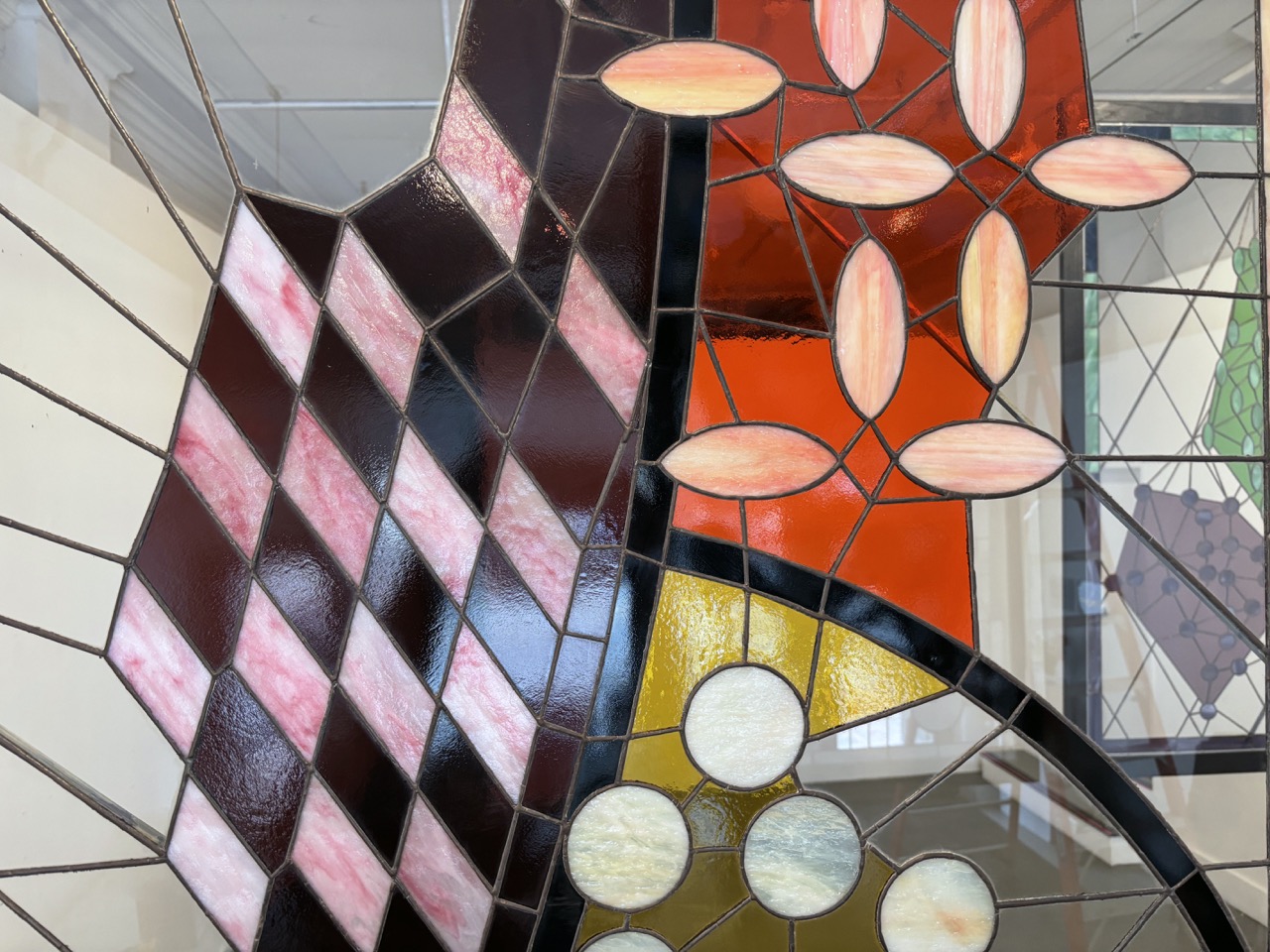
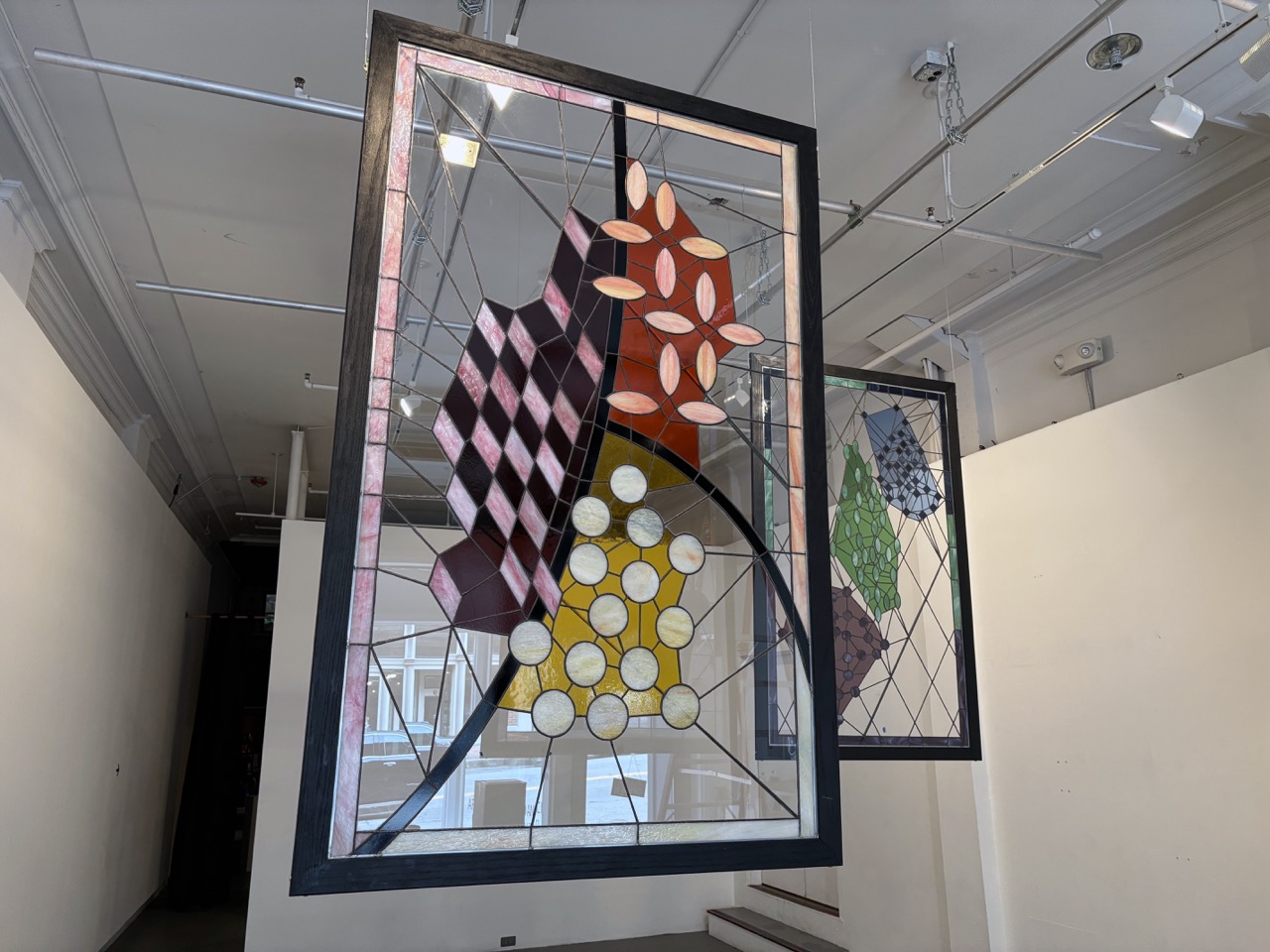
False Idols is a triptych that depicts representations of commonly utilized machine learning algorithms (artificial neural network, Bayes classifier, clustering algorithm) with geometric and visual forms commonly found in medieval stained glass windows.
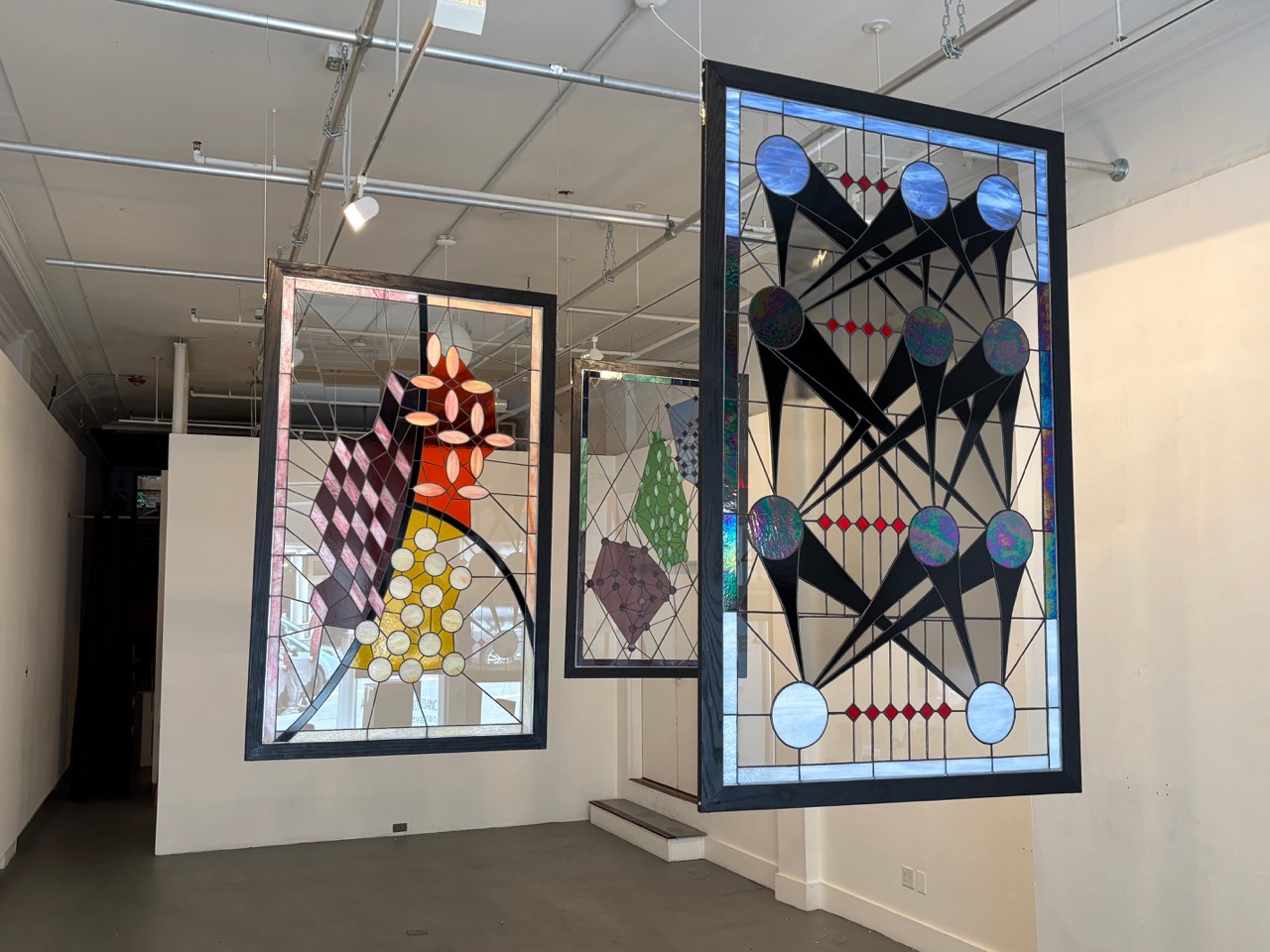
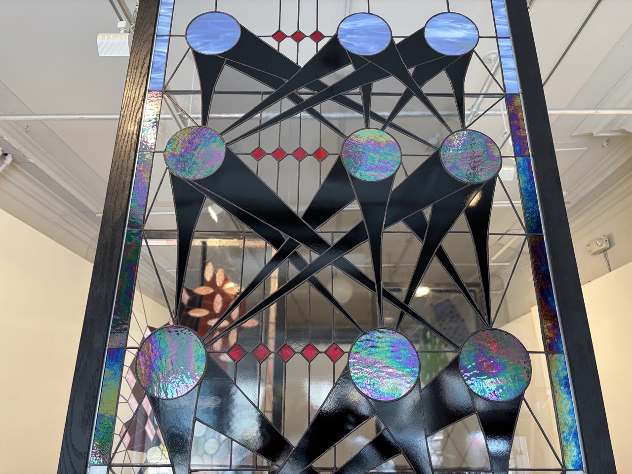
Idols (Bayes), False Idols (Clustering).
Based on research papers, textbooks, and other visual representations used to depict or teach about these algorithms in scientific literature, the diagrams were reinterpreted as stained glass windows to reflect the socially-constructed valorization and deification of AI, and technology as a whole, in the current moment.
False Idols will be on view in the exhibition Technologies of Relation at the Massachusetts Museum of Contemporary Art (MASS MoCA), beginning February 21, 2026.
This project was supported by the Culture Council at Emerson Collective. Thank you to Dragonfly Stained Glass Studio (Easthampton, MA) for assistance with the design process and for window fabrication. Thank you to Benjamin Cowden for assistance with framing.
Core Memory
2025
Series of 15 layered prints
Digital prints on laser cut Hahnemühle photo rag; digital prints on transparent polymer film; screenprint on acid-free card stock; hand-inked caption on bond paper
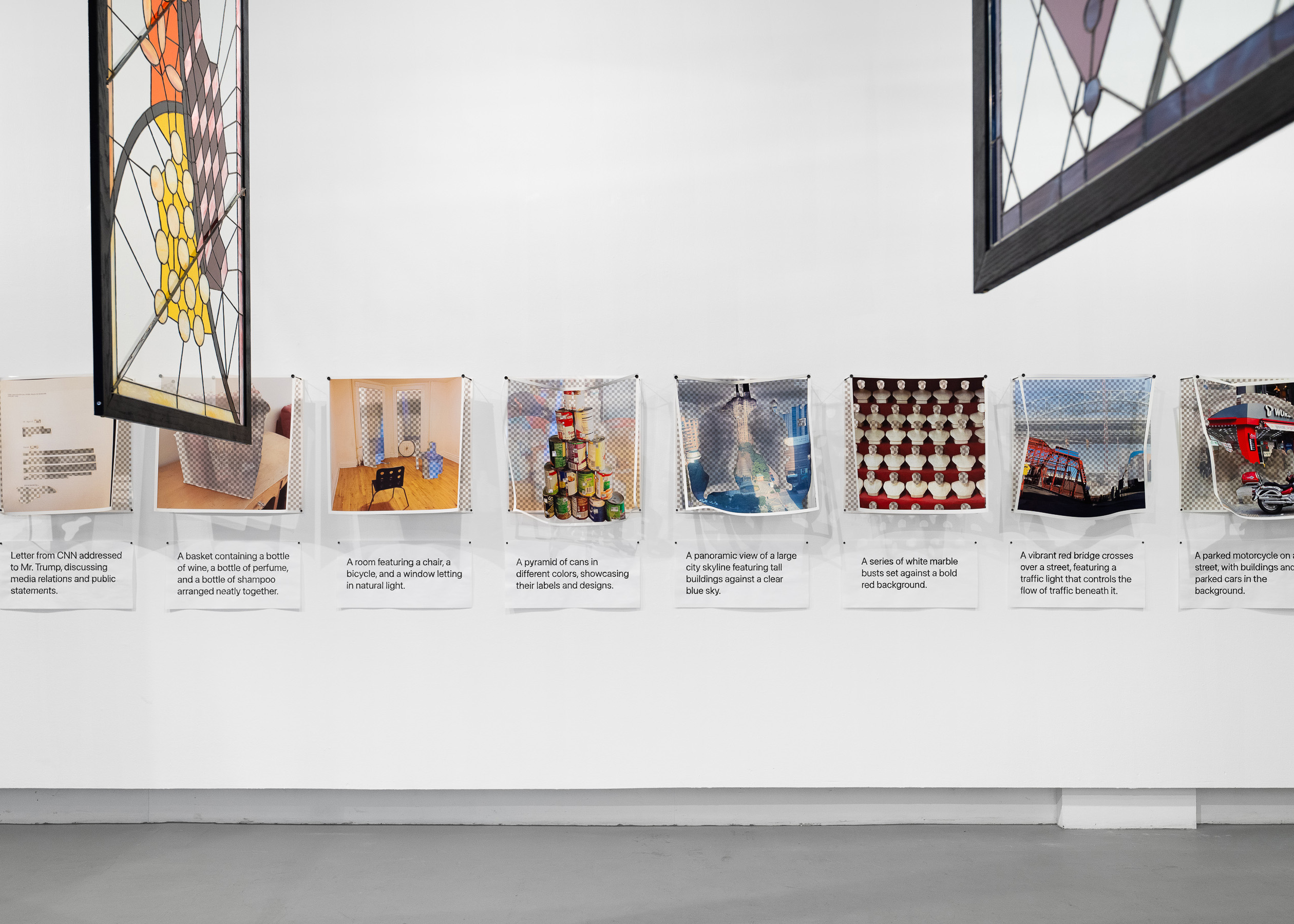
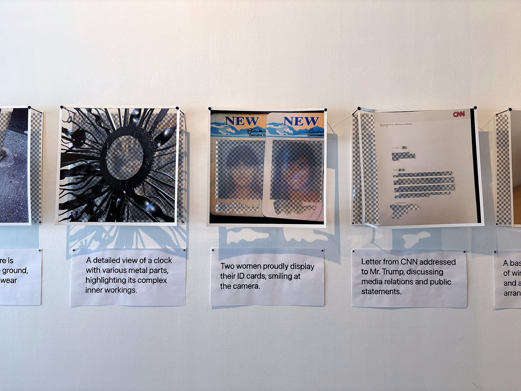
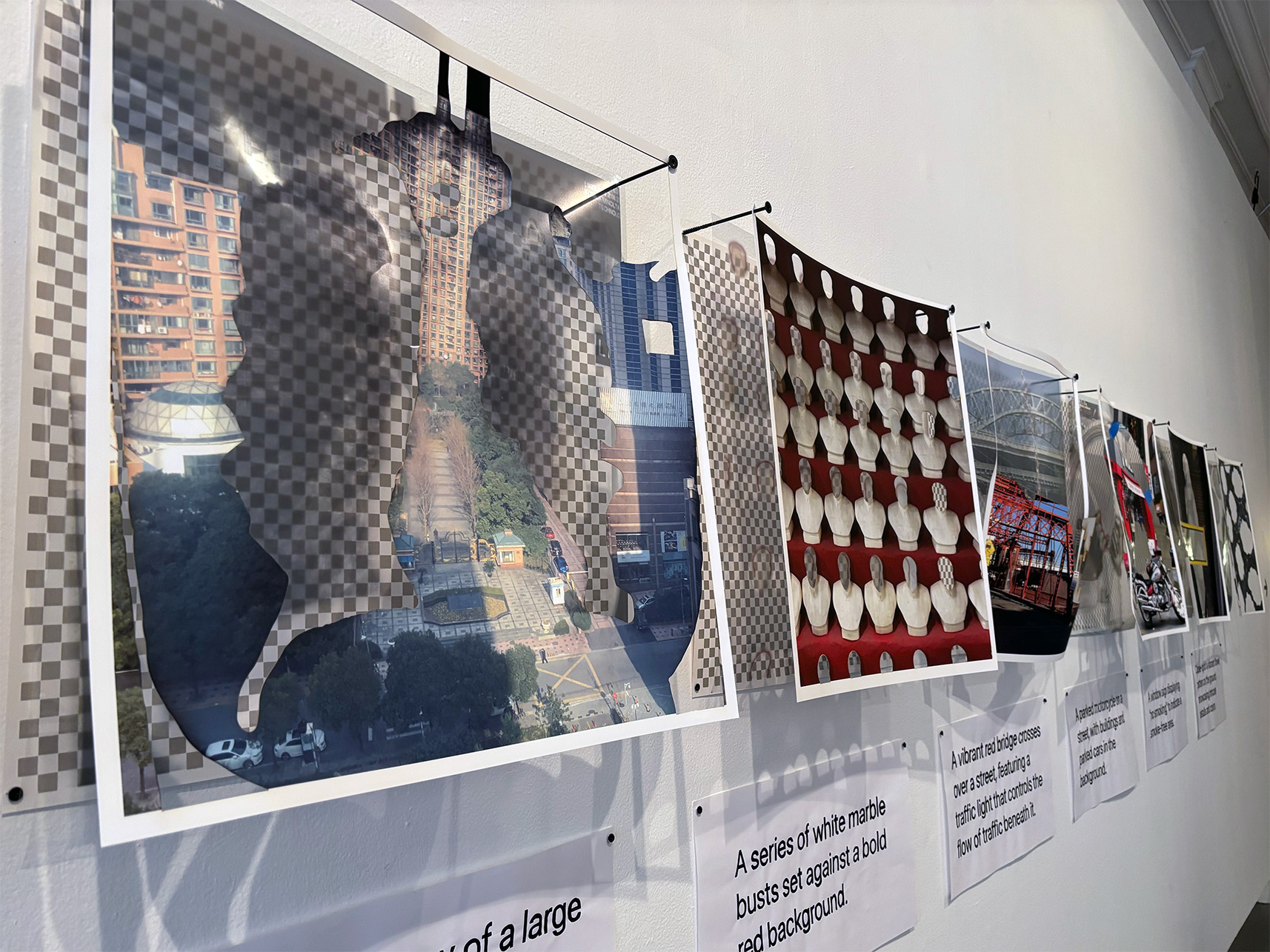
Core Memory is an exploration of the things that artificial intelligence is incapable of understanding about the individual human experience, and its futile attempts to fill in the gaps it leaves behind. For this work, I run personal photographs from my archive through an automated alt-text generator, and then systematically remove content based on what is left out of or misinterpreted by the description.
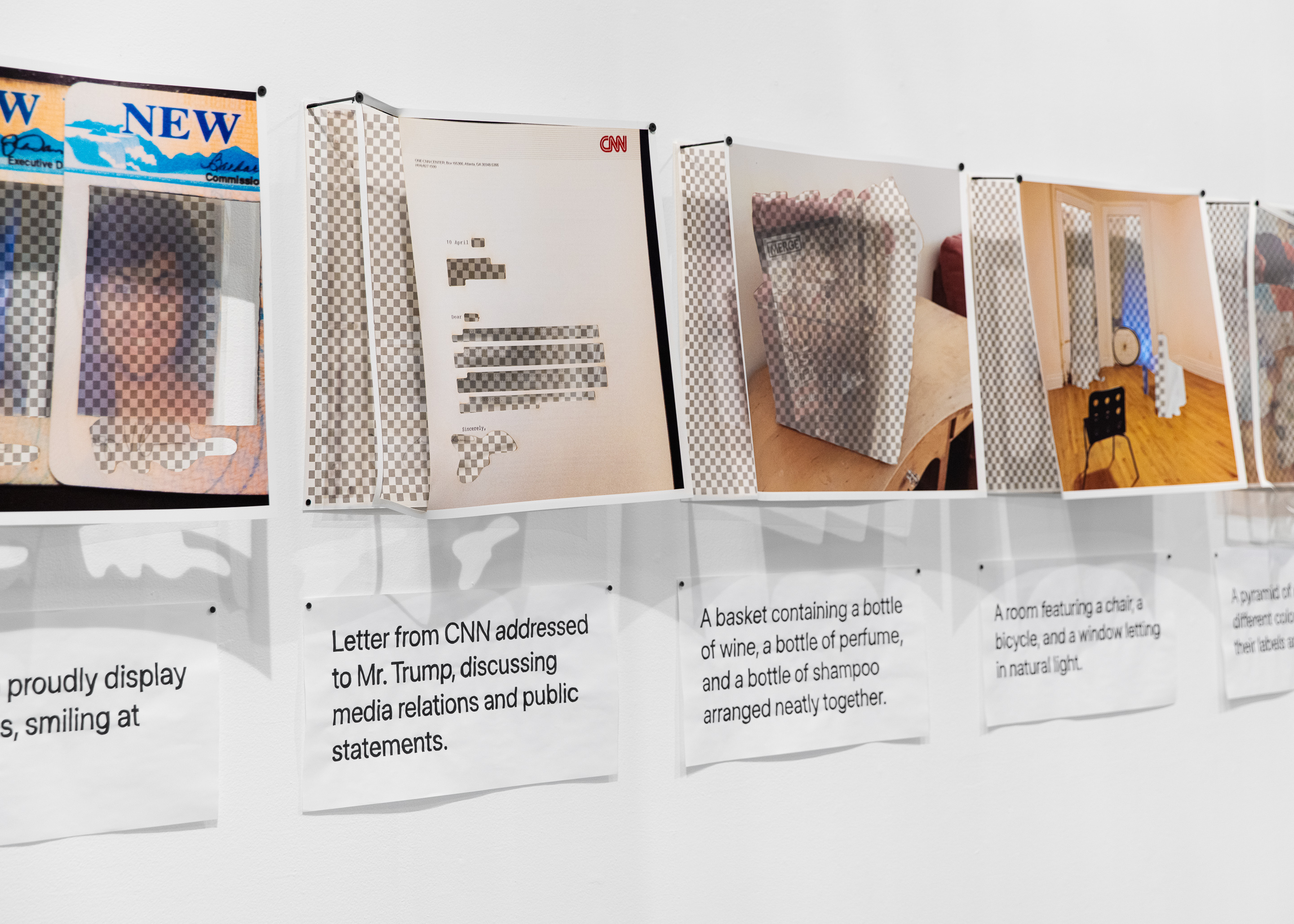

2025. Photo by Joel Tsui.
2025. Photo by Joel Tsui.
In its initial incarnation, the work took shape as a series of 15 prints, which each contained three layers. The bottom layer was a manually screenprinted transparency grid, similar to what you would find in an application like Photoshop. The top layer was the original photo printed on archival rag, but the print has been laser cut to remove the things that the generator ignored or misinterpreted.
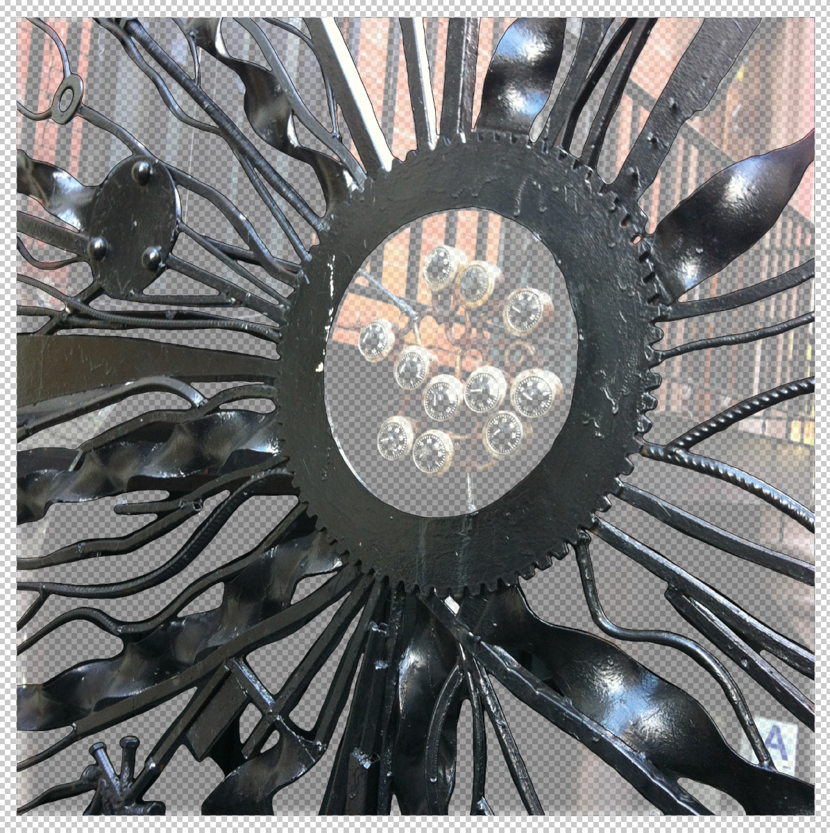
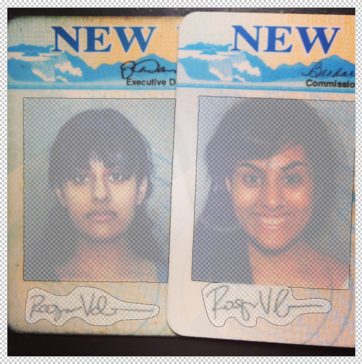
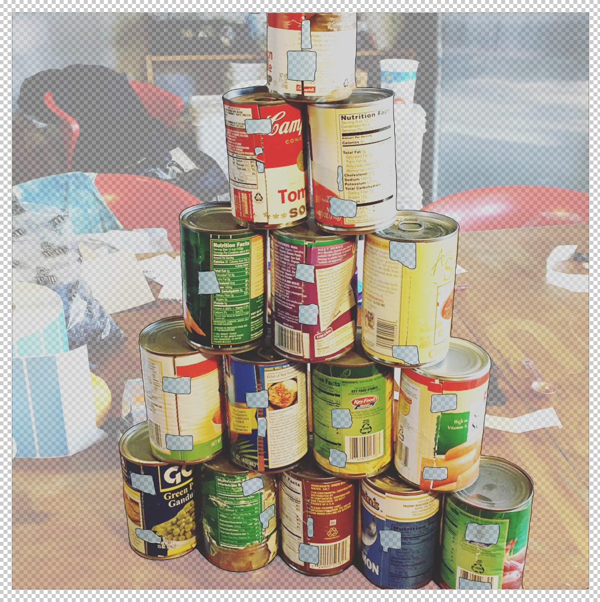
Those removed elements were then printed at a reduced opacity on transparent film and installed as the middle layer, visible through the holes in the top and offering a ghostly reminder of what the AI was incapable of seeing. A hand-inked version of the caption was displayed on bond paper underneath.
2025.
2025.
The title refers to the pop psychological concept of “core” memories — deeply personal memories that shape and define who you are throughout your life — as well as the computational concept of “core memory,” which refers to how information is distilled into binary 0s and 1s and stored in a computer system.
This project was supported by the College of Humanities and Fine Arts at the University of Massachusetts Amherst. Thank you to Mikaël Petraccia for assistance with printing.
Artificial Abundance
2023–ongoing
Digital prints rendered in a variety of physical formats:
Wallpaper, dye sublimation on Chromaluxe metal panels, risograph prints
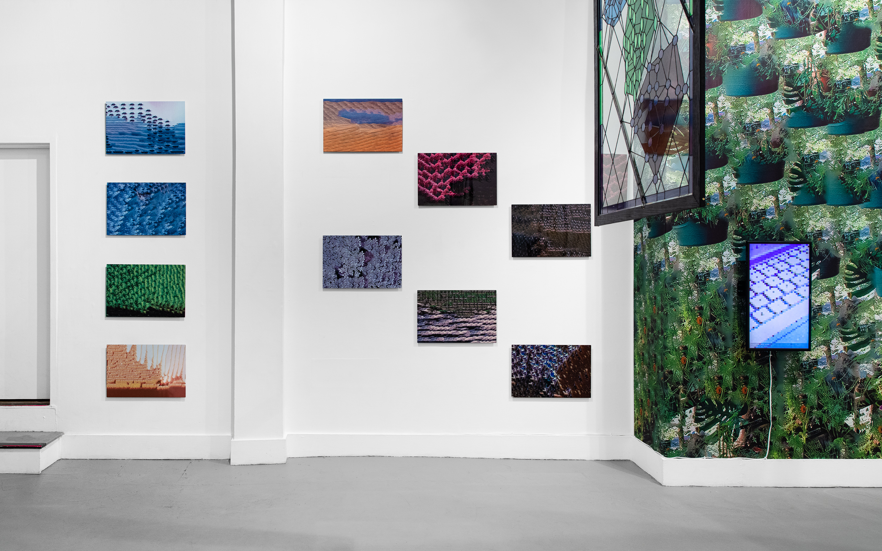
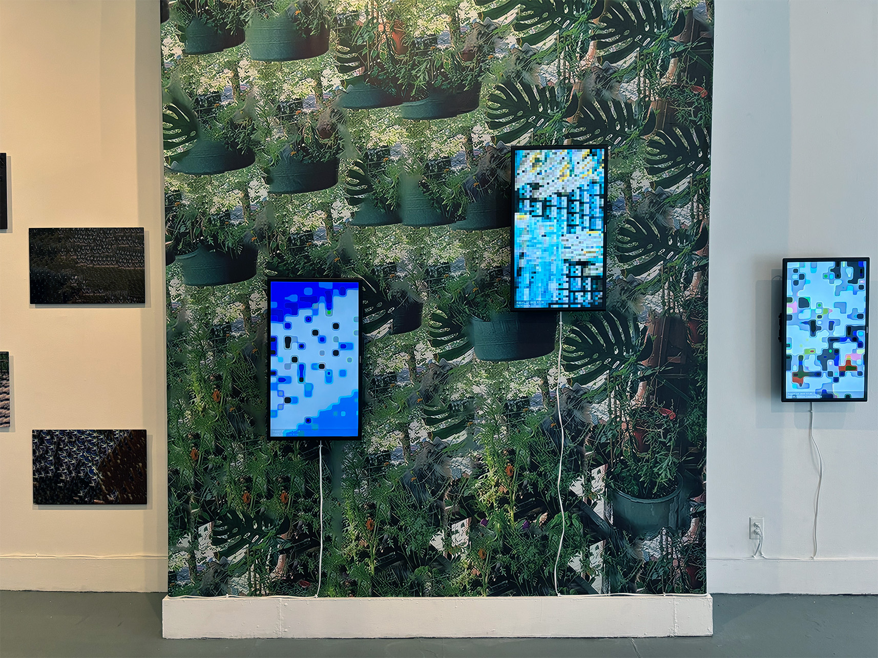
Artificial Abundance is a series of computationally generated prints created by manipulating personal landscape or nature photos taken by the artist.
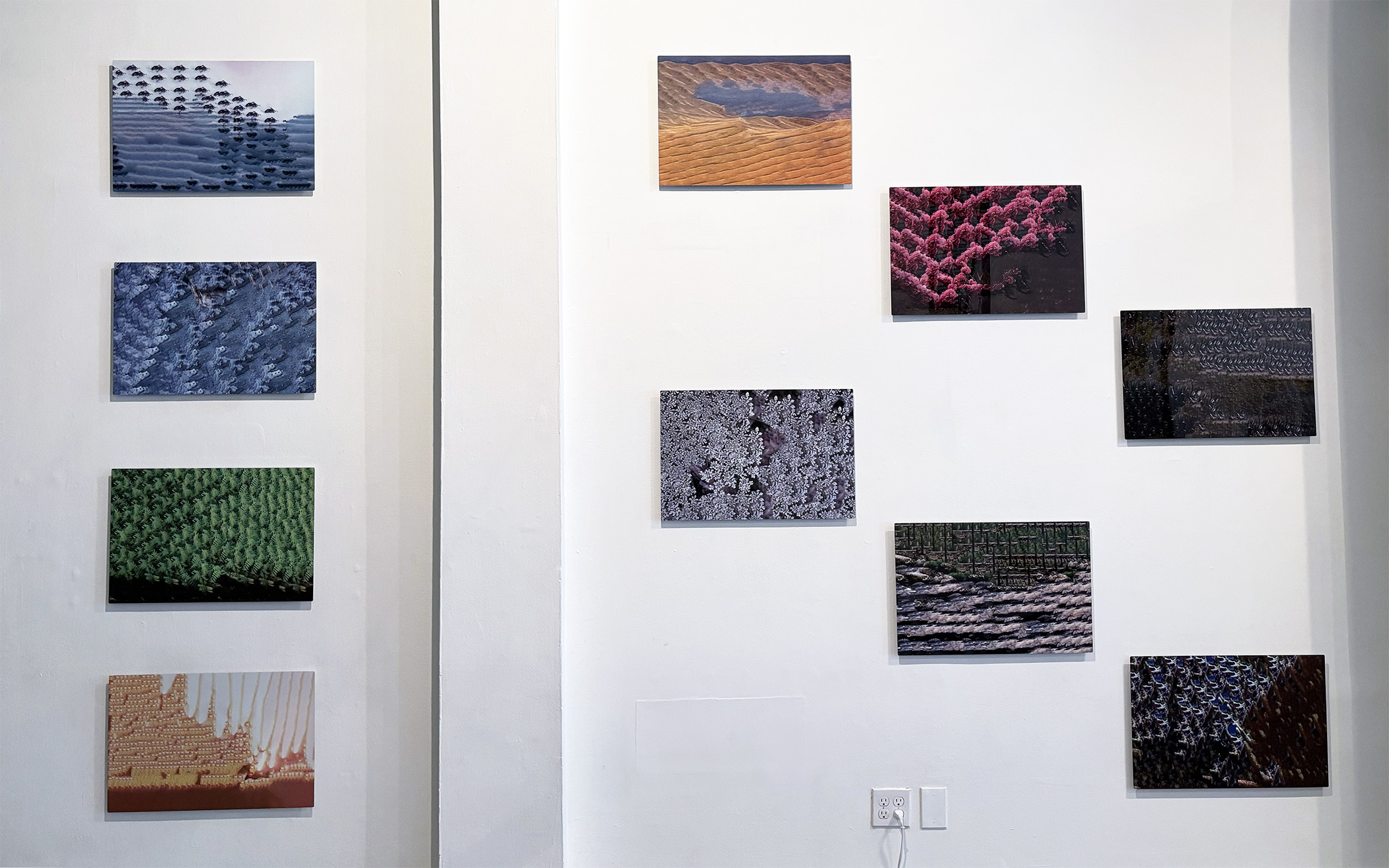

Using none of the AI image making software that has garnered exponential hype and criticism alike in recent years, the work is instead generated using machine learning tools that have been available within standard consumer design software for over a decade.
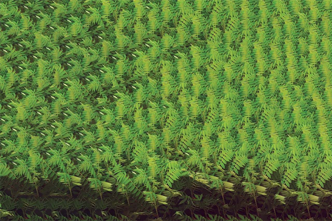
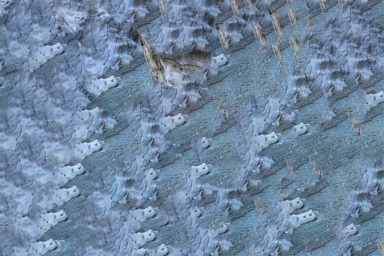
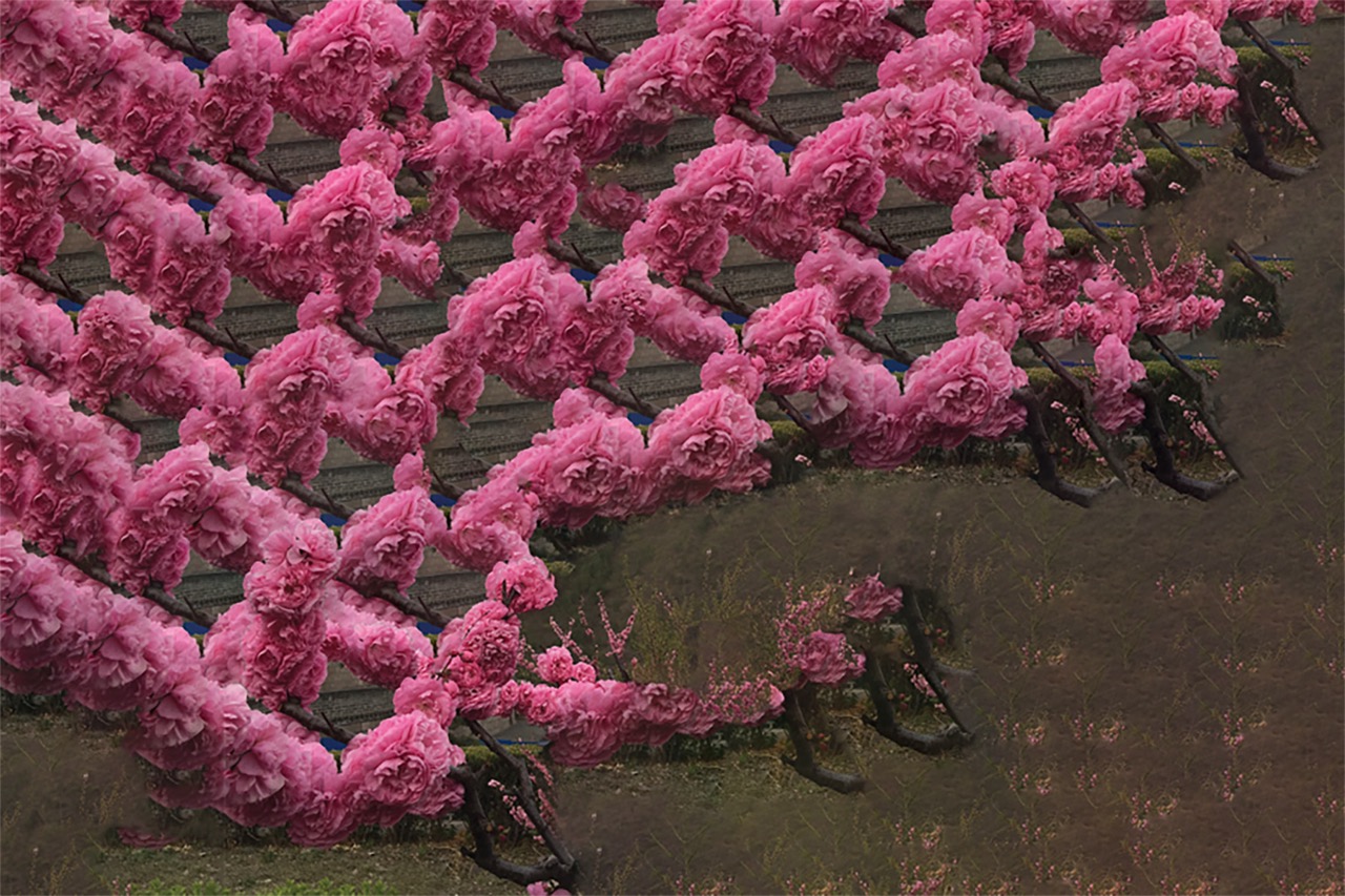
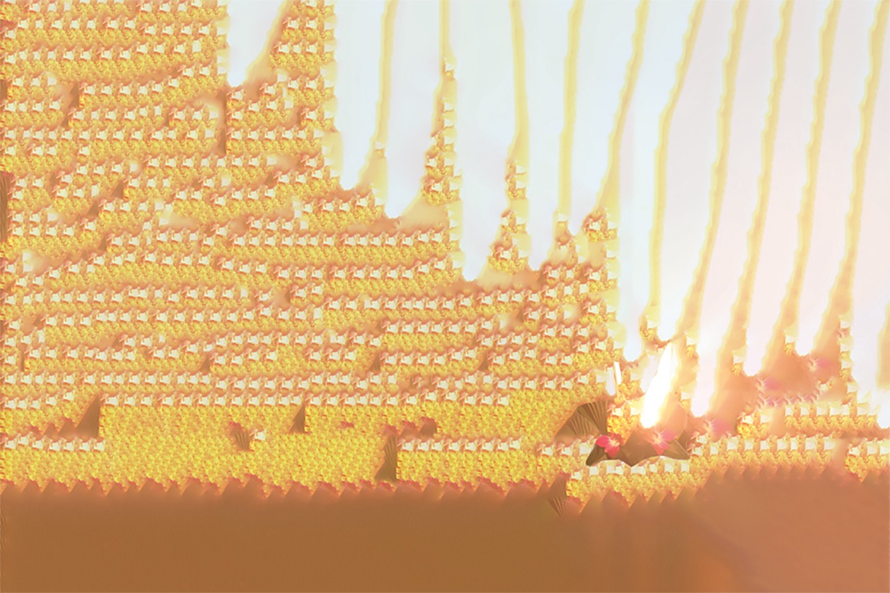
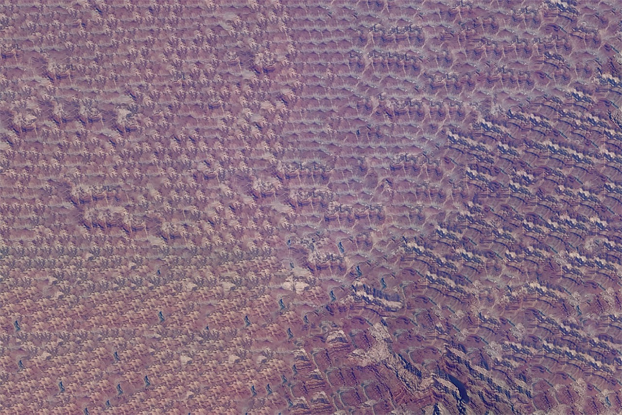
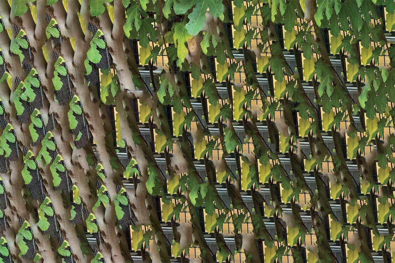
The series points to the perpetual mythic and omniscient nature that we continue to assign to the idea of artificial intelligence—always existing at the periphery of our vision instead of being slowly and deeply integrated into everyday life—alongside the detrimental effects that its growth will continue to have on the world if its developers remain unchecked and unregulated.
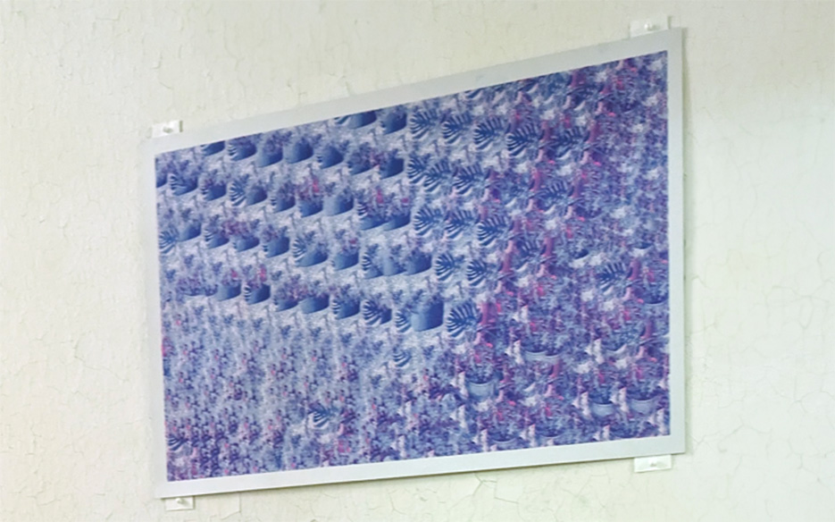
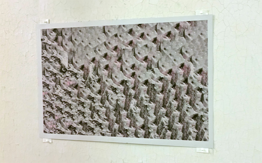
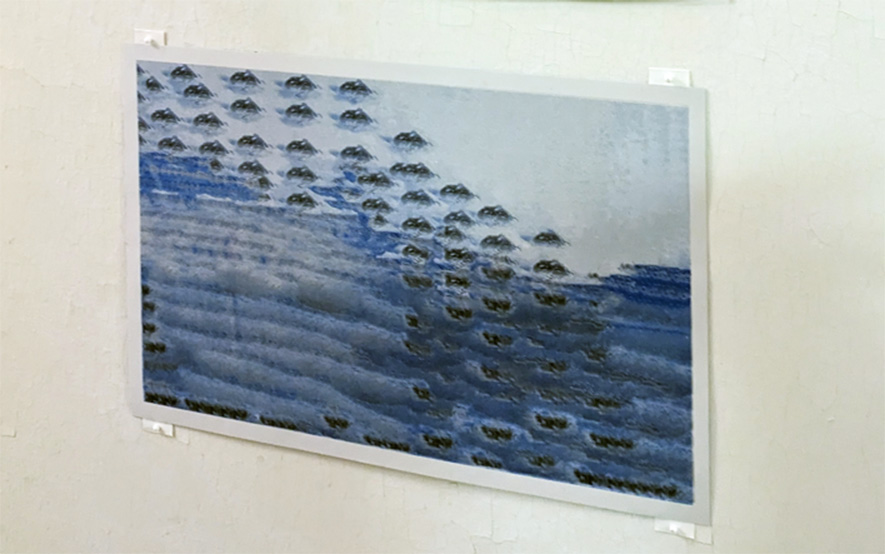
Artificial Abundance currently exists as 30 digitally generated images, which have been translated to print through a variety of methods. In addition to Roopa Vasudevan: Artificial Abundance at SPACE (2025, Portland ME), the work has been shown at various stages in the exhibitions Artists Formerly Known as Prints (2023, Flux Factory, Governor’s Island NY) and the School for Poetic Computation’s Electronic Cafe for Poetic Computation (2023, Recess, Brooklyn NY).
Thanatos
2025
Custom chatbot on mobile website; documentation video
Thanatos is an in-progress artistic chatbot representing a futile attempt to automate the functionality of a death doula, or someone attempting to provide emotional and spiritual support to those dealing with the end of life.

Drawing inspiration from ELIZA (1966, Joseph Weizenbaum’s early pattern-matching chatbot developed at MIT) and rule-based chatbots often found in customer service contexts, THANATOS operates by using key words and phrases input by the user to select a response from a range of options. No large language models were used in its development, and no data input into the bot will ever be saved or stored.
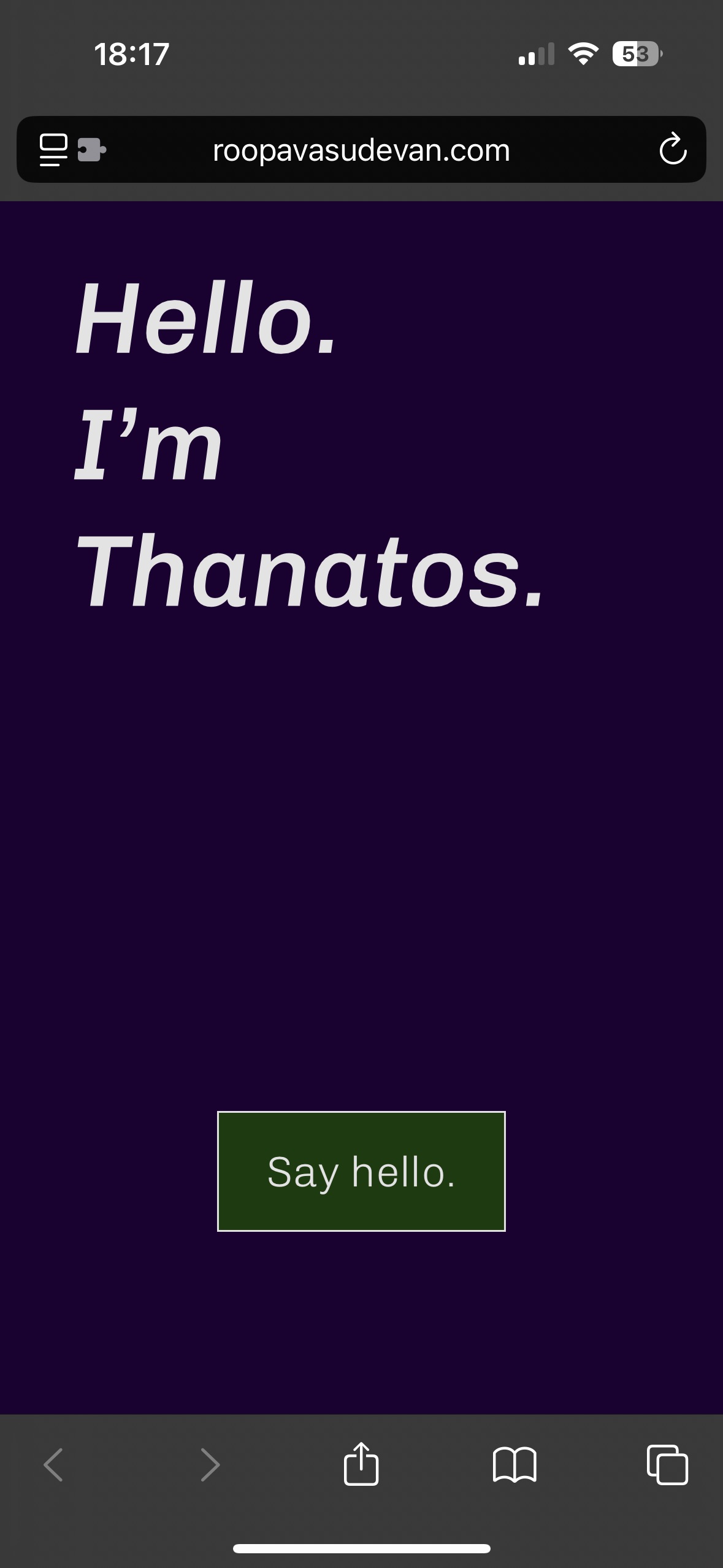
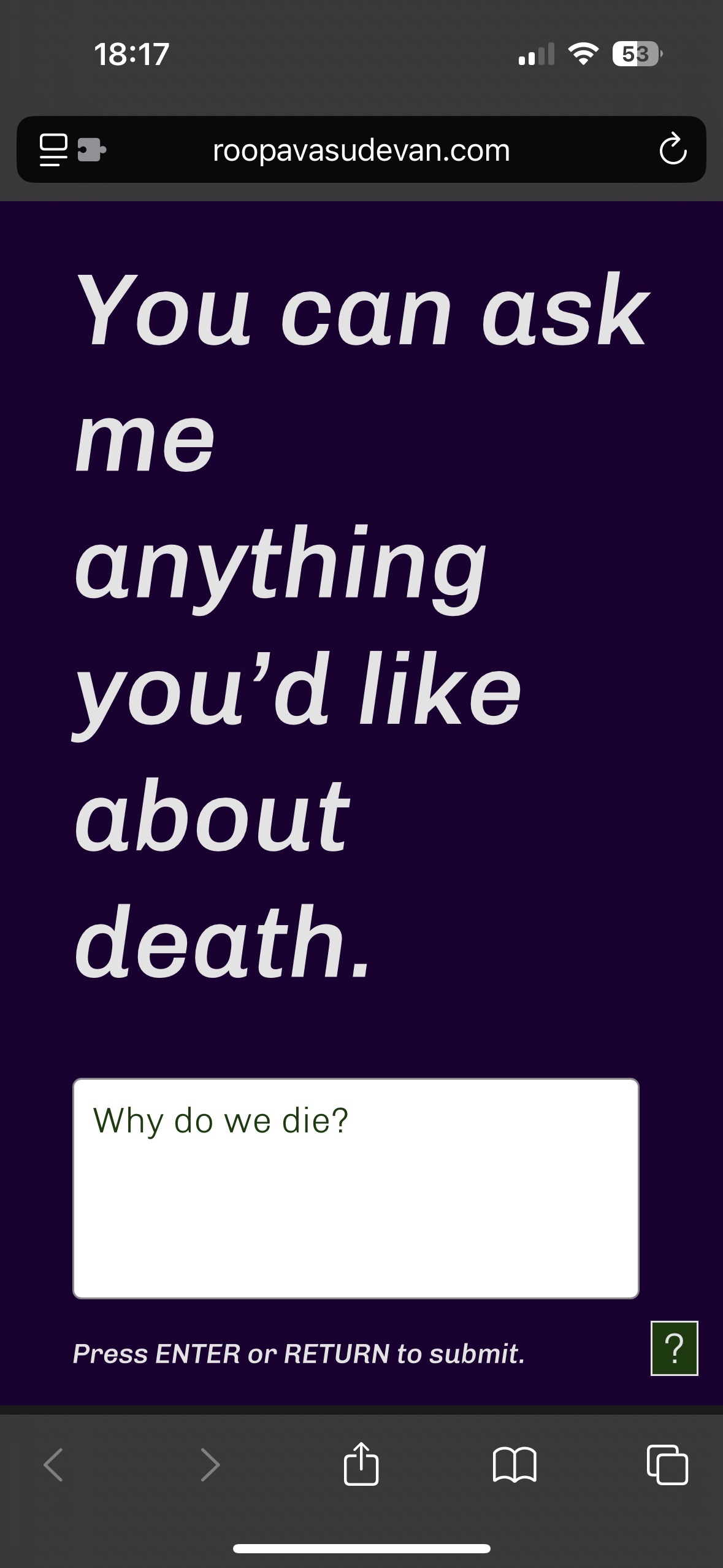
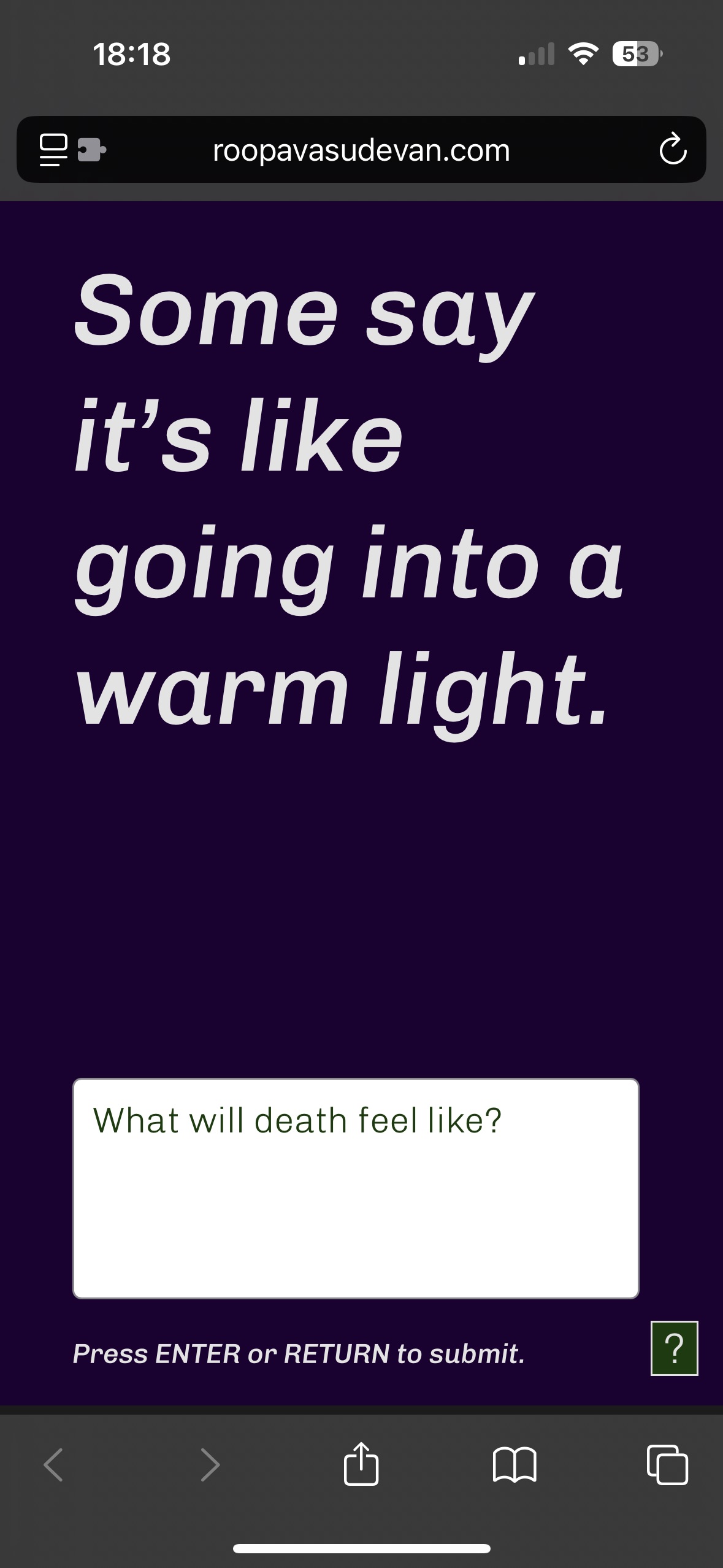
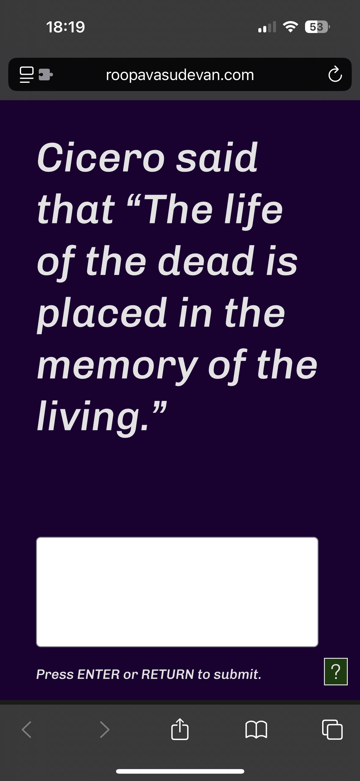
As we continue to navigate an age where those in power claim that almost everything about our lives can be automated, exploring questions surrounding death and dying offers a chance to evaluate the gaps between what we imagine artificial intelligence to be—a full facsimile of the human experience—and the realities of what it can (and can’t) provide.
Chat with Thanatos here. This project is an artistic exploration and not meant to serve as a substitute for therapy or end of life support. If you or someone you know is struggling, call the 988 crisis hotline.
Hype Cycle
2025
Three-channel generative video installation
Created with Processing
A three-channel video installation depicting the emotional distortions present in press coverage of artificial intelligence, collected over one week in August 2025. I collected posts from RSS feeds from a variety of sources in the business press, the mainstream tech press, and developer forums and communities.
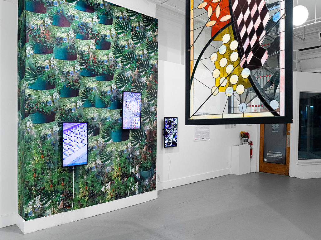
The work utilizes a widely-available sentiment analysis toolkit (VADER, created in 2014), which is often used to extract emotional registers from social media posts and other user-generated content, in order to place each collected text on a spectrum from -1.0 (extremely negative) to 1.0 (extremely positive). Using pixel manipulation and commonly-used image effects like blurring and posterization, I applied filtering to stock images in order to represent how extreme the sentiment falls on the spectrum.
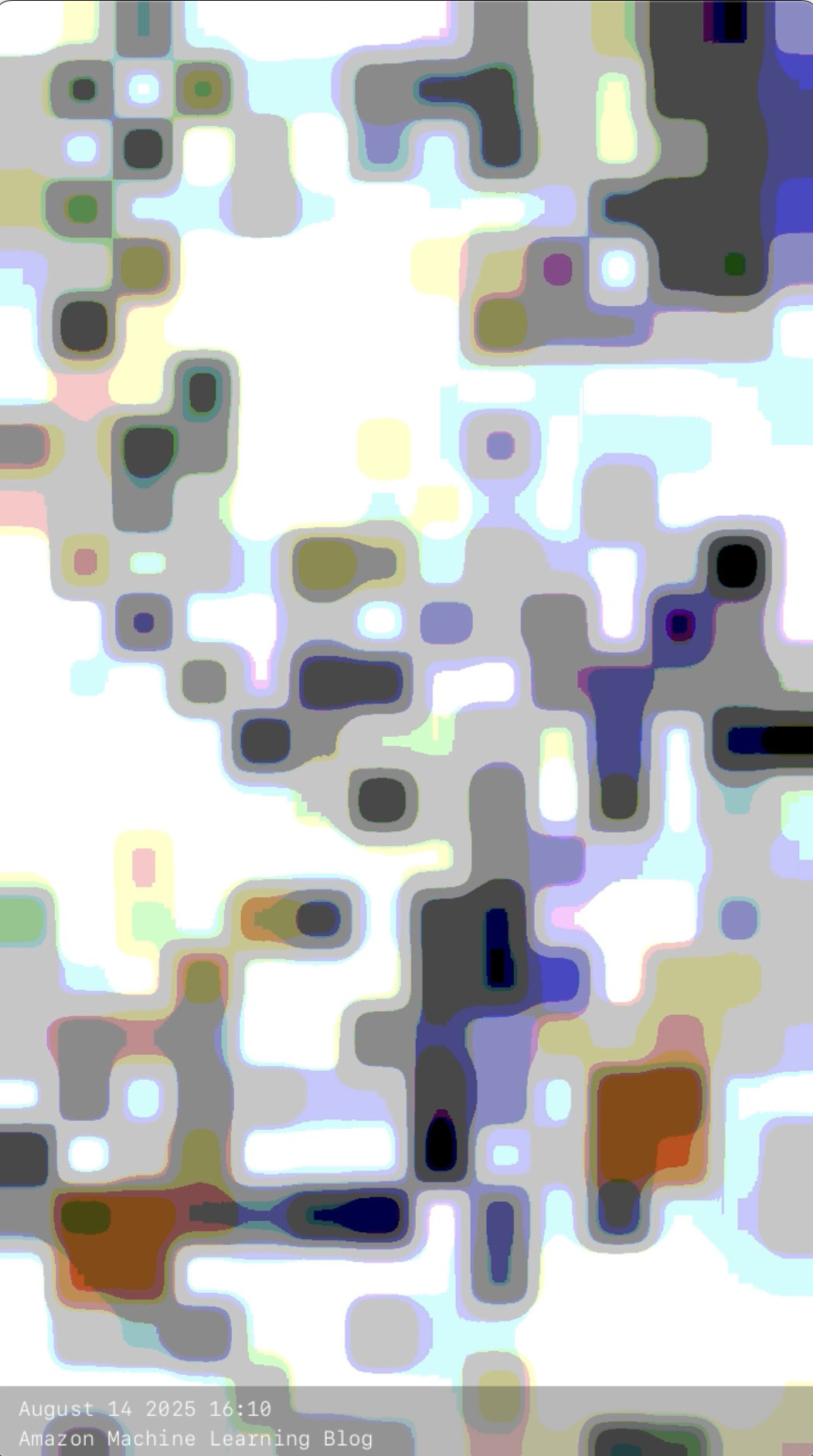
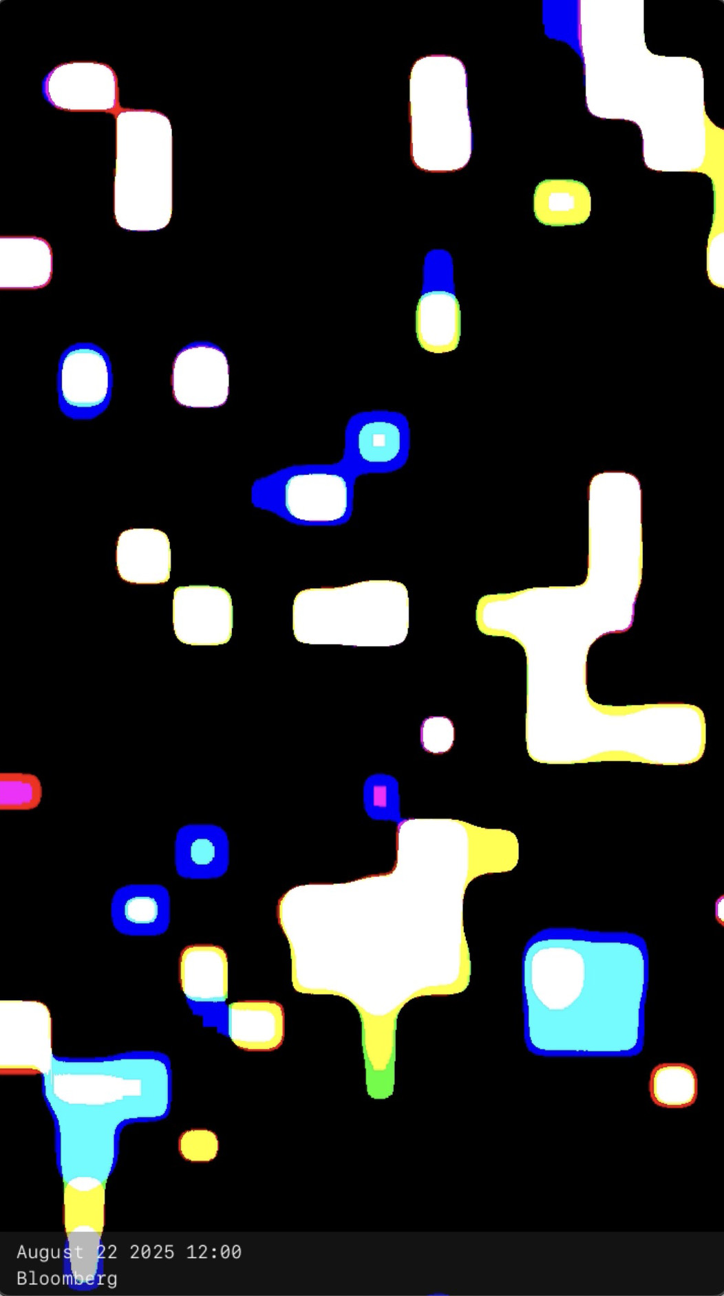
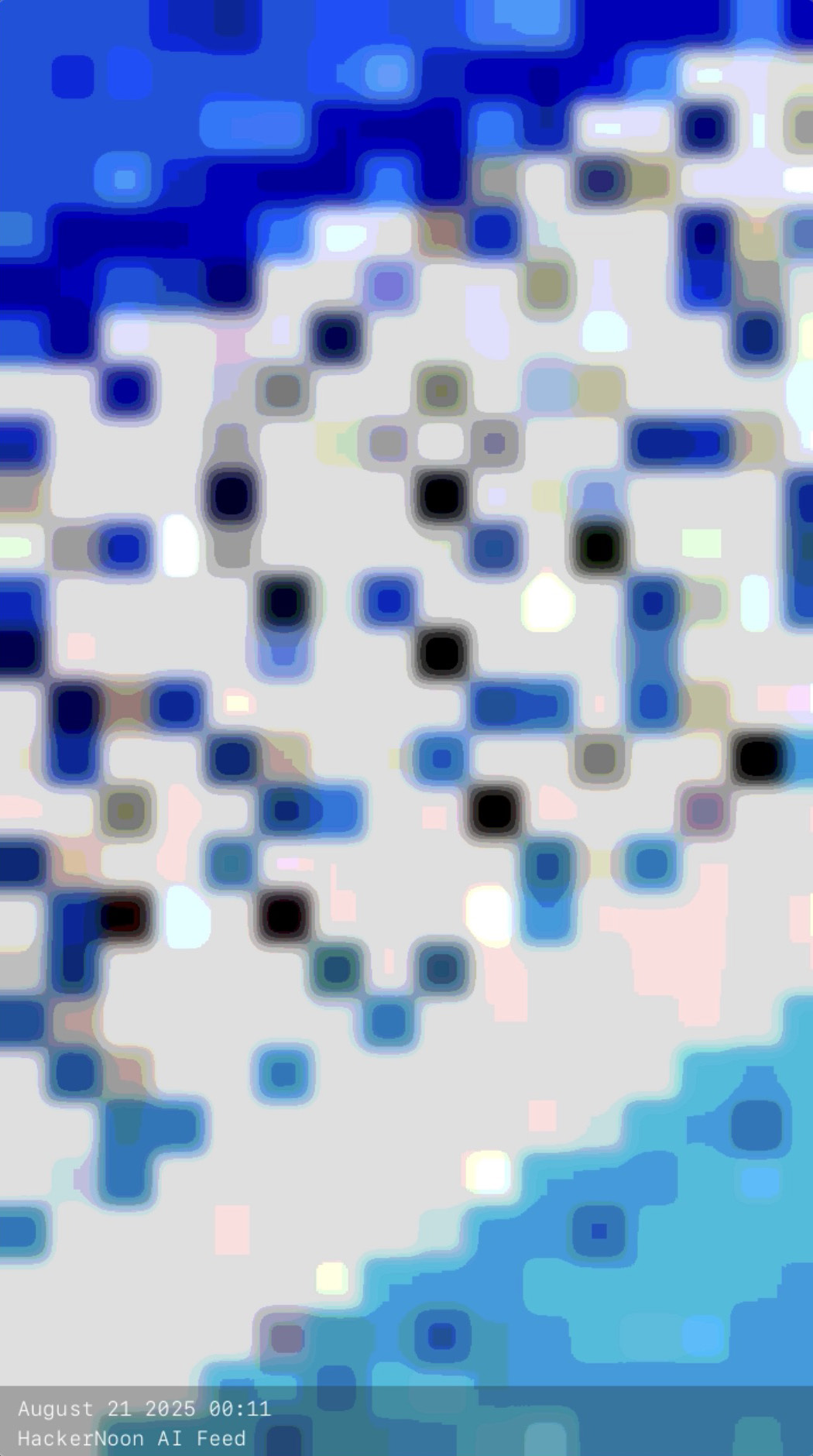
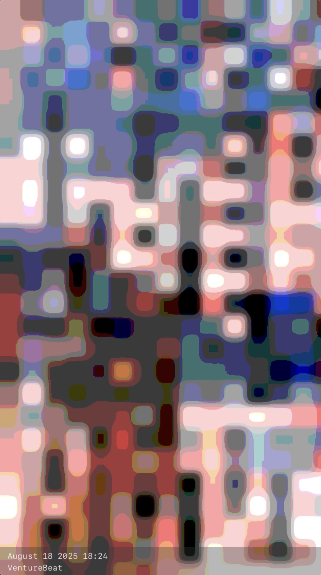
The warped nature of the images point to how distorted the media discourse surrounding AI has become, often leading us to extreme assumptions about the technology’s fundamental power and abilities.
Pressure Systems
2025
Generative animation; site specific vinyl window clings
Pressure Systems is a series of site specific and impressionistic works investigating the tangible effects of data collection and storage.
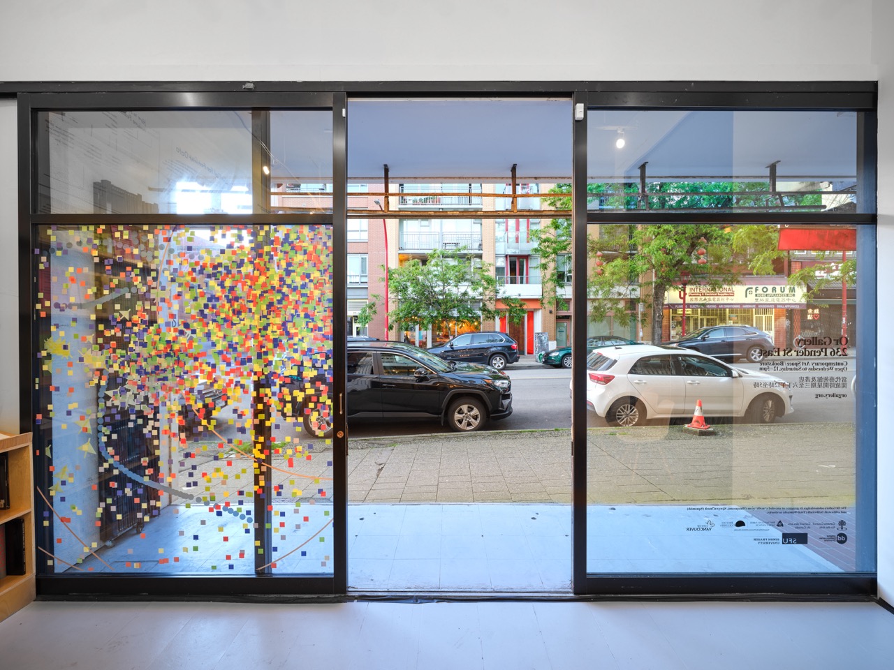
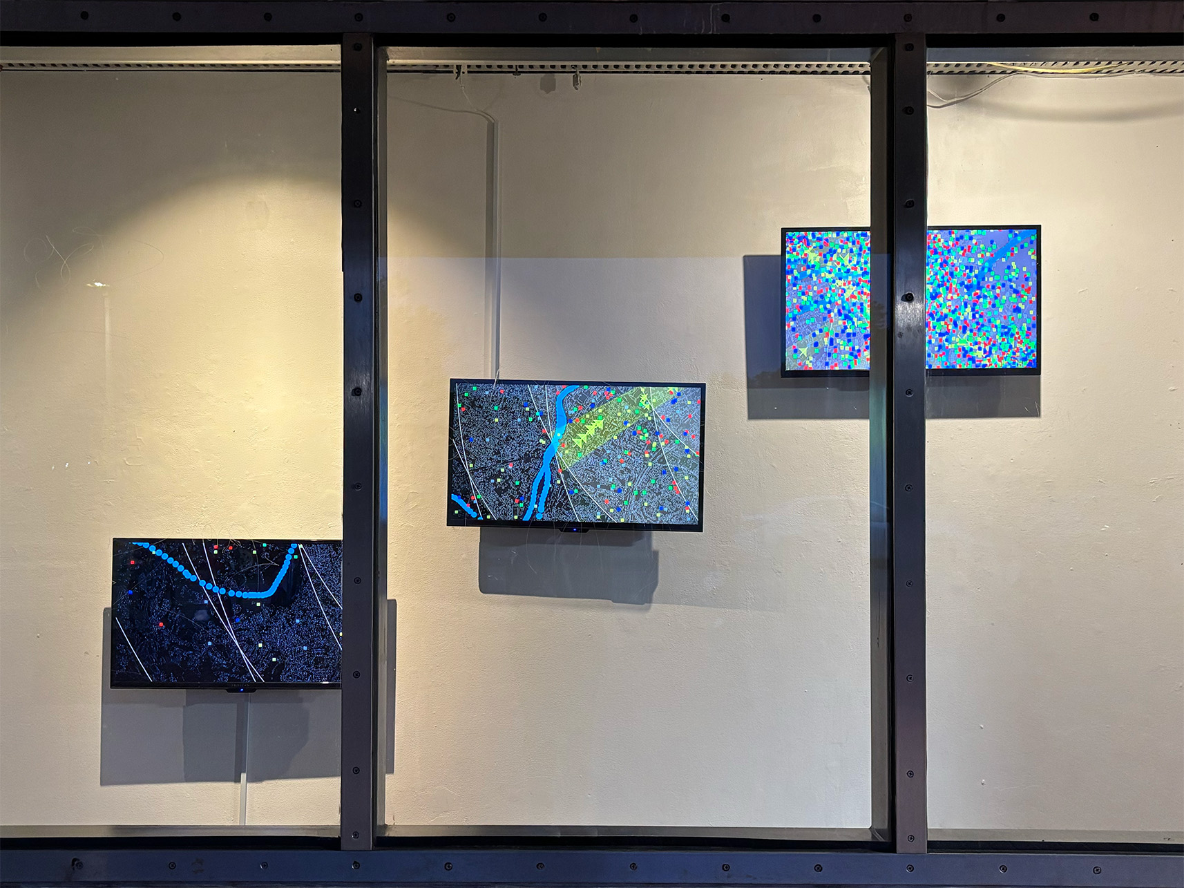
The works that comprise the series superimpose iconography and motion on physical space to depict the material needs of processes that are often regarded as immaterial and invisible. I take inspiration from both meteorological maps and electronics schematics — traditional means of representing fluid events that often cannot easily be seen by the human eye.
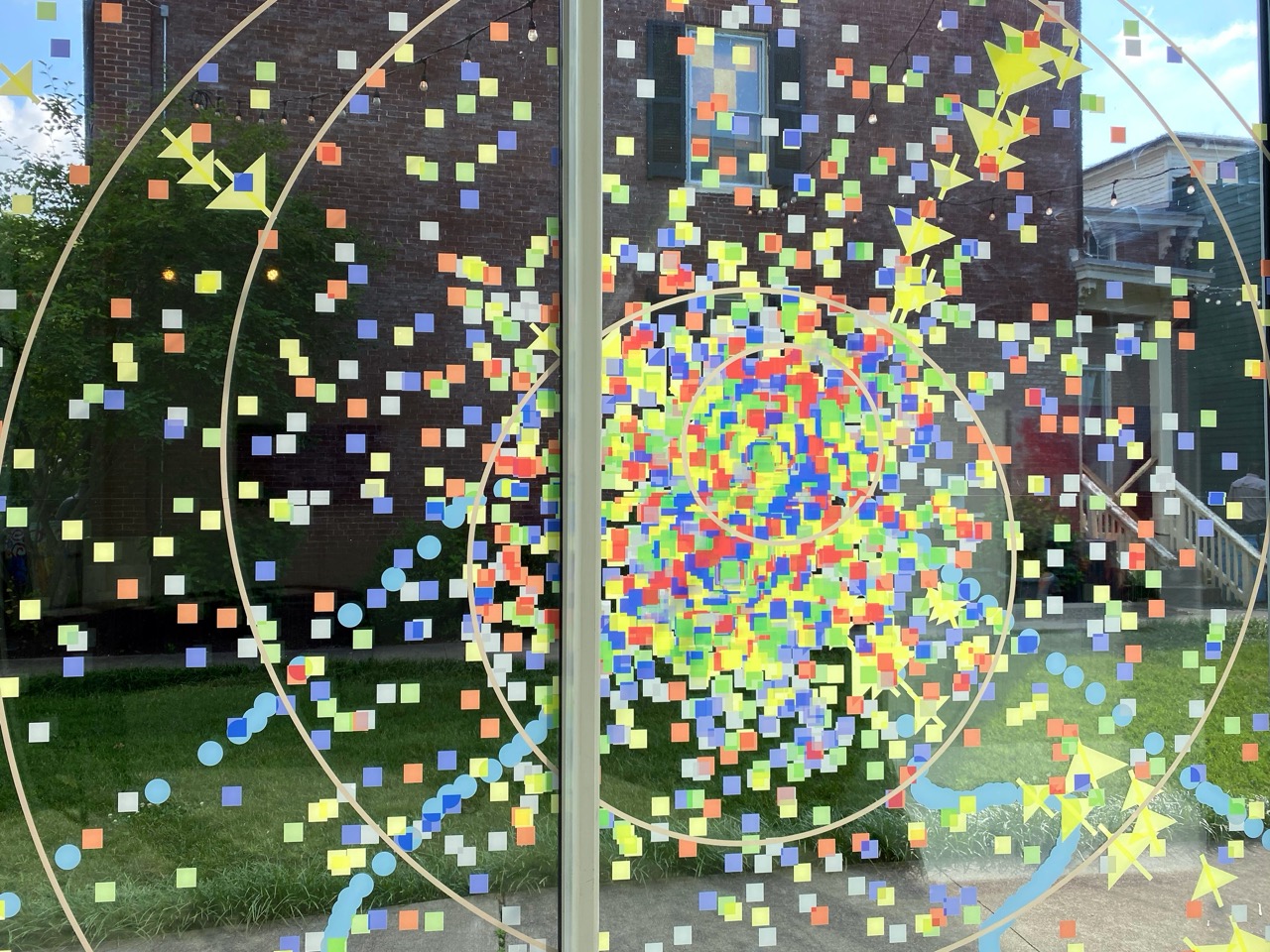

Each work in the series begins with a generative animation, completed using Processing, an open source software toolkit for the arts. The animations took as their starting condition the geography of each location, centered on the gallery or arts space at which the work was exhibited. I conducted additional research into locations of power plants in the cities, local bodies of water, and the locations of nearby data centers.
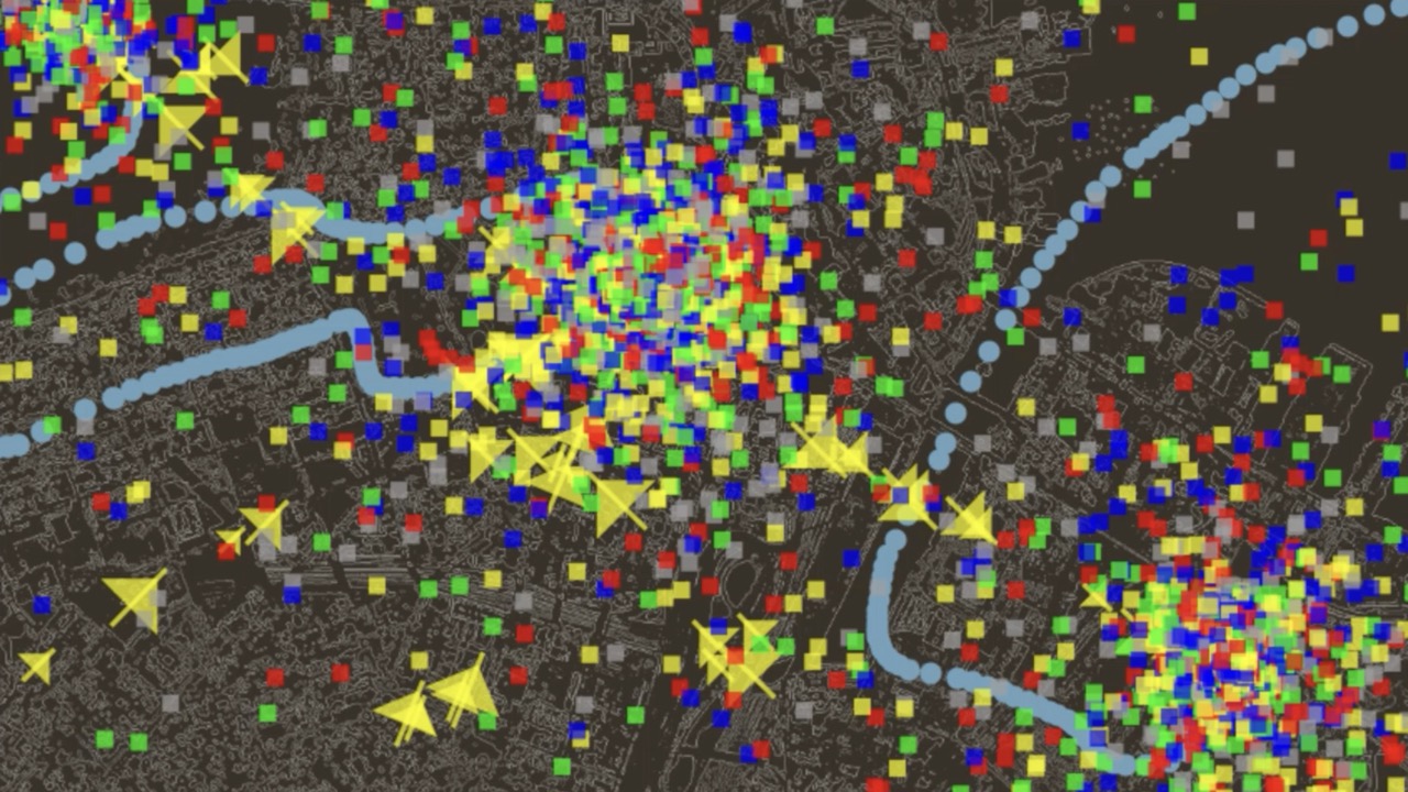
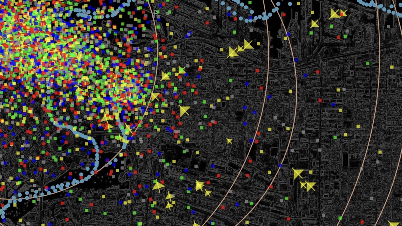
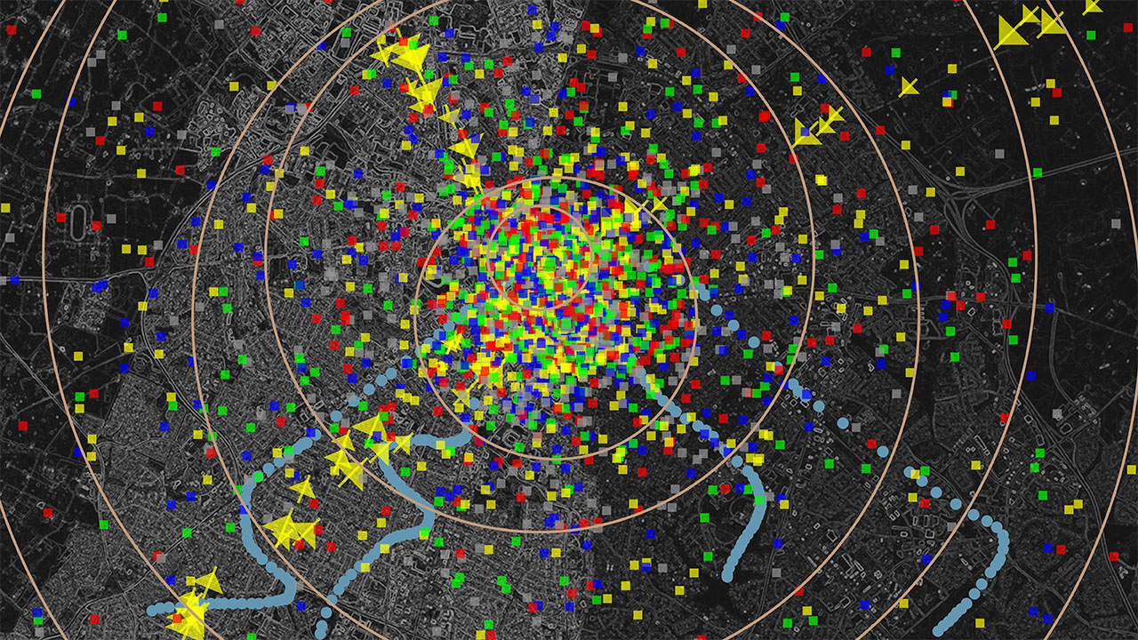
These locations and relationships serve as the basis for renderings of imagined “flows” of materials to and from the sites of the data centers. The movement of electrical current and water is represented by icons or symbols that are used to represent or denote it, or its equivalent, on weather maps and schematic diagrams. As the animations progress, what begin as manageable streams of water and power to the sites of the data centers quickly escalate out of control as “storms” of data start to emerge, fed by (and demanding more of) the resources pouring into the centers. Over time, rings symbolizing “pressure systems” — areas of local deviation or fluctuation from the surrounding conditions — begin to appear, trained on the data centers and indicating increasing instability in the digital atmosphere.
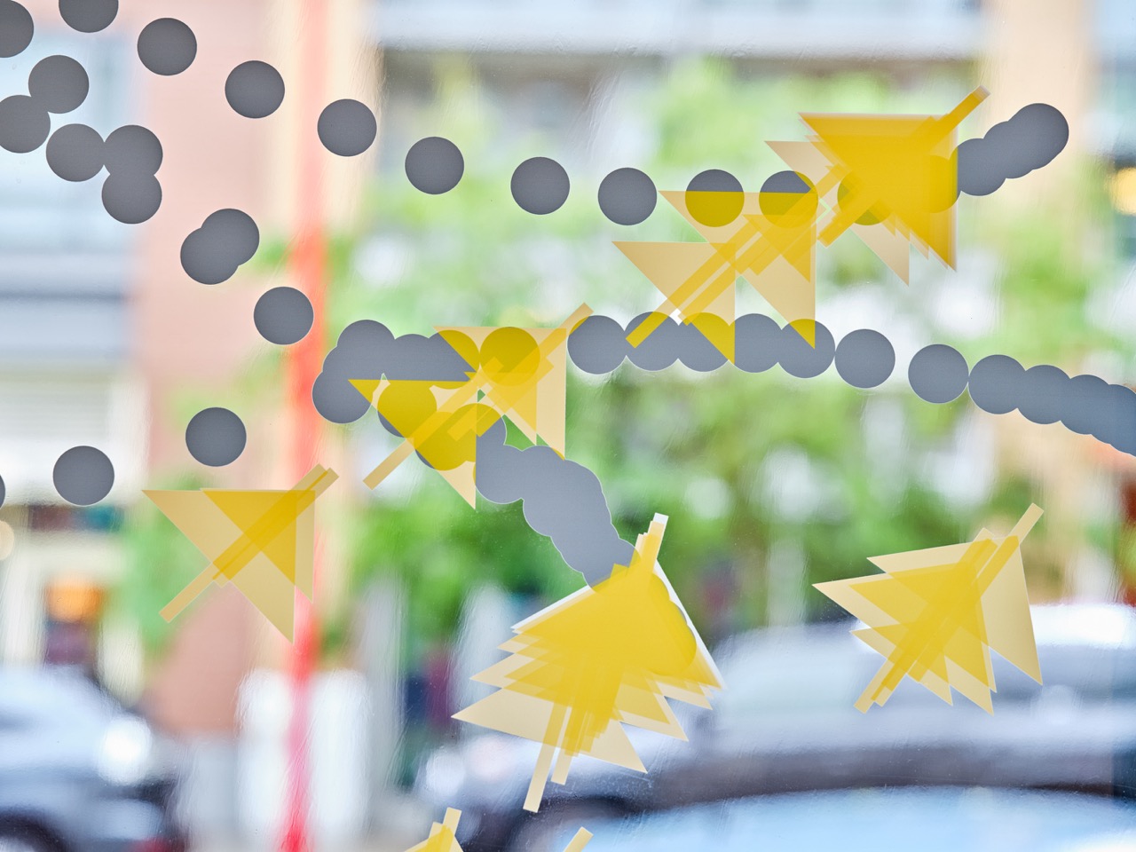
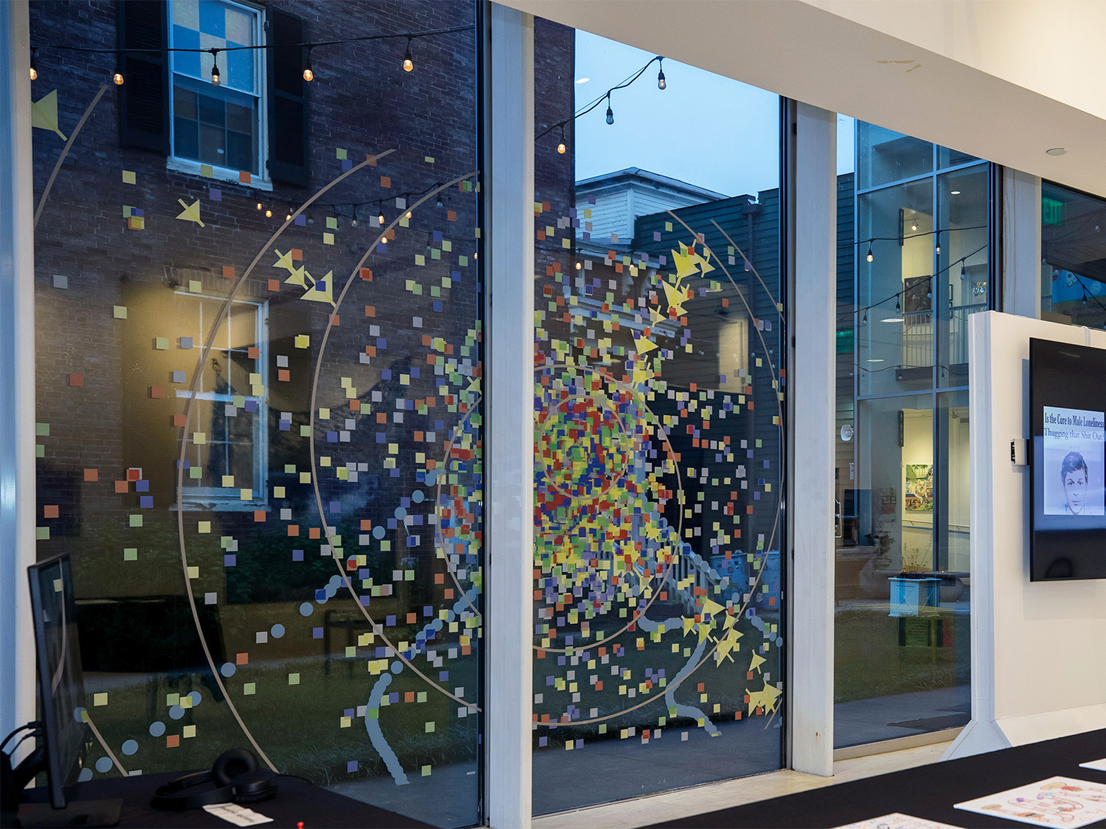
Pressure Systems was created for the Data Fluencies Exhibition Series, which I organized as part of the Data Fluencies Project (2022–2025) and which took place at three galleries across North America in 2025. For the Boston exhibition, the work was exhibited as a three-channel video installation of the animation. The videos were synced across the monitors, offering a lateral view of the flows to and from data centers in the city. In Vancouver and Lexington, the work was realized as transparent vinyl clings over the windows of the spaces, on which stills taken from the animation (sans maps) were printed.
For more information about the exhibition series, click here.
Slow Response [Series]
2021 — present
Slow Response is an ongoing series in which I render quick response (QR) codes through a variety of materials, methods, and configurations. In each code, I attempt to re-create a process that is typically done within milliseconds by computational systems; the techniques I use take much, much longer than that.
Unlike computer-generated codes, and maybe contrary to the intent of the format, the QR codes I create are fickle, inconsistent and do not always scan — frustrating the expectations of instant gratification associated with the form, and troubling the instinctual response we have developed to it in a very short period of time. They also often contain technical imperfections due to personal aesthetic preferences, distractions, miscounting, miscalculating, and other errors or choices that can only be described as human.


The work, as a whole, addresses the ubiquity of these digital artifacts that never quite seem to fit within everyday life or appeal to our aesthetic standards, yet have so quickly engendered automatic responses and expectations from those who regularly use mobile devices. I am also interested in what happens when artifacts meant to be consumed by a machine eye are filtered through human ones instead — where breaks and failure happen, and how much failure the machine will actually take.
Slow Response I (Drawings)
2021 — 2022
Ink and colored pencil on graph paper; mobile websites
A meditation on speed, form, instinct, and the rush toward futurity in the era of moving fast and breaking things.

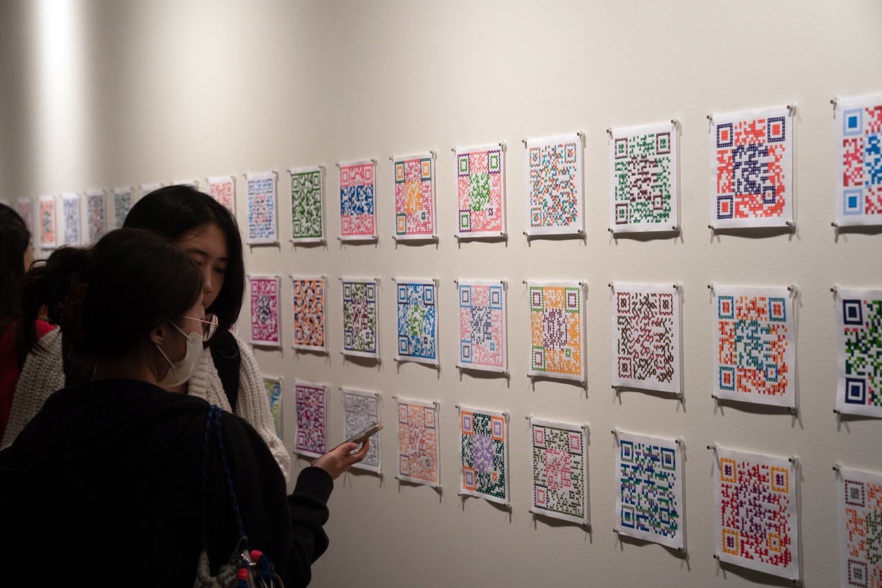
Slow Response I (Drawings) is a series of 100 hand-drawn QR codes, completed between November 2021 and March 2022. In each drawing, I experimented with form, pattern, texture and color to test the boundaries of when the codes will scan and when they won’t. Over the course of the project, the codes became more complex and intricate in their design, while the ability to scan them consistently diminished. In the end, 70 of the codes scan with a device, while 30 do not; it’s up to the viewer to discover which are which.

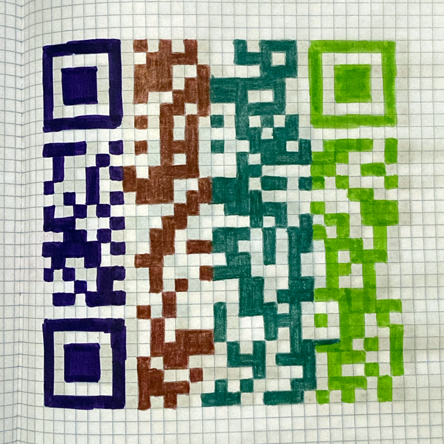


Each scannable code links to a unique mobile website that offers a short meditation on quickness in technology, computational form and how we adapt to it, and the notion of the future and what it means. A different snippet of the text can be accessed from each individual code; together, the texts read as a longer narrative.


As I was going through the process, I posted an Instagram story when I finished each drawing, in an effort to be transparent about my creative process and the stumbling blocks I came across along the way.

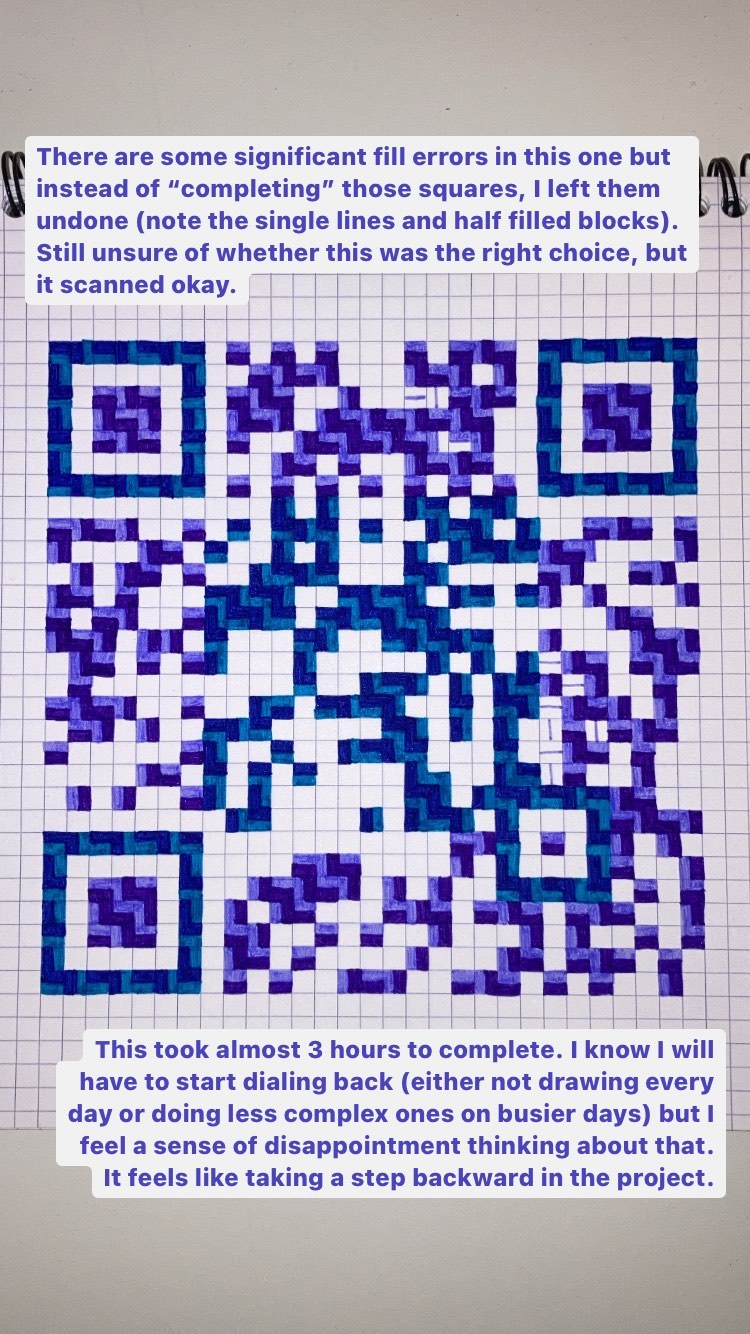


Slow Response I (Drawings) also served as a component of my dissertation research towards my PhD at the Annenberg School for Communication at the University of Pennsylvania.
View all the codes as they were posted to Instagram: Code Studies, Code Studies II.
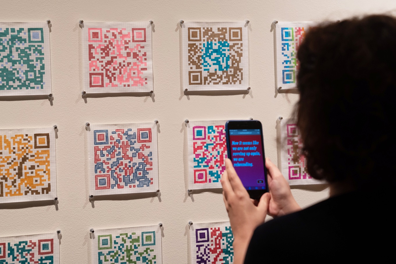

Read reflections on the work, along with an interview with curator Tessa Bachi Haas and fellow exhibiting artist Nicolo Gentile, in the catalog for HARD MEDIUM SOFTWARE, which accompanied the exhibition of the same name at AUTOMAT Collective in Philadelphia (May 2022). The project was also featured in the exhibition Selective Attention: Interventions into the Computational Gaze, on view at the Annenberg School at Penn from August 2022 through May 2023.
Slow Response I (Drawings) will be on view in the exhibition Technologies of Relation at the Massachusetts Museum of Contemporary Art (MASS MoCA), beginning February 21, 2026.
Slow Response II (Motion)
2022
Triptych of lenticular prints (18" x 27" each); mobile websites

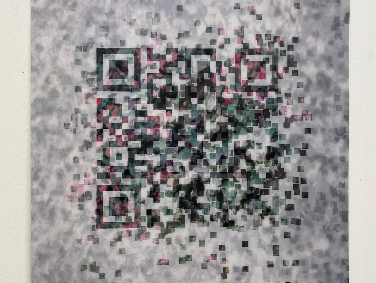


Slow Response II (Motion) is a triptych of lenticular prints that animate into scannable QR codes, but only when viewed from very specific angles. When scanned, the codes lead to websites containing poetic reflections on the finicky nature of the renderings, and the annoyances we feel with them as a result.
The work asks the viewer to consider questions of patience, expectation, and instant gratification in their relationships with technology, and probes at the frustration we feel when technical systems do not operate as seamlessly as we desire.
Special thanks to Dean Bjerke and Tracer Imaging for their assistance with printing. The work was on view in ART & CODE 8, a showcase for NEW INC & Rhizome Y8 Art & Code track members at Public Works Administration in New York, NY. It was also on view in November/December 2022 at Vox Populi in Philadelphia, PA.
Provocations For/On Technology
Print Screen
2023
Organized in collaboration with Walker Tufts
IRL installation part of Invited: Take Care of the Square Footage, Icebox Project Space, Philadelphia, PA (July–August 2023)
URL installation as the Screenshot Pavilion, The Wrong Biennale 2023 (November 2023–March 2024)
For a full list of participating artists, click here.


Capturing screenshots on our devices has never been easier. All it takes is the click of a button or a keyboard shortcut, and we can save whatever we are seeing. This can often lead to a form of digital hoarding, where we are compelled to collect everything we find fleetingly interesting, even as we do not always know what we will use it for later. The drive to capture and save mirrors the imperatives and mechanisms of surveillance capitalism, where data and information is constantly harvested by powerful interests, often unwittingly, from those using digital systems.


Print Screen is an exhibition featuring over 450 of the weirdest, most esoteric, or most out-of-context screenshots submitted by 162 participating artists. The show includes screenshots collected from the depths of contributors’ hard drives and devices, which were often taken for reasons now unknown. The open call asked participants to look for images they had already captured in the past, rather than take them anew for this specific opportunity. As a result, the exhibition displays a wide variety of aesthetically interesting, humorous, or confusing imagery, which was intriguing enough for contributors to save in the moment but which takes on a whole new meaning when divorced from the specific context in which it was collected.


In the IRL format, prints of the screenshots are displayed within a physicalized “desktop” environment; visitors are invited to sort, categorize, and filter through the screenshots, placing them into an arrangement that makes sense to them in the space. By applying embodied practices of sorting, displaying, and arranging to a process where we often lose track of images as soon as we take them, the show asks us to reconsider our impulses to store every digital artifact we come across—and reminds us of the commonalities of interest and experience that might prompt us to save these images in the first place.
Print Screen also has a companion URL component as part of The Wrong Biennale, taking place from November 2023-March 2024 (and continuing independently afterwards). Visit printscreen.show to experience the interactive work.
Special thanks to Aaron Billheimer and Michael Derian at the National Liberty Museum (Philadelphia, PA) for large format printing assistance. Screenshots printed at Fireball Printing (Philadelphia, PA).
Requiem for the Early Internet
2022
Laser-cut acrylic plaques affixed to benches; mobile websites
Requiem for the Early Internet is a series of commemorative plaques for public benches that memorialize the pre-Big Tech Internet. The plaques pay tribute to digital spaces and tools prevalent in the 1990s and early 2000s, which have largely vanished with the advent of platform capitalism and the tightening control over online space exerted by a small number of giant monopolies.

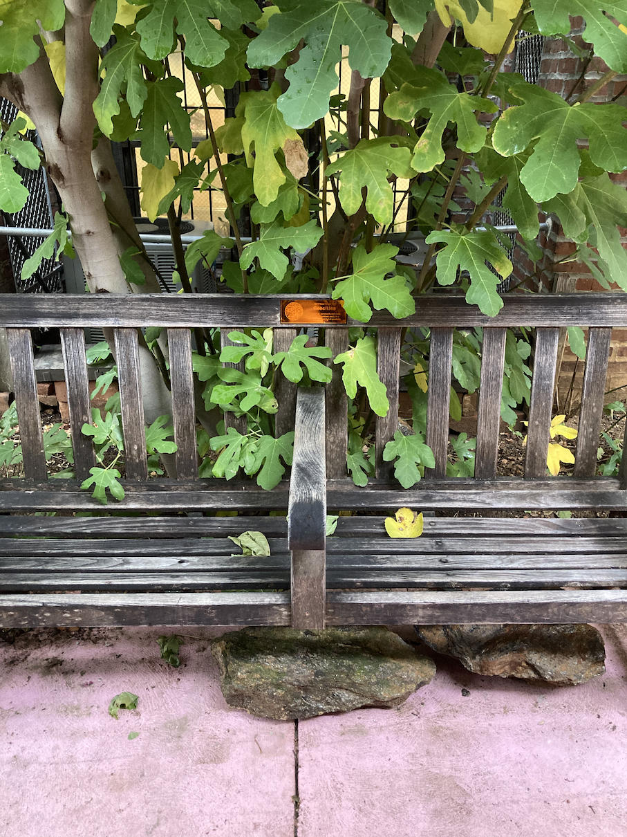

Each plaque contains a scannable code, which links to a mobile-optimized eulogy website. The sites use or re-create digital interfaces and visual language from the early Internet era to reflect on why these things were so meaningful to us back then — and why we miss them today.

As discussion of Web3, the metaverse, and new models for online space becomes more and more heightened, it is important to reflect on where we are now, what has brought us to this point, and what we might have misguidedly discarded along the way. Requiem for the Early Internet attempts to capture the optimism of our online past, in hopes that it might enable us to envision what we want to see more of in the future.


The first version of this work is a site-specific installation for benches in the backyard at Space 1026 (Philadelphia, PA), created as part of the exhibition In Loving Memory. A newly commissioned version of the work will be on view in the exhibition Technologies of Relation at the Massachusetts Museum of Contemporary Art (MASS MoCA), beginning February 21, 2026.
Intrusive Order
2023
Single channel video

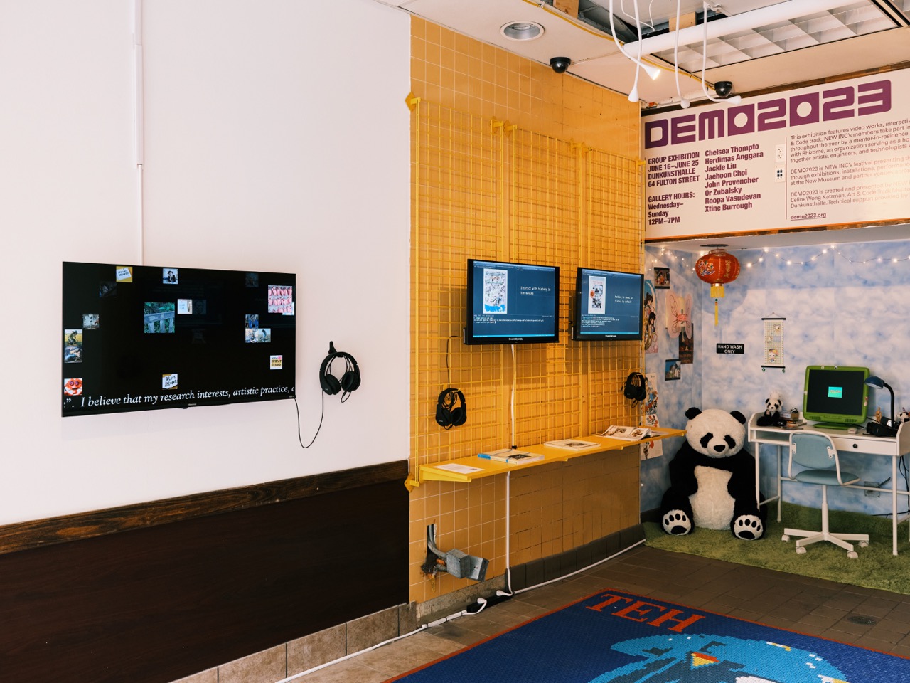
The rise of generative AI has prompted new urgency in discussions about the ethics and assumptions inherent to machine intelligence and automation. Questions of classification, categorization and “fit” also permeate the academic job market, where hundreds of qualified applicants vie for a limited number of positions each year, and are often rejected for not aligning to extremely specific teaching, research, or artistic criteria—standards which are, more often than not, kept maddeningly opaque to applicants.


Drawing its title from intrusive thoughts about my own worth and talent, Intrusive Order is based on 15 descriptors that I wrote about myself during various stages of my own experience on the academic job market between 2022 and 2023. The descriptions were repurposed as prompts for AI image generators, and the results were combined with hand drawings, found imagery and photography, and generative animation to expand, reimagine, and problematize them.
The work points to the flattening and misrepresentation that plague both processes of AI and academic “fit”, and underscores the social and emotional ramifications of imposed order and sorting.
Version 1 of the piece was shown as part of the Art & Code Showcase at Dunkunsthalle (New York, NY) as part of NEW INC and the New Museum’s DEMO2023. All documentation of the work on this page by Isaiah Winters. Special thanks to NEW INC, Rhizome, and everyone who supported me during my time on the market.
Machine Readable [Exhibition]
2018 — present
Collection of 5 projects featured in a 2021 solo exhibition at Vox Populi in Philadelphia, PA
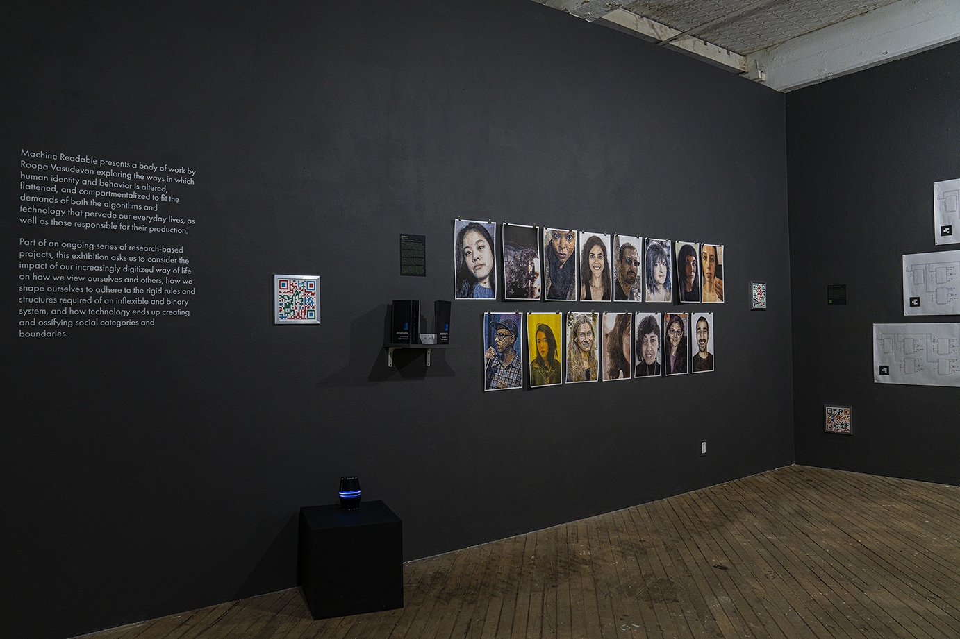

Machine Readable is a body of work exploring the ways in which human identity and behavior is altered, flattened, and compartmentalized to fit the demands of both the algorithms and technology that pervade our everyday lives, as well as those responsible for their production. Part of an ongoing series of research-based projects, this exhibition asks us to consider the impact of our increasingly digitized way of life on how we view ourselves and others, how we shape ourselves to adhere to the rigid rules and structures required of an inflexible and binary system, and how technology ends up creating and ossifying social categories and boundaries.


As more and more of our lives have moved into virtual contexts, we have come to primarily see others through technological mediation: the lens of a camera, the flat screen of a device, the data from a web search. What has technology done to our conceptions of human interaction and agency? What do we prioritize in our everyday decision making—technology or each other? How do we learn to do what the machine asks of us, and why doesn’t it really work the other way around?


A solo exhibition entitled Roopa Vasudevan: Machine Readable was on view at Vox Populi in Philadelphia, PA from June 11 through July 18, 2021. The exhibition was supported by a grant from the Sachs Program for Arts Innovation. Visit the gallery website here, and a virtual tour of the show here.
Photo and video documentation by Raúl Romero & Roopa Vasudevan.
Works in this collection:
dataDouble
2018–present
Web browser extension (Chrome & Firefox); risograph print library; publication
View project website here.
dataDouble is a project designed to illuminate the ways in which our identities are reduced and flattened by data collection. Finding inspiration in the concept of the “data double”, a likeness developed out of the digital traces that we (voluntarily or involuntarily) leave behind in our day to day interactions with technology, the project seeks to translate an individual user’s browsing data into a visual interpretation of how they are seen in the eyes of those extracting their information.
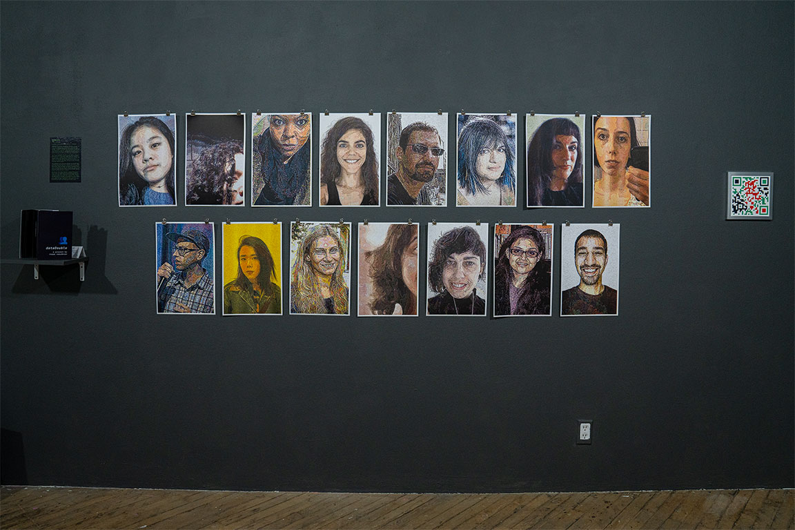
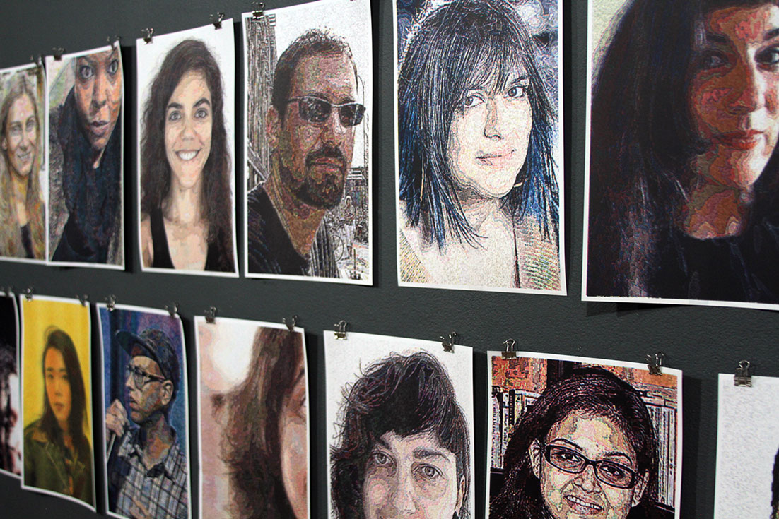
The core of the project consists of a web browser extension, currently available for both Google Chrome and Mozilla Firefox, which locally collects a user’s browsing data cumulatively from the time of installation. Upon installing, the user is also prompted to upload a photo of themselves, which is altered and shaped into a portrait of their “data double” by applying image manipulation techniques that directly correlate to the amount and type of data collected from their browsing. The portrait is available to download from the extension after 14 days of use.
As data accumulates, the image, while still somewhat recognizable as a portrait of the individual user, becomes a warped and alternate representation of the self; the reduced, flattened version that is used as a basis for the extremely segmented experience that users have on the Internet today. But by utilizing a portrait of the user as a baseline, the project also serves to inject humanity back into a process that often strips it away, attempting to return voice to the user in the process.
In the first iteration of the dataDouble project (2018 — 2021), a group of 15 participants used the browser extension for 14 days each. This was followed by an interview with me, during which we talked both about their experience using the extension, as well as more broadly about notions of dataveillance, identity, and tracking. The digital portraits and interview excerpts were compiled into the 2021 dataDouble publication (see here for more details).


The digital portraits were then also printed via risograph; each portrait generated a print version measuring 11” x 17”. The digital images were translated into CMYK color, and printed in ink approximating these tones as closely as possible. Bringing a digitally generated portrait back into the physical world carries with it inherent loss and changes in color and quality, mirroring the impossibility of fully translating human identity between the physical and the digital. The dataDouble print library is an ongoing project, and anyone who uses the extension can add their portrait to the collection.

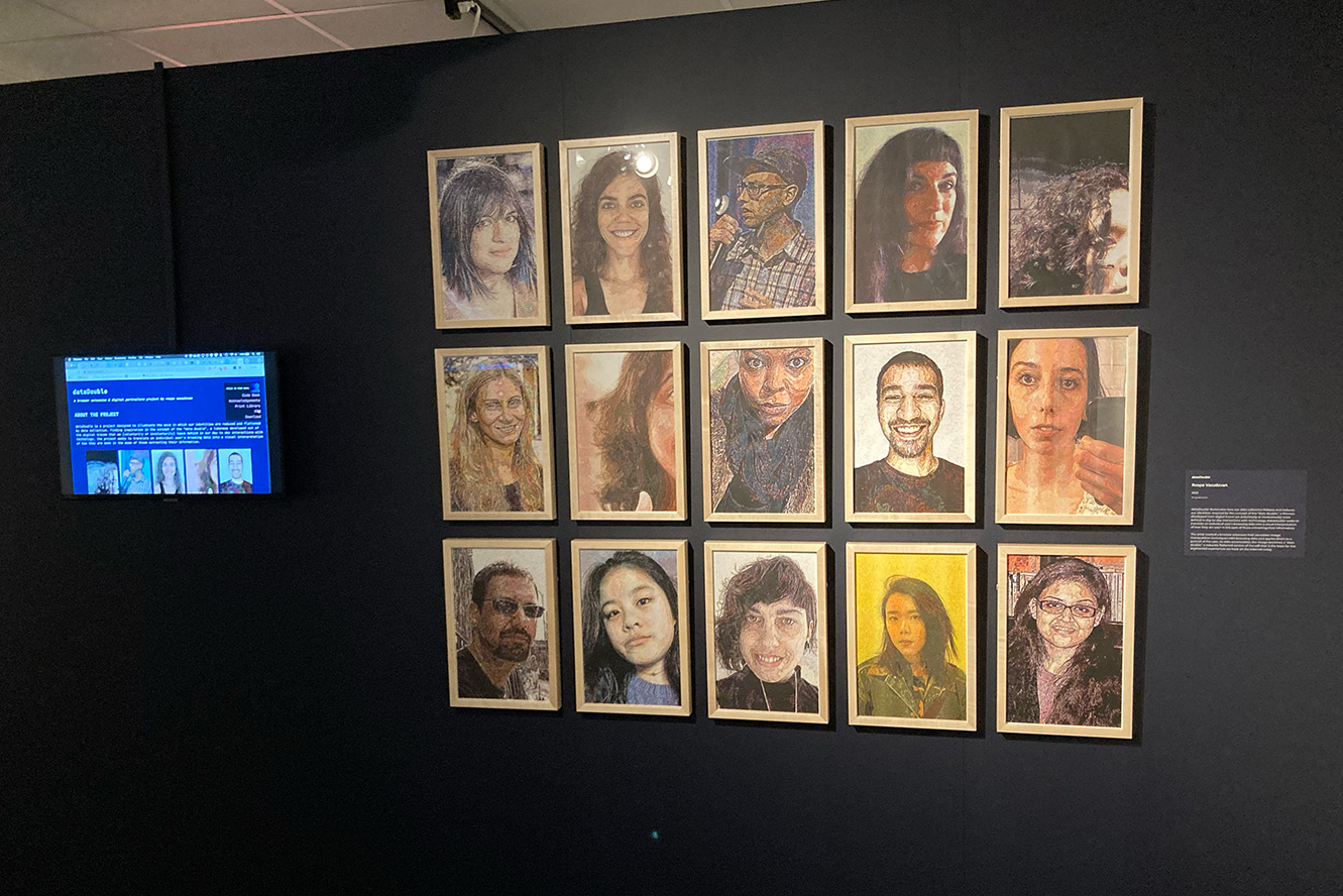
Read more about the project in articles in ACM Interactions, the Brooklyn Rail, and Annenberg School News. The work was additionally featured in the exhibition Data Nation: Democracy in the Age of AI at the National Liberty Museum (Philadelphia, PA; see right hand photo above). View reviews of the show (and the artwork) in Billy Penn (WHYY) and Philly Artblog.
Provocations For/On Technology
2021 — present
Manually screenprinted QR codes; linked websites
Provocations For/On Technology is a series of five manually screenprinted QR codes, hung throughout the exhibition space. The codes in the prints contain flaws, misalignments and imperfections as a result of the printing process, but they are still scannable by mobile devices.


Each code links to a unique website, designed to be accessed from a mobile device, and which asks a question directly related to the viewer's experience with technology in the current moment. These questions are not meant to be answered directly — indeed, the viewer is given nowhere to place a response. Rather, they are meant to pull the viewer back from engaging with technology on autopilot. By asking visitors to consider questions of instinct, assumption and embodiment in their engagement with the piece, I hope to point to the ways in which we have come to develop default, unconscious practices related to technology, both within arts spaces as well as in our everyday lives.


A version of this project is also available for purchase, to be exhibited in private homes. Each QR code in this version links to an ever-changing website, which will offer provocations, questions, and directives related to the viewer’s relationship with technology. The website will be changed at random intervals over the course of five years. After that time, the website will go offline, leaving the viewer with a defunct art object reflecting the remains of a (once-commonplace?) technological system.


This project was also exhibited as part of Refamiliarization at the Platform Artspace/Worth Ryder Gallery in Berkeley, CA (2021).
Special thanks to Aaron Terry for assistance with screen printing. View the interaction in this project, as visible through a cell phone, here. Prints are available to purchase at the Vox Populi store.
Big Tech Says Sorry
2020 — present
Browser extension, ambient audio
Digitally printed posters
Photoshopped Google Maps images


Big Tech Says Sorry is a suite of projects that explore the relationships between technology, affect, authenticity and reception. These projects mine and interrogate these connections through a focus on the act of apology, the performance of contrition, and the chasm that exists between action and intent. The works hint at discrepancies that arise when emotion is mediated through technology, both in terms of the tools themselves as well as the scale inherent in their current use. It also investigates the specific role that affect plays in the ways in which we consume and relate to the presence of technology in our lives.
My work on these projects stems from a personal interest in the ways in which technology companies are (not) held accountable for their actions in a time where they not only exercise a large amount of control over our day to day lives, but also seem to face no substantive repercussions for mistakes, lapses in judgment, discriminatory actions, and outright bad behavior. The apologies that these companies issue in the wake of data breaches, human relations scandals, and other violations often feel blatantly fake and manufactured. Big Tech Says Sorry examines the ways in which these powerful corporations exploit and misuse affective cues surrounding the act of apologizing in order to maintain the status quo.


In its current stage, the work consists of 4 posters meant to be installed adjacent to the headquarters of tech companies in major United States cities (as well as renderings of what they might look like in the spaces, constructed on top of Google Street View images of these locations); video documentation of a web browser extension that interrupts user action in order to apologize for wrongdoing; and an ambient audio piece utilizing default voices that come with the companies’ smart home devices.


All of the apology text in the browser extension and audio piece either comes from my own archives, or was newly written about specific people and circumstances from my past. References to names, places and events from my life were replaced with those pointing to fraught moments in specific tech companies’ histories.
Speculative Systems
2019 — present
Systems diagrams printed on 18” x 24” bond paper
Augmented reality application
These two augmented reality triptychs illustrate systems diagrams for protocols named after socially constructed binaries: “Master/Slave” and “Male/Female”. These protocols are often used and referred to within technical environments as defaults, without reference to the hierarchical social differences they assume as given.


This work attempts to unpack what is meant when referring to the protocols by these names; offers theoretical and personal reflections on the implications of these terms in their default usages; and considers a speculative reimagination of technical systems that attempts to refuse or question these inequalities.
In the gallery, viewers scan a QR code to reach the project website on their mobile device. Once the webpage has loaded, viewing the diagrams through the phone’s camera displays additional images and text related to each imagining of the systems displayed.


View a walkthrough of the piece, as seen through a device, here. View large versions of the augmented reality diagrams here. Content warning: reflections on sexual assault and trauma.
Syntax Error
2021
2-channel video installation
Created with Processing and the Merriam-Webster Thesaurus API
Syntax Error explores technical error messages and the subconscious translation necessary to understand them. The work points to the mental adjustments and training required of programmers in order build for inflexible systems, and emphasizes the steep learning curve required of humans in order to become fluent, or even simply familiar, with how machines operate.
Novice programmers often point to the deciphering of error messages as one of the most difficult aspects of learning how to use technical systems. This video installation draws from error messages that I have frequently encountered in my own art practice, and was created by automatically running these phrases through a synonym database, one word at a time, in a futile effort to translate these phrases into something that is more immediately legible to a non-programmer.


While the phrases quickly become nonsensical and incoherent, the viewer is at times able to draw personal meaning from unusual juxtapositions of language, based on social context and their own experience. The project also points to the fact that, contrary to the belief that the error messages are coming from the “computer”, other people are responsible for developing these languages and error messages... so what does it say that these messages are written in such an impenetrable way?


The installation is scored with the sounds of hard drives, some of which are failing, and some of which are operating normally. The difficulty in distinguishing between the two demonstrates the gap between the seamlessness with which we expect technology to operate, and the material reality of mechanical processes.
Zines & Artist’s Books
Artificial Abundance [Book]
2025
80-page wire-bound book with die cut cover
Interior risograph printed in neon coral, light lime, and federal blue inks
Edition of 100, purchase on Metalabel.
An artist's book that contemplates what it means to even speak about computation as though it is capable of replicating human life in the first place. A meditation on AI, death, embodiment, and the things humans know that machines never could.
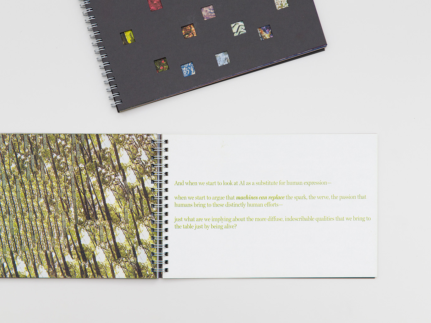
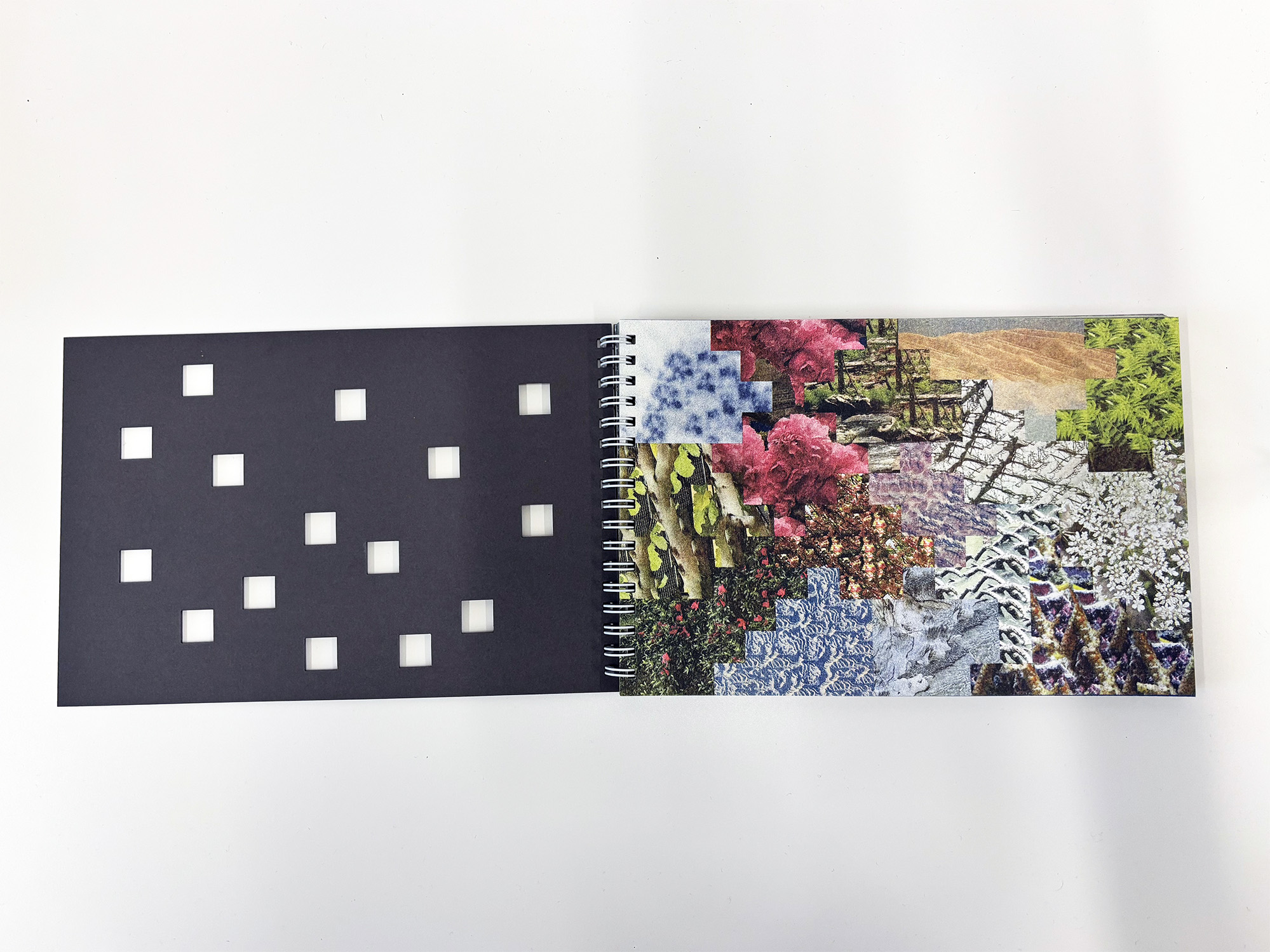
Bridging deeply personal memories with scholarly meditations on artificial intelligence — and its relationships with the things that foundationally define the experience of being human — I unpack the assumptions inherent to cultural conceptions of AI, and suggests that the things that are often elided in the false equivalence between computational and human sensemaking are the things that may matter the most. What do we leave behind in our rush to classify and quantify our existences, and to reduce the totality of our lives into what can be encoded into 0s and 1s?
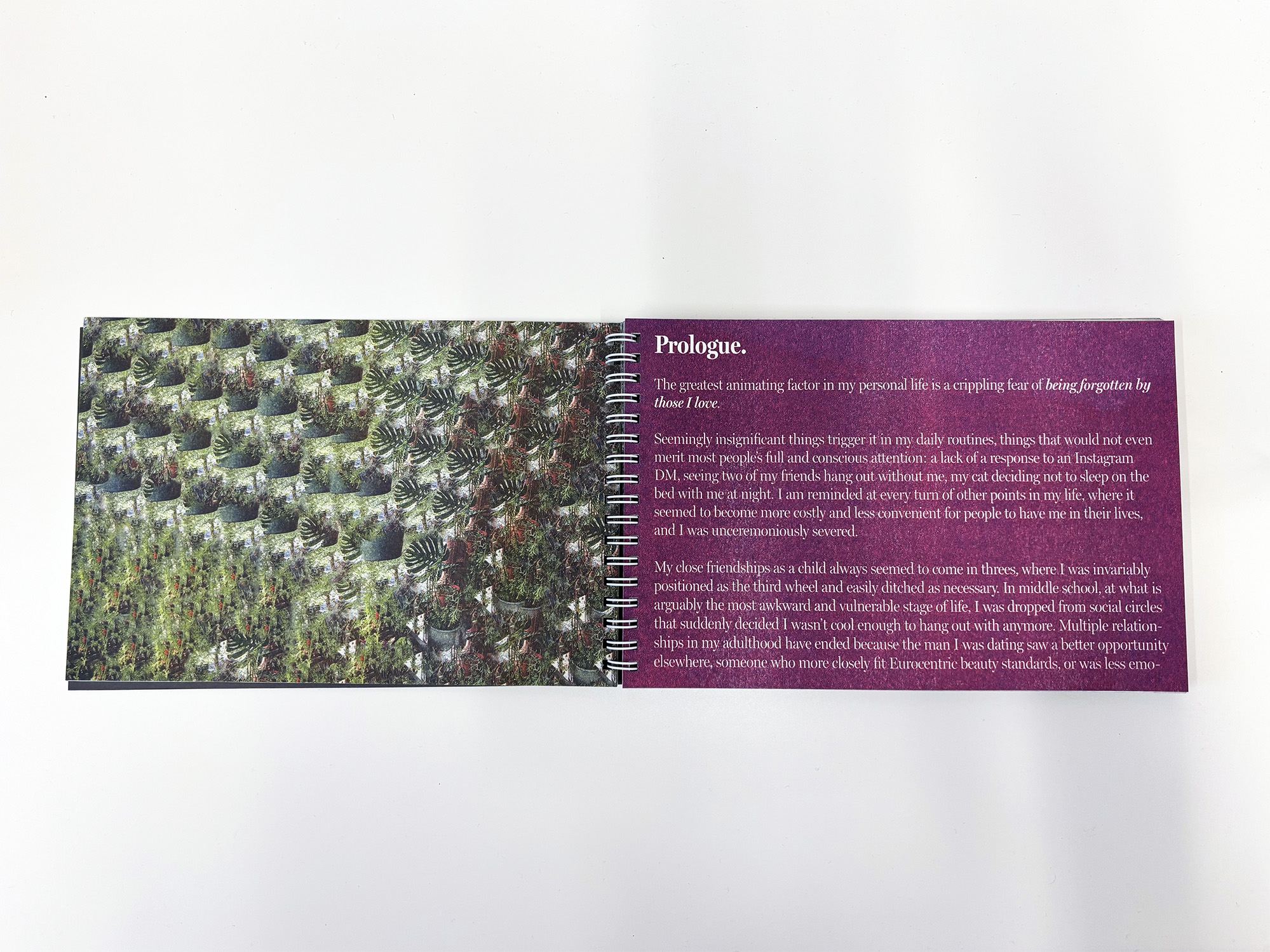
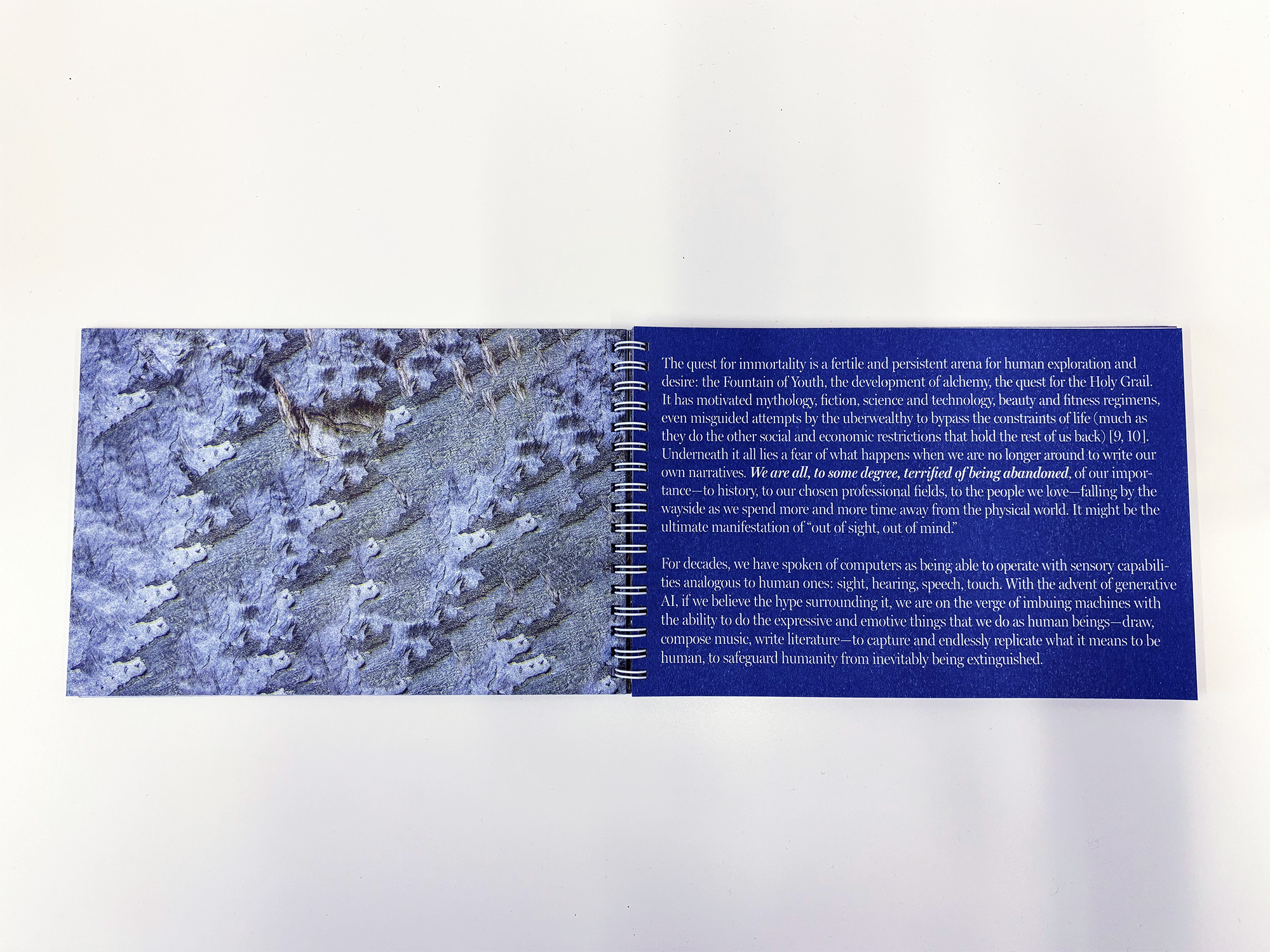
Woven throughout the text are images that I created by manipulating photography from my personal archive with machine learning tools that have been available in standard consumer design software for over a decade. The deliberate refusal to use LLMs and image generation software, in favor of tools that have long been integrated into our lives, points to the perpetual novelty of AI in the cultural imagination — and the ways in which our fears of what is to come lead us to gloss over what is happening in the present.
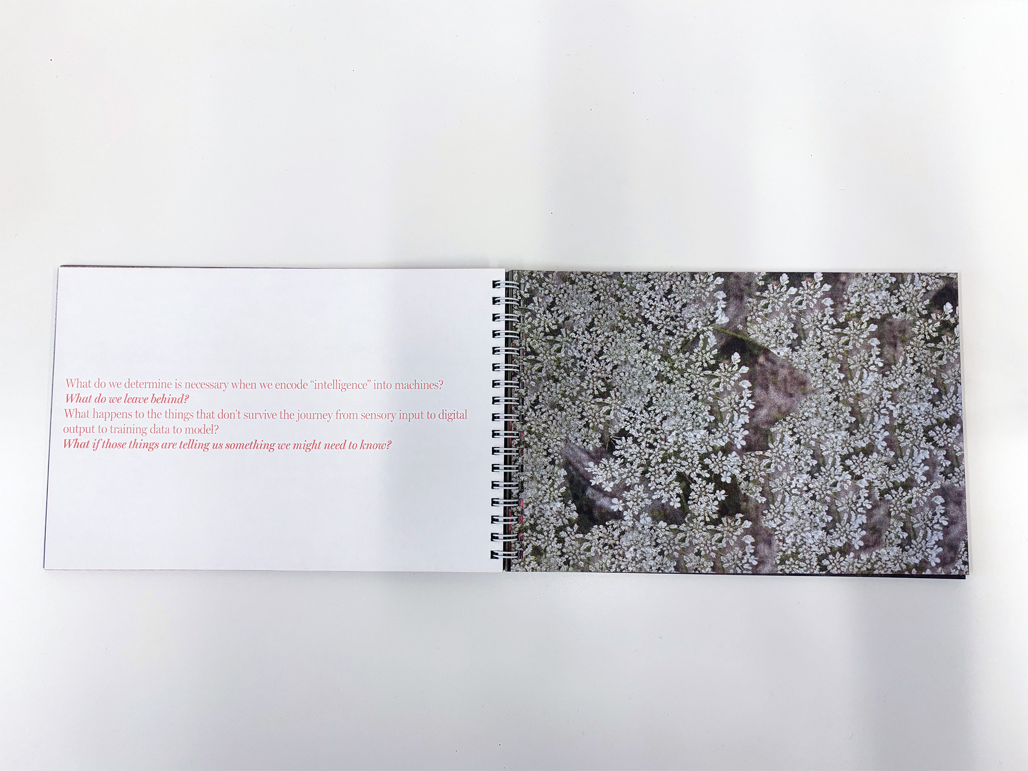
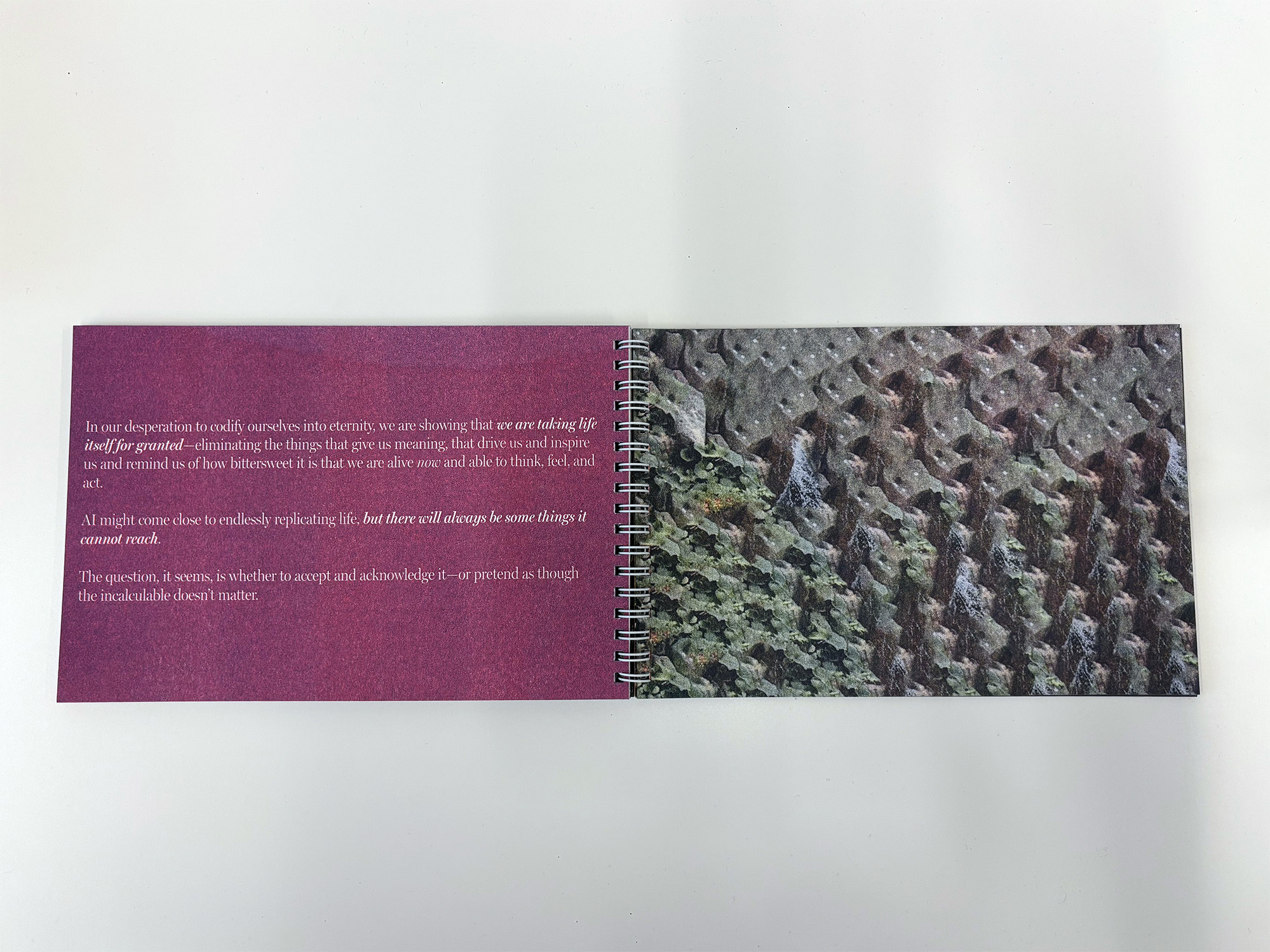
This book was produced in conjunction with the exhibition Roopa Vasudevan: Artificial Abundance, on view at SPACE Gallery (Portland, ME) in September and October 2025. Printed and bound by Risolve Studio (Lancaster, PA).
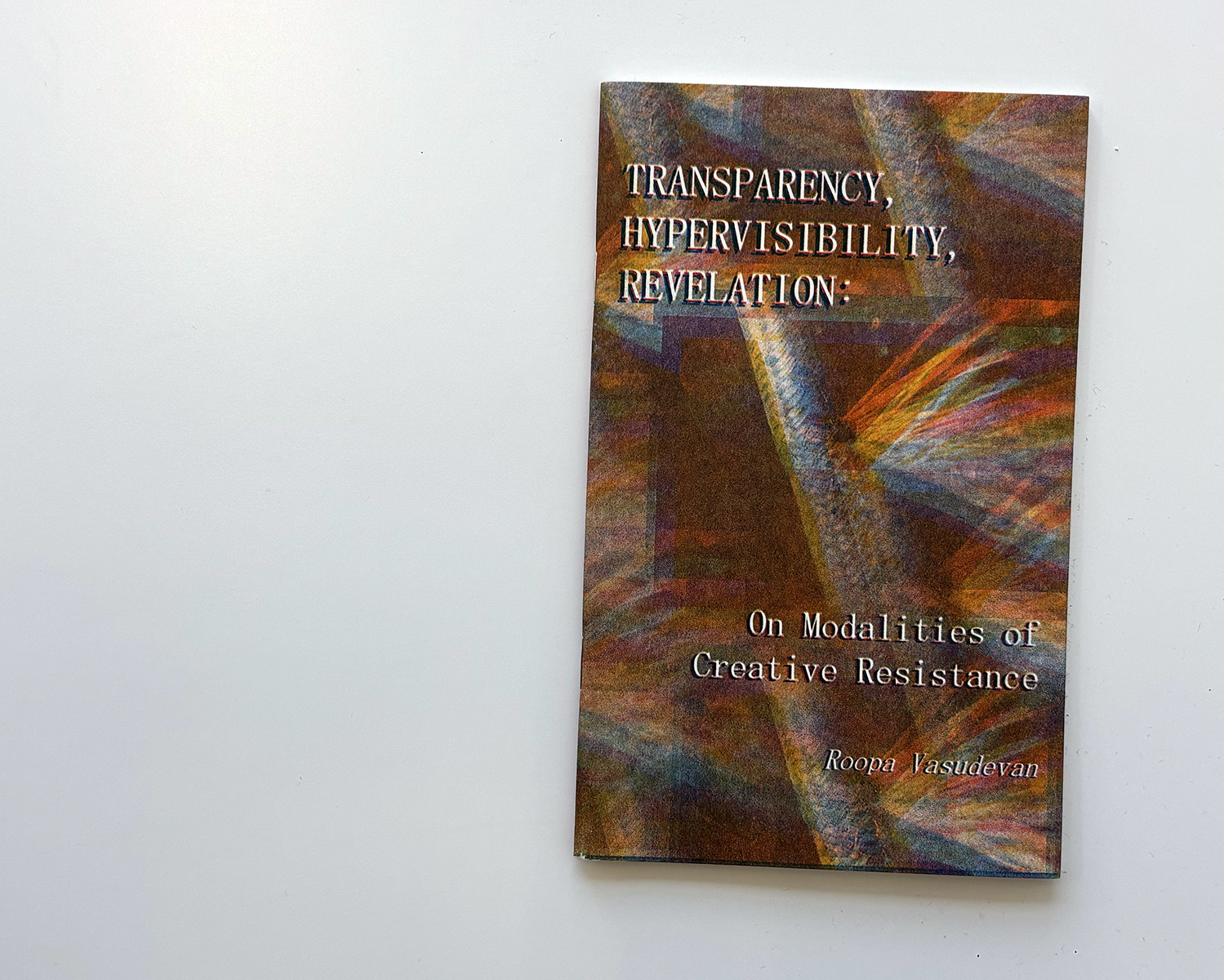
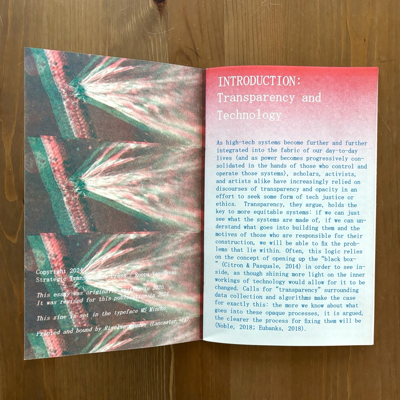
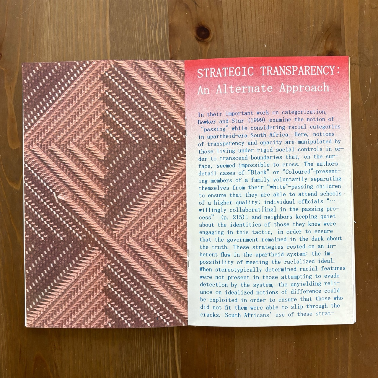
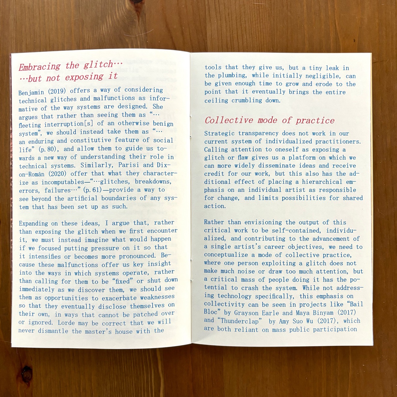
Transparency, Hypervisibility, Revelation
2024
32-page zine
Risograph printed in sunflower, scarlet, and blue inks
Edition of 100, purchase on Metalabel and at Printed Matter.
This zine presents a new way of thinking about the promises and pitfalls of artmaking for digital and social change—one that, instead of falling prey to the cat-and-mouse dynamic of Big Tech and its extractive systems, takes advantage of duration, time, and conformity to its own advantages.
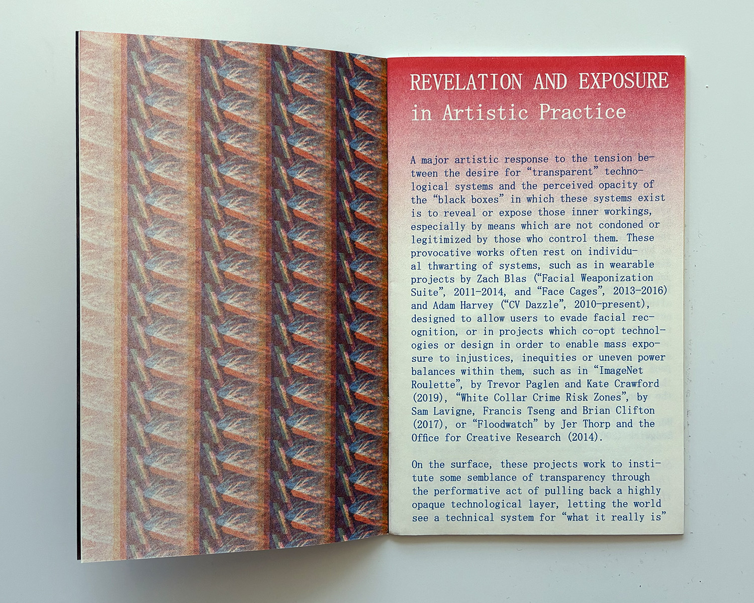
This zine presents a new way of thinking about the promises and pitfalls of artmaking for digital and social change—one that, instead of falling prey to the cat-and-mouse dynamic of Big Tech and its extractive systems, takes advantage of duration, time, and conformity to its own advantages.
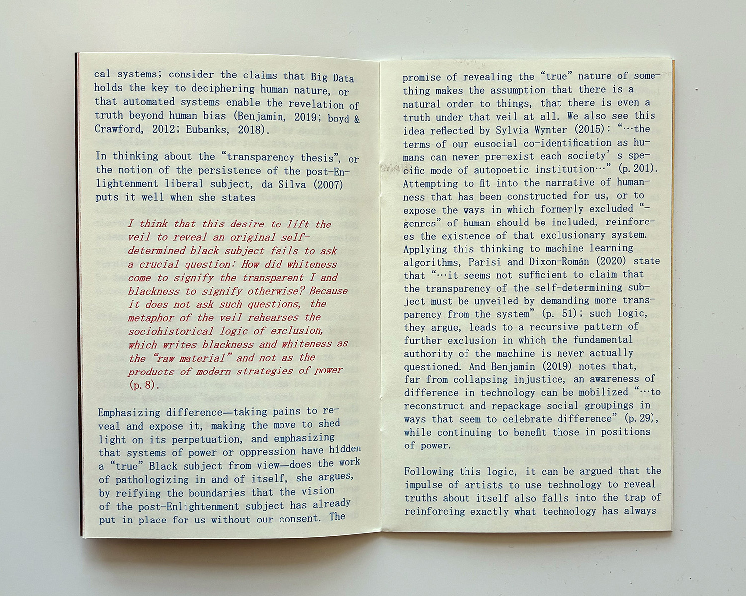
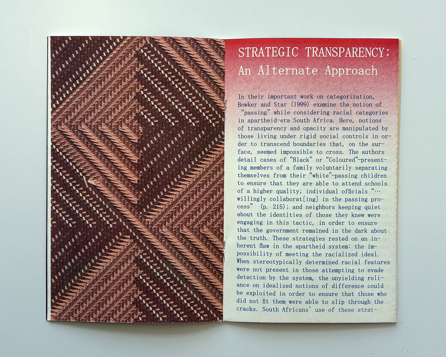
Engaging notions of transparency and opacity in the contexts of both race and technology, this zine presents a new way of thinking about the promises and pitfalls of artmaking for digital and social change. The work asks whether it is possible to adhere to a model that, instead of falling prey to the cat-and-mouse dynamic of Big Tech and its extractive systems, takes advantage of duration, time, and conformity to its own advantages.
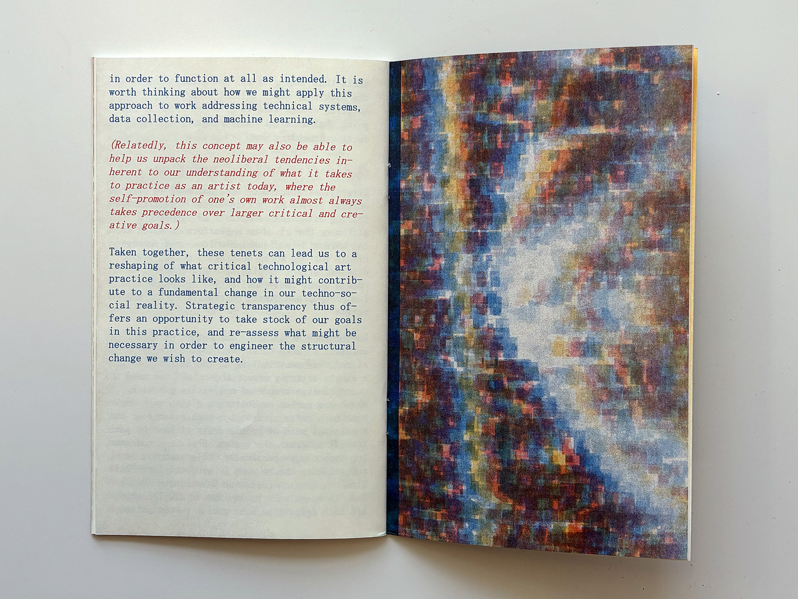
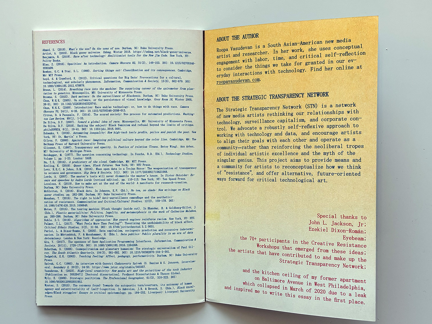
Printed and bound by Risolve Studio (Lancaster, PA). An online version connected with this work entitled “At His Own Game” was published by Taper magazine in Spring 2024.
Aligning an Open Source Ethos [Zine]
2024
40-page zine
Risograph printed in black, sunflower, and fluorescent pink inks
Edition of 100, purchase on Metalabel and at Printed Matter.
A zine that outlines motivations, challenges, and hopes for open source creative technology communities—and offers ways to begin the process of values alignment in these spaces.
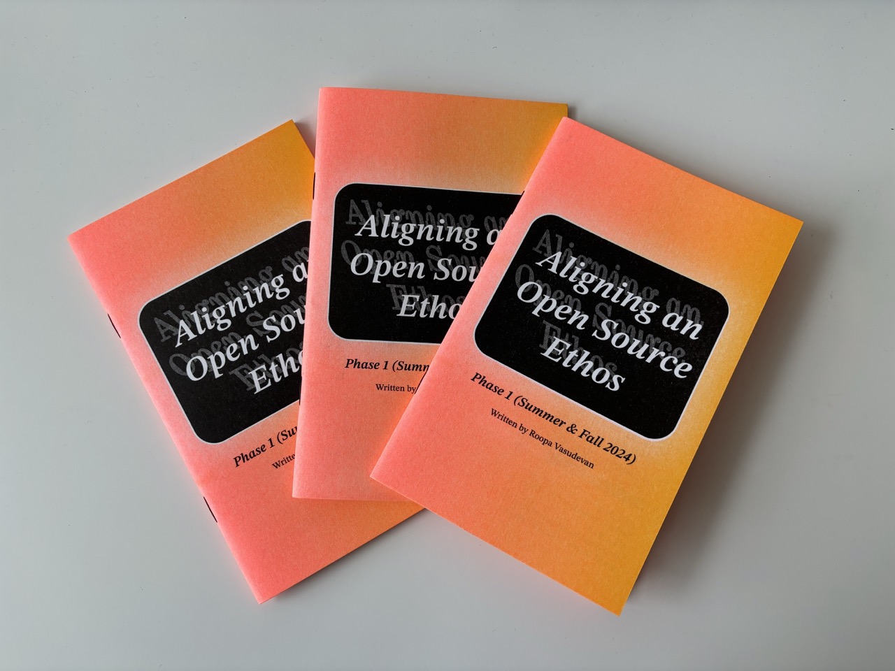
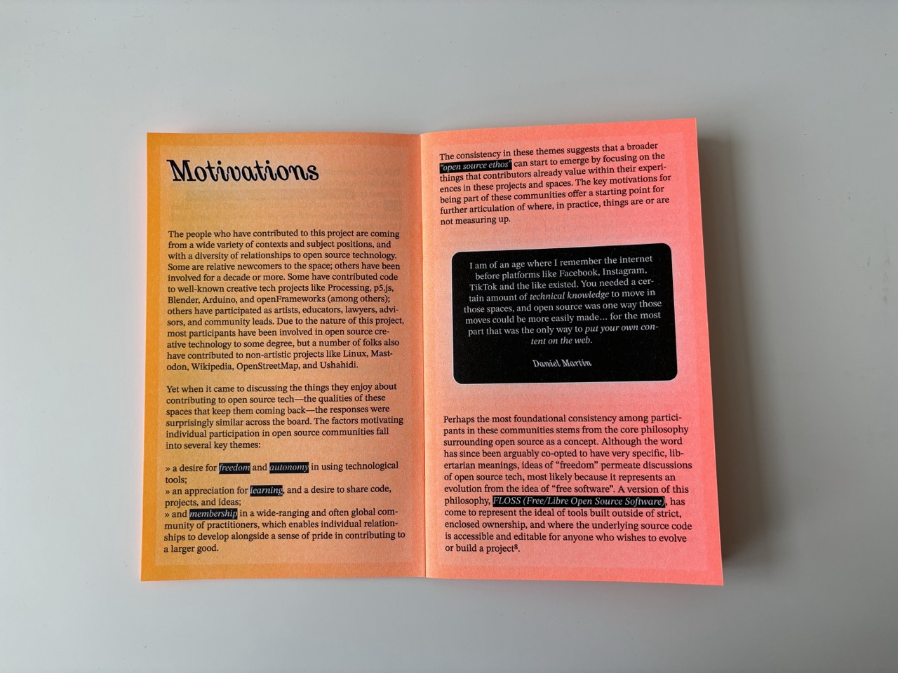
Begun as part of the Processing Foundation Fellowship in 2024 ("Sustaining Community: Expansion and Access"), "Aligning an Open Source Ethos" attempts to take steps towards reconciliation and alignment of value-based goals among open source communities. Working with contributors to, participants in, and members of a variety of open source projects (both inside and outside of both the Processing Foundation and the creative tech field at large), I have begun to explicate and outline core values that participants in these spaces take to heart.
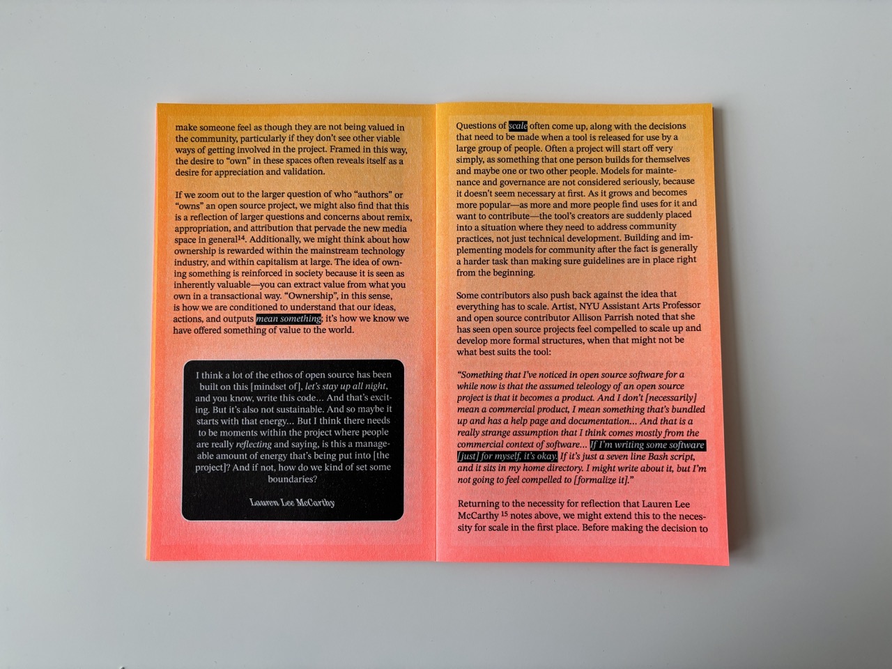
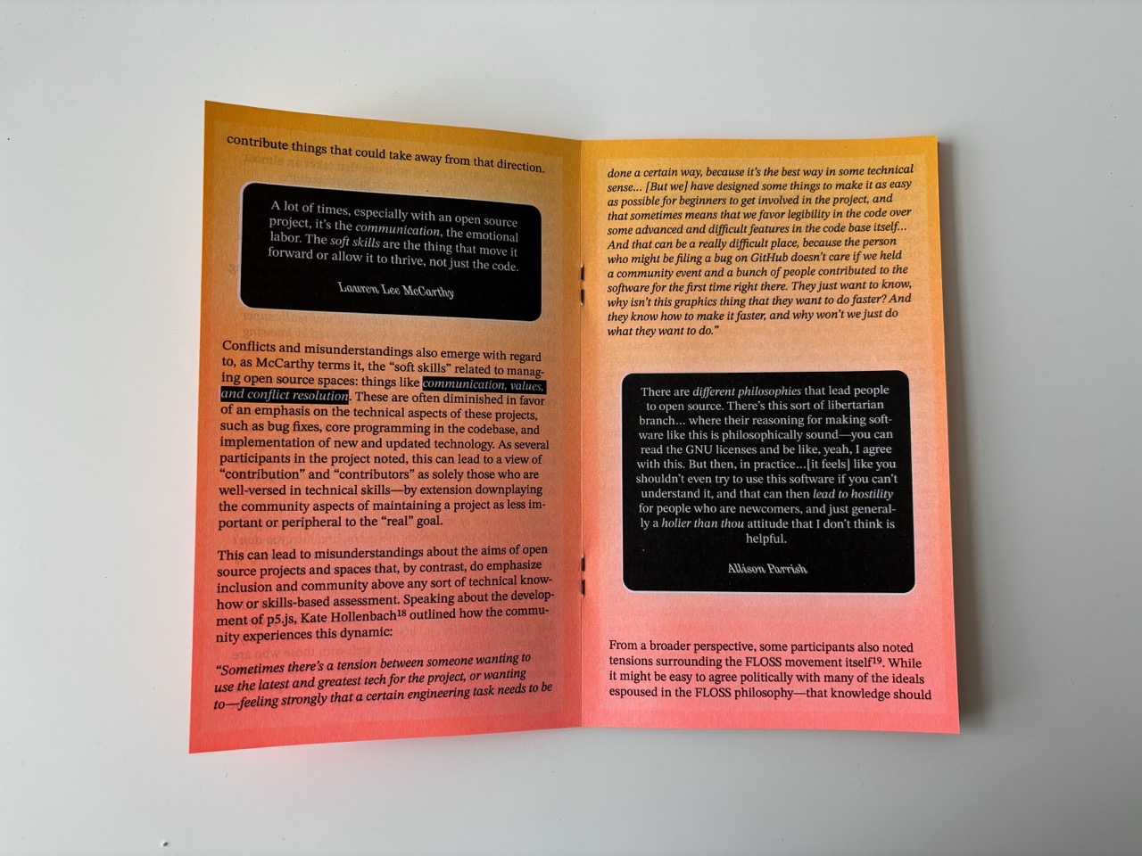
This zine collects the preliminary findings from a questionnare and series of interviews conducted in the summer and fall of 2024. The zine introduces the question and the project’s scope, and then goes through several sections outlining the motivations that bring people to and keep people participating in open source projects; the challenges that people observe that lead to tension, conflict, and misunderstandings; and the first steps at future possibilities once we understand and articulate these common experiences.
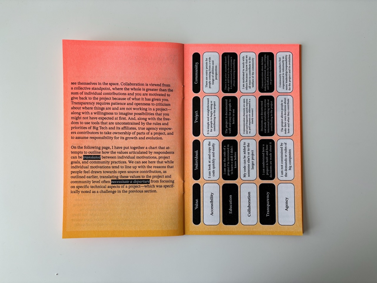
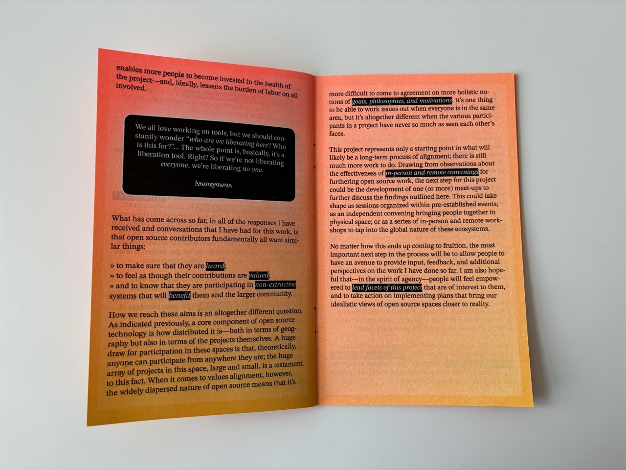
Printed and bound by Risolve Studio (Lancaster, PA). A companion website was also produced for this project, through which participants can fill out a survey about their own experiences.
dataDouble Publication
2021
Perfect-bound booklet
5.5" x 8.5"; 48 pages
Digitally printed


As part of the project dataDouble, I produced a limited-run publication to coincide with its debut exhibition in 2021. This publication contains a collection of the digital portraits generated by participants using the dataDouble web browser extension in its initial iteration, alongside extended interview reflections by those participants, and a newly written introductory essay about the project.


The publication is available for purchase through the Vox Populi Store in Philadelphia, PA. It was printed by Fireball Printing.
Vox Populi Exhibition Brochures
2020 — 2022
Digitally printed brochures
6" x 6" folded; 12" x 18" unfolded
Between January 2020 and February 2022, I designed several of the exhibition brochures for Vox Populi, a 30+ year old artist collective and gallery space in Philadelphia where I was a member between 2019 and 2023.


Several of these brochures were created using Processing to develop code-based, generative templates. The brochures were printed by Fireball Printing.


Websites & Net Art
A collection of websites that I have designed, both for my own artwork and for other collaborations. I also designed and built the website that you’re currently on.
Sluts Across America: A Birth Control Advocacy Project
2012/2022
Website (2012 version built with Sinatra; 2022 version built with Node.js)
View the work here.
Sluts Across America is a participatory Internet project designed to highlight the absurdity of the war on reproductive rights waged by conservative factions of American society. Users are invited to submit a 200-character statement outlining their support for contraception, along with their location; the site then adds their contribution to a map collecting statements from people all over the United States (and the world). The map is a show of solidarity in support of birth control, and also highlights the myriad, complex, and personal reasons that people choose to take advantage of it.
The project takes its name from an insult hurled in 2012 by conservative commentator Rush Limbaugh towards Sandra Fluke, then a law student advocating for the Affordable Care Act in front of Congress. By satirically leaning in to this epithet, the project highlights the misguidedness of shaming people for taking control of their own health and well-being, while also asking whether it is possible to truly reclaim derogatory language directed at marginalized groups.


Sluts Across America originally went live in April of 2012, and collected over 8,000 submissions in the first three months after its launch. The project is part of the Sophia Smith Collection of Women’s History at Smith College (Northampton, MA), where it has been archived for long-term preservation. The project was also included in the exhibition WUSSIES Networking: Some Queer Sensibilities at the Bureau of General Services—Queer Division (NYC, 2023–2024).
The project has been covered by or debated in numerous press outlets, including the Philadelphia Inquirer, Slate (1, 2), the New Yorker blog, GOOD Magazine, and more.
The work also remains live and open for new contributions for as long as I am able to keep it functional; view the site and add your voice here.
Rhythm of Access (commissioned for Sun Thinking exhibition) ↗
At His Own Game (for Taper #12: Tools) ↗
FRIENDS ONLY (for CURSOR issue 7: In the Archives) ↗
Aligning an Open Source Ethos [Website] ↗
Philly Arts for Black Lives ↗
No to Zero for the Arts ↗
Curatorial & Organizing Work
Data Fluencies Exhibition Series
2025
Boston: Boston Cyberarts, April 18–June 15, 2025
Vancouver: Or Gallery, May 29–July 19, 2025
Lexington: The Living Arts and Science Center, June 6–July 25, 2025
The Data Fluencies exhibition series explores the role of art in reimagining our often-narrow understandings of data and machine learning.
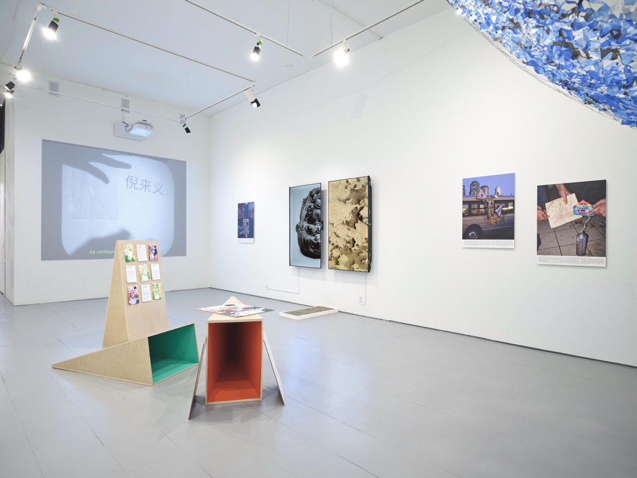
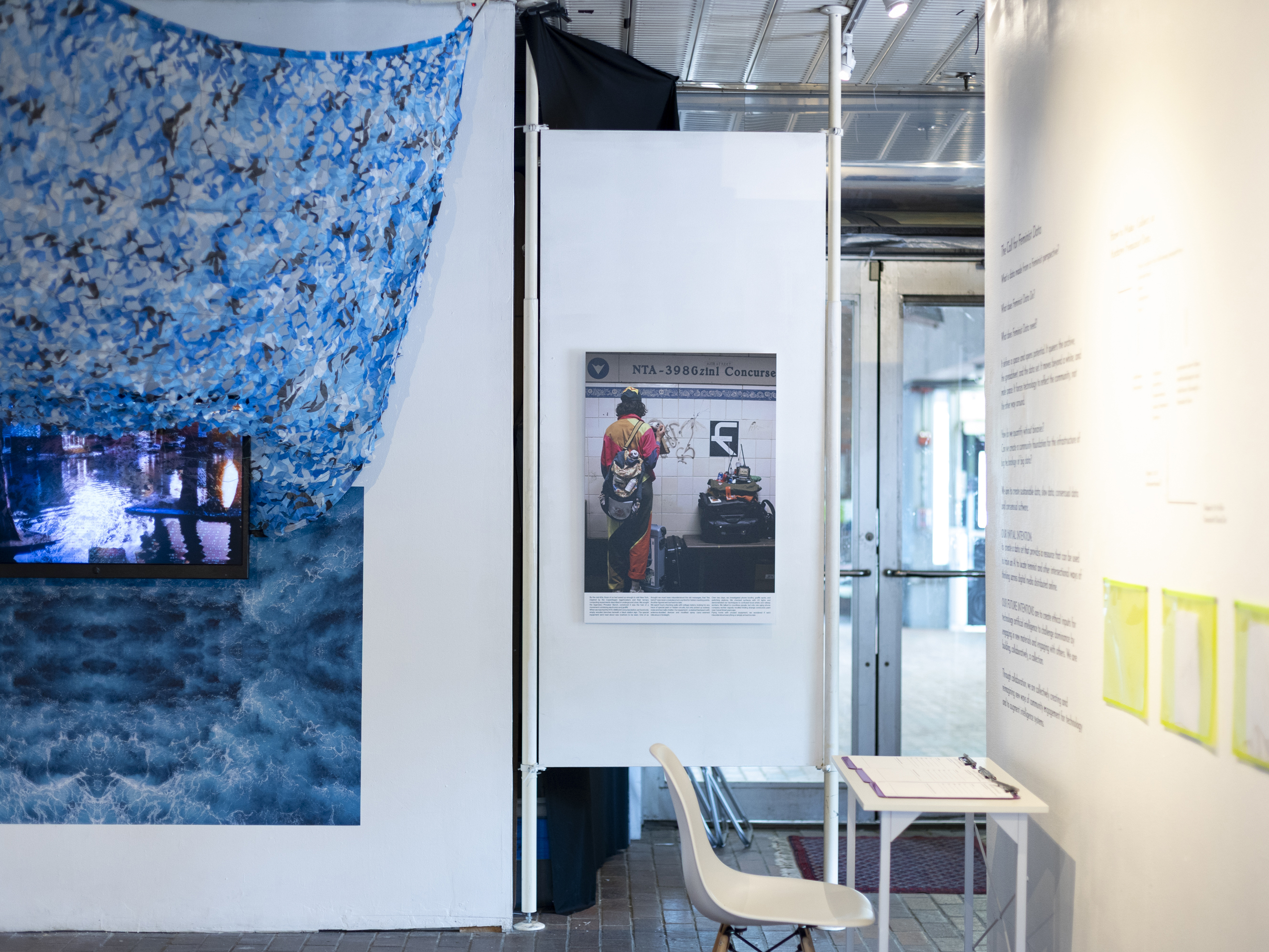
Lani Asunción, and the Imaginative Methods Lab. Photo by Dennis Ha.
Part of the larger Data Fluencies Project based out of the Digital Democracies Institute at Simon Fraser University (Vancouver, BC, Canada) and funded by the Mellon Foundation, the series consisted of three separate but thematically-connected exhibitions on view throughout North America in the spring and summer of 2025. The exhibitions took place in three cities connected to collaborating Data Fluencies institutions: Boston (MA, USA); Vancouver (BC, Canada); and Lexington (KY, USA).
The exhibitions featured the work of six contemporary artists — Lani Asunción, Jazsalyn, Lai Yi Ohlsen, Kristoffer Ørum, Caroline Sinders, and myself — engaging critical approaches to data and technology. These works were placed in conversation with local and community-based research led by Data Fluencies grant investigators at Emerson College (Boston), York University (Toronto), Simon Fraser University (Vancouver), the University of Kentucky (Lexington), and the University of Southern California (Los Angeles). Each exhibition featured different research projects in dialogue with the artists’ works.
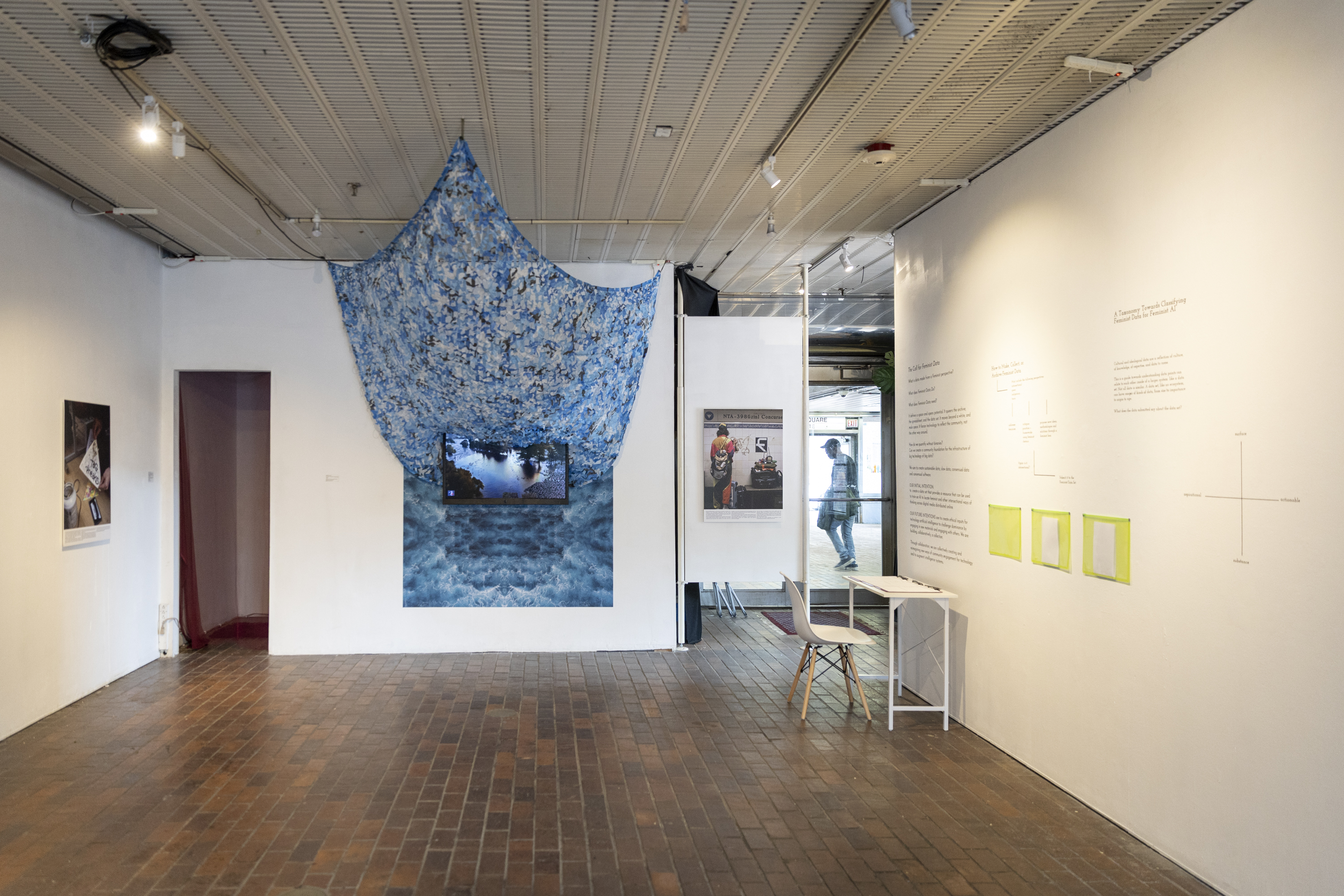
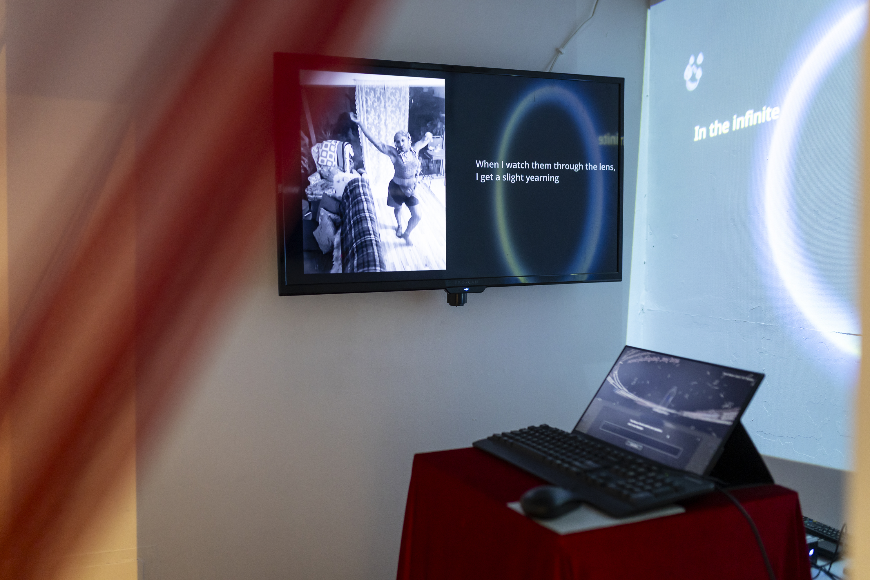
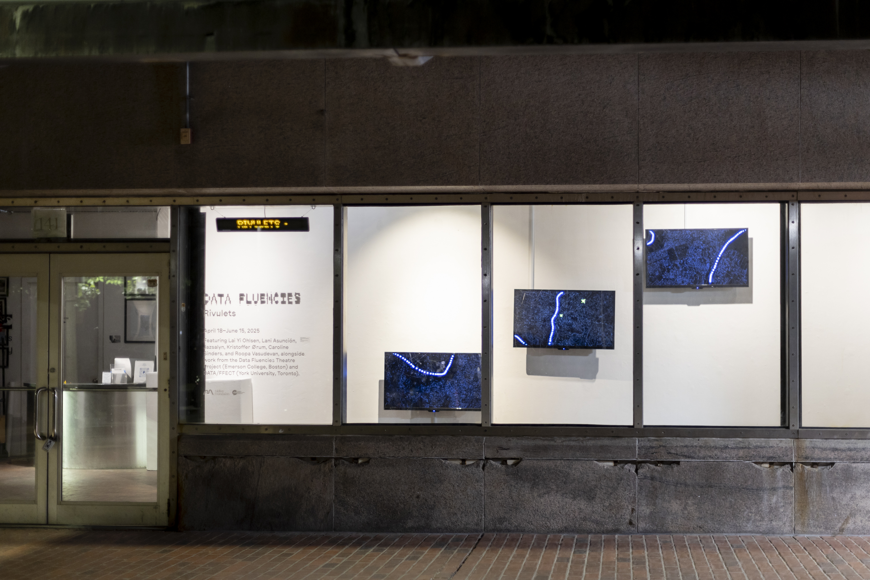
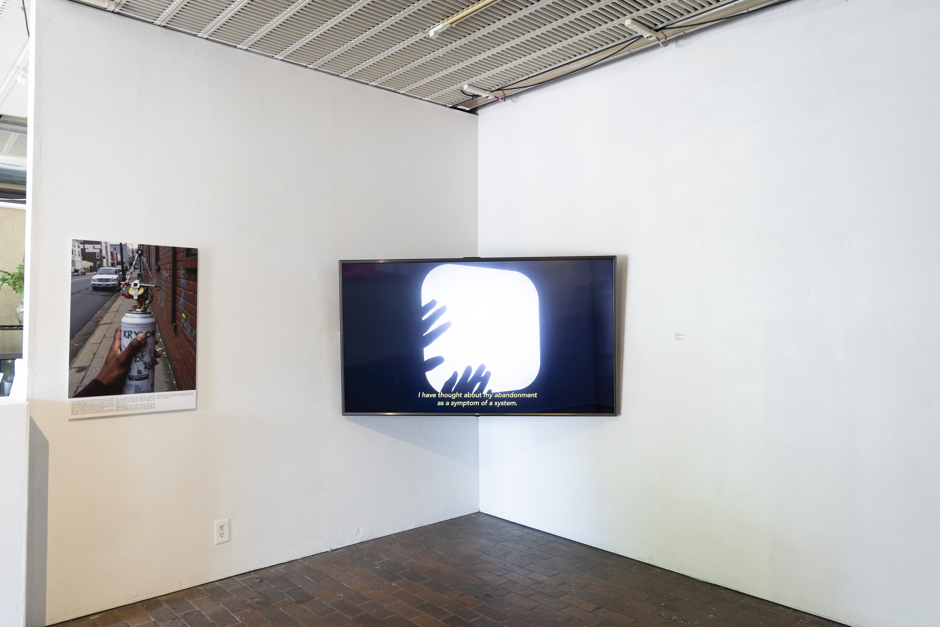
The first show — Data Fluencies: Rivulets at Boston Cyberarts (Boston, open from April 18–June 15, 2025) — explored the ways that adjusting or reconfiguring our personal experiences of data-driven and machine learning systems might lead to broader systemic change. Drawing from the rivulet, which is a small, localized stream that flows into larger systems, the exhibition focused on critique and subversion of existing technological systems, along with reflection on their prevalence in our everyday lives.
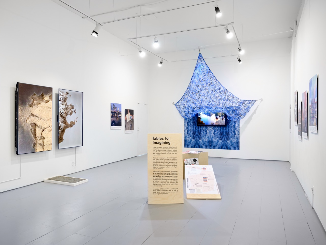
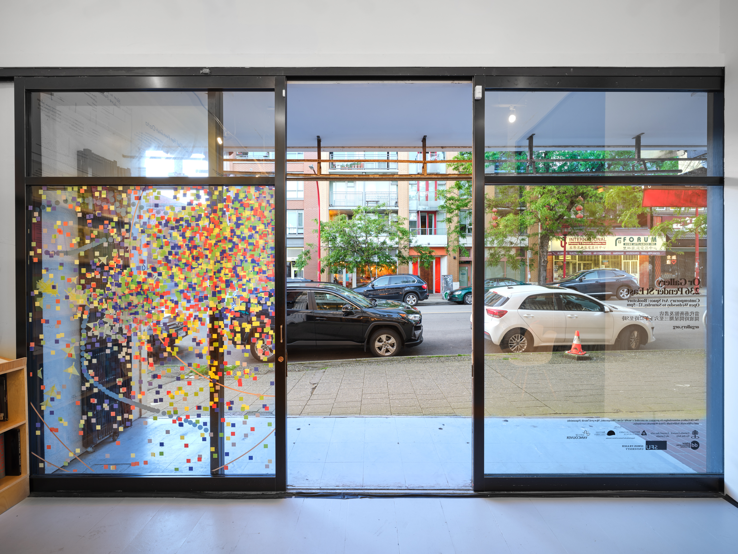
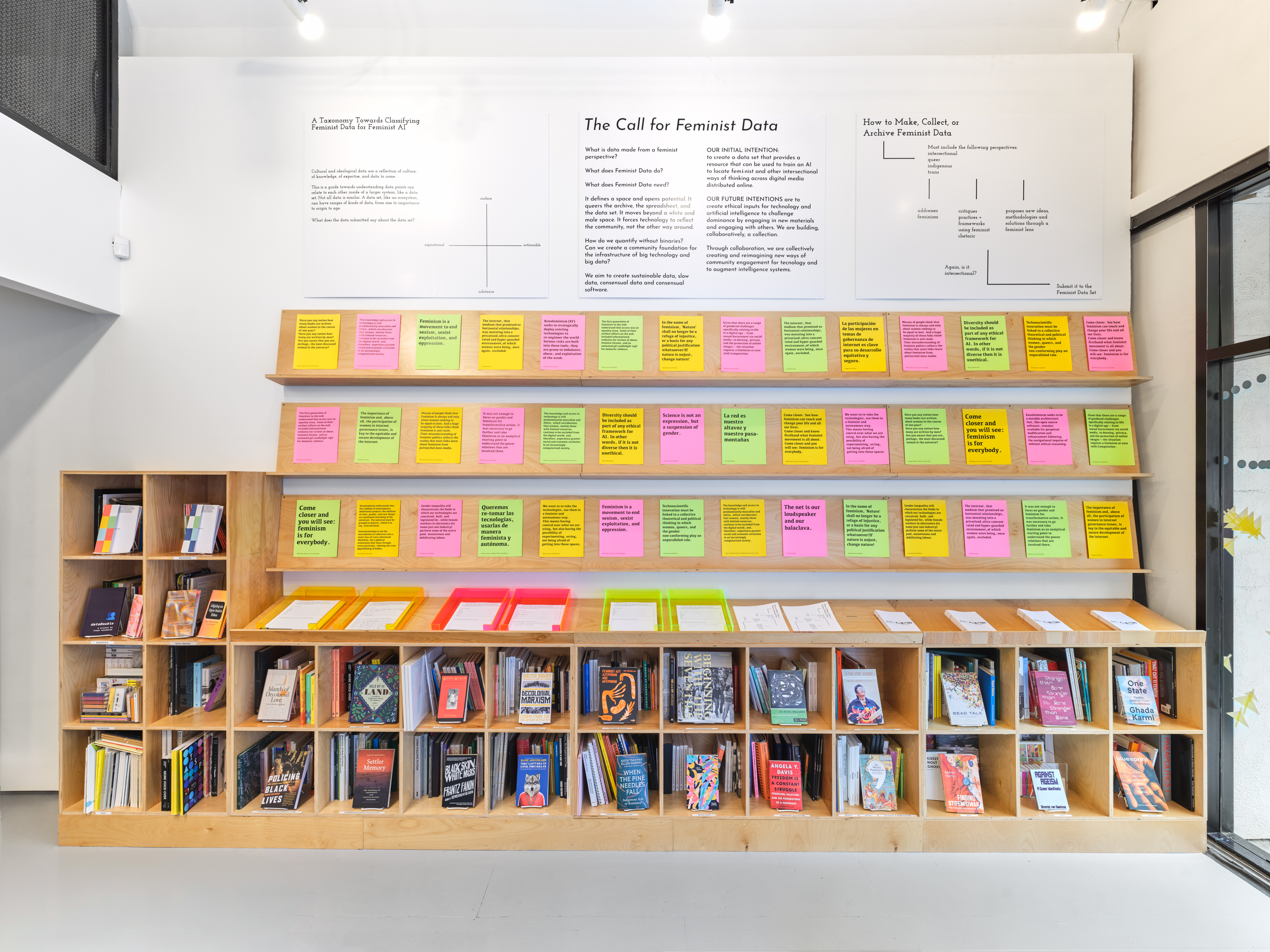
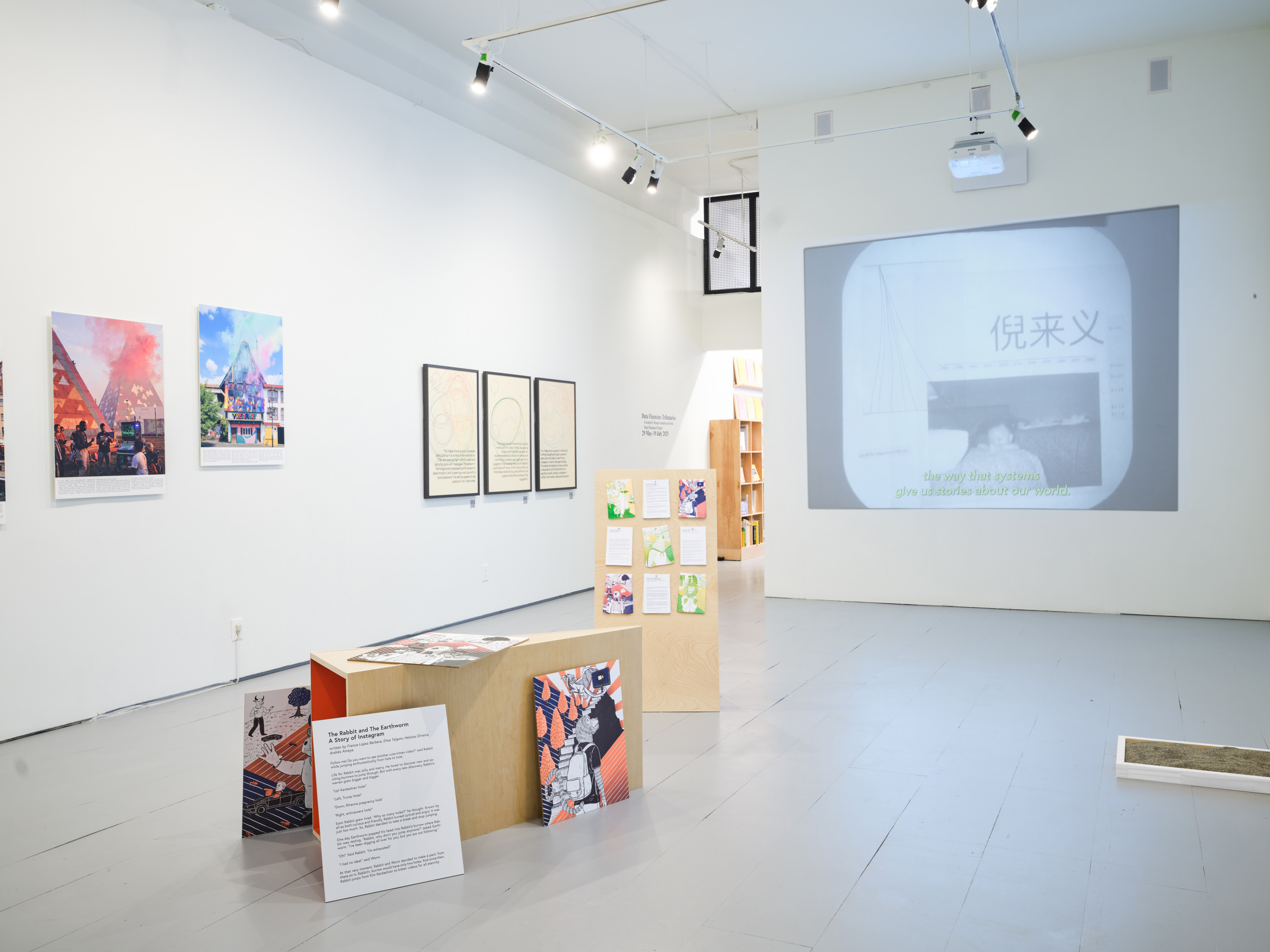
The second exhibition — Data Fluencies: Tributaries at Or Gallery (Vancouver, open from May 29–July 19, 2025) — moved from individual subversion and critique to community-centered forms of resistance and knowledge production. Taking inspiration from river tributaries, which eventually flow together and combine into larger rivers or water systems, the works in the show considered the ways that engaging communities can open up doors for a collective reimagination of our relationships with technology.
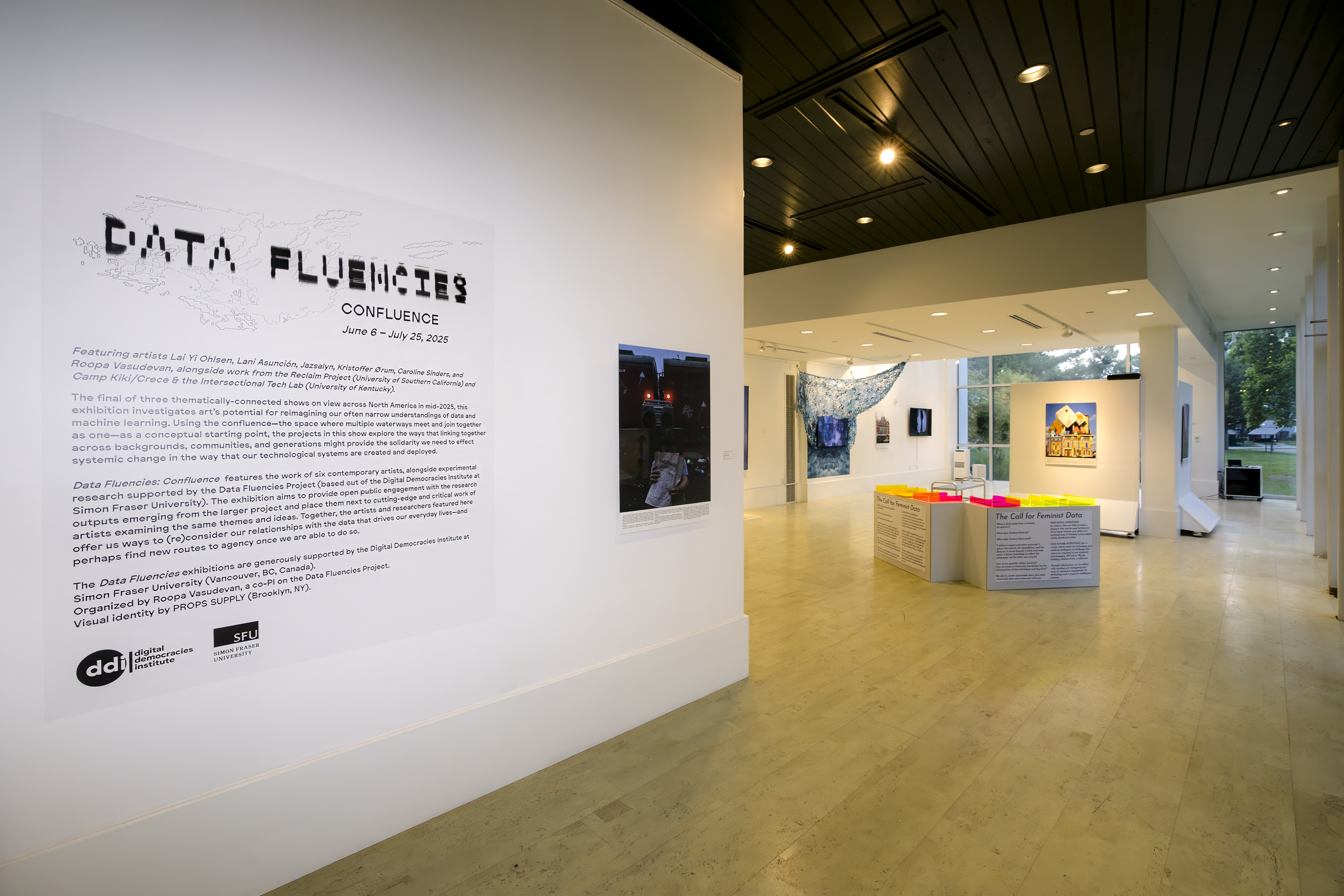
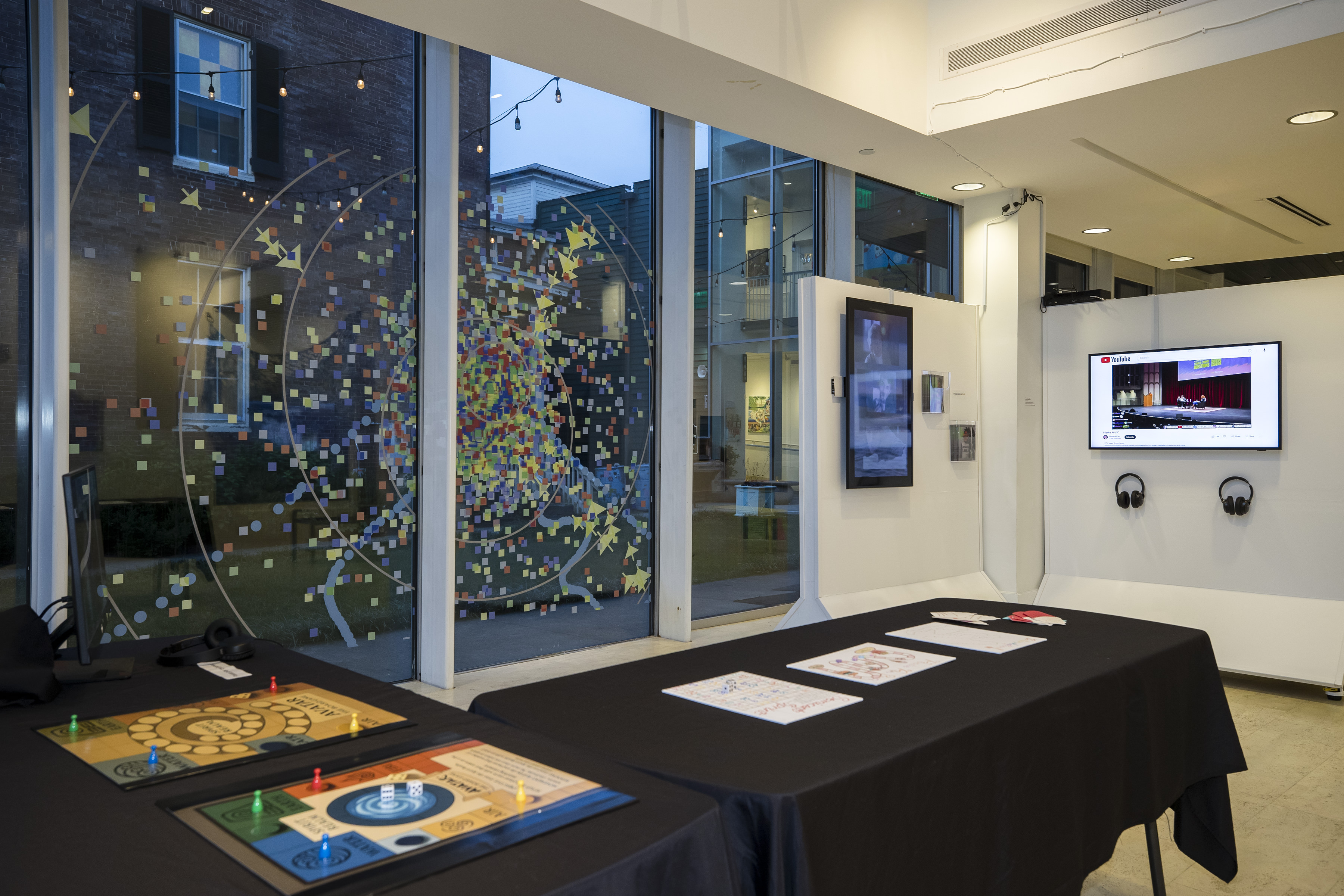
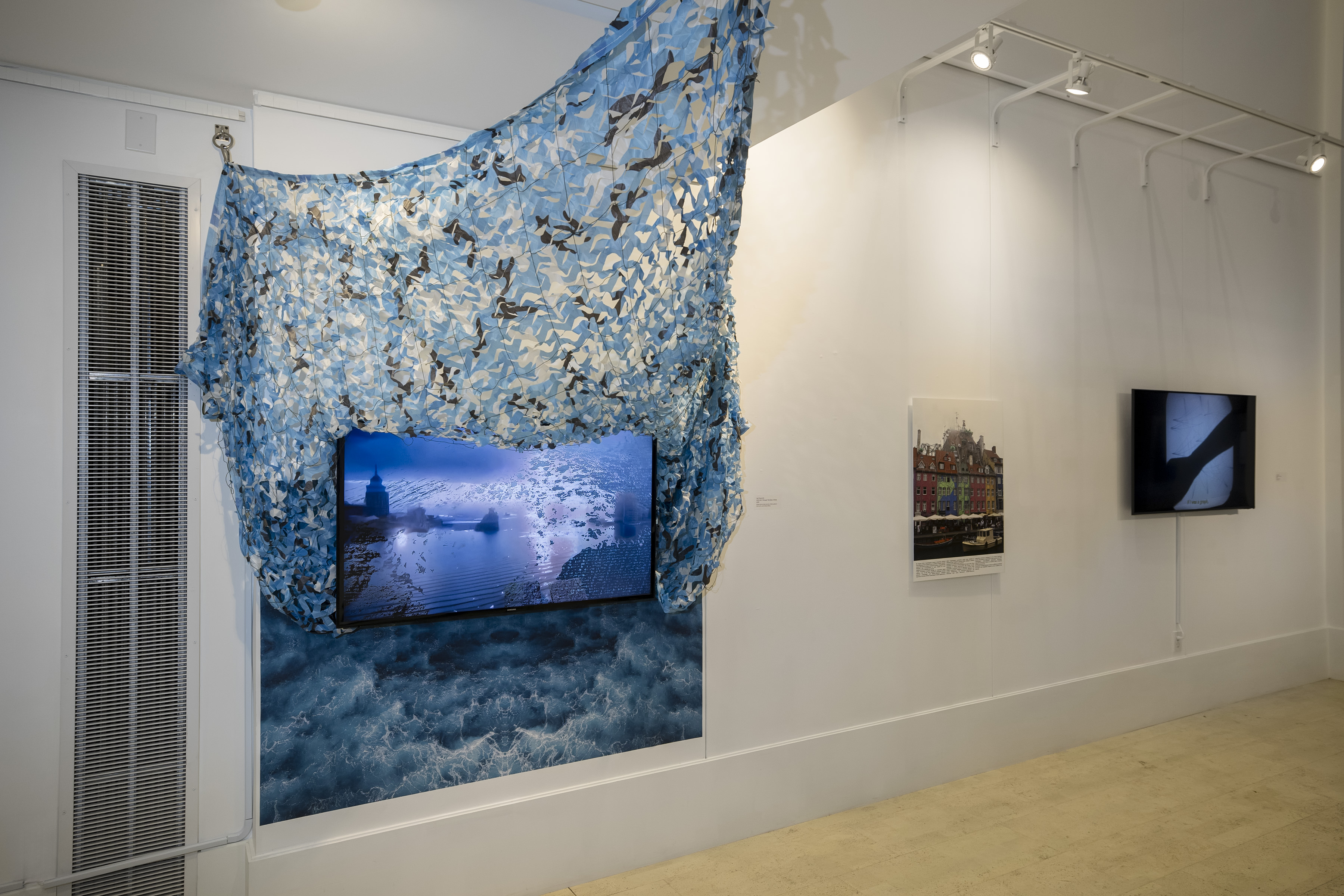
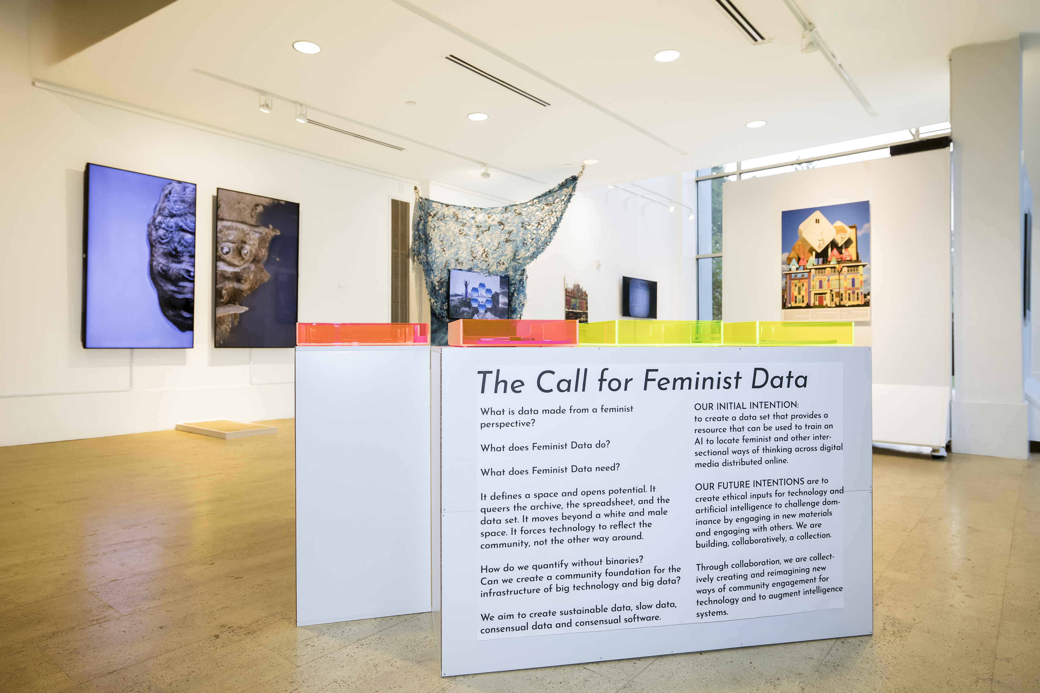
The final show in the series — Data Fluencies: Confluence at the Living Arts and Science Center (Lexington, open from June 6–July 25, 2025) — used the confluence, or the space where multiple waterways meet and join together as one, as a conceptual starting point. The projects in this show explored the ways that linking together across varying backgrounds, communities, and generations might provide the solidarity we need to effect systemic change in the way that our technological systems are created and deployed.
The Data Fluencies exhibitions were organized during my time as a co-PI on the Data Fluencies Project. In the fall of 2025, an exhibition catalog designed by PROPS SUPPLY will be released both in print and online.
Print Screen
Strategic Transparency Network
2020 — present
Cultural organizing project, developed from an ongoing series of workshops and encompassing digital, written, and public art projects
Visit the Network website for more information.
The Strategic Transparency Network is a group of new media artists rethinking our relationships with technology, surveillance capitalism, and corporate control. Our aim is to develop frameworks for tech-based creative resistance that do not serve to reaffirm the dominance of Big Tech and its profit-driven imperatives. We advocate a robustly self-reflexive approach to working with technology and data, and encourage artists to align their goals with each other and operate as a community—rather than reinforcing the neoliberal tropes of individual artistic excellence and the myth of the singular genius.


The network emerged from a series of workshops run as part of Eyebeam’s Rapid Response For a Better Digital Future fellowship in the summer of 2020. The workshops are online gatherings where digital artists come together to collectively explore what resistance means in their practices, look meaningfully at how these conceptions might cause harm or contribute to surveillance capitalism, and make commitments for their work going forward. Participants spend 10-15 minutes free writing in response to seven guiding prompts, and come together after each one for group discussion on the questions and themes that emerge.


Each workshop ends with participants collectively authoring a manifesto outlining their beliefs and commitments. These have evolved into a series of Manifestos for Creative Resistance, which are continually being added to by new collaborators and participants.


Workshops have been run to date with the support of Eyebeam, ABC No Rio, and Common Field. The workshops that I personally lead also serve as a form of creative research for my dissertation project at the Annenberg School at the University of Pennsylvania. The workshop format is open-source and freely available for others to use and adapt; the only requirement is to contribute the resultant manifesto to the Collective’s GitHub organization when it is completed.
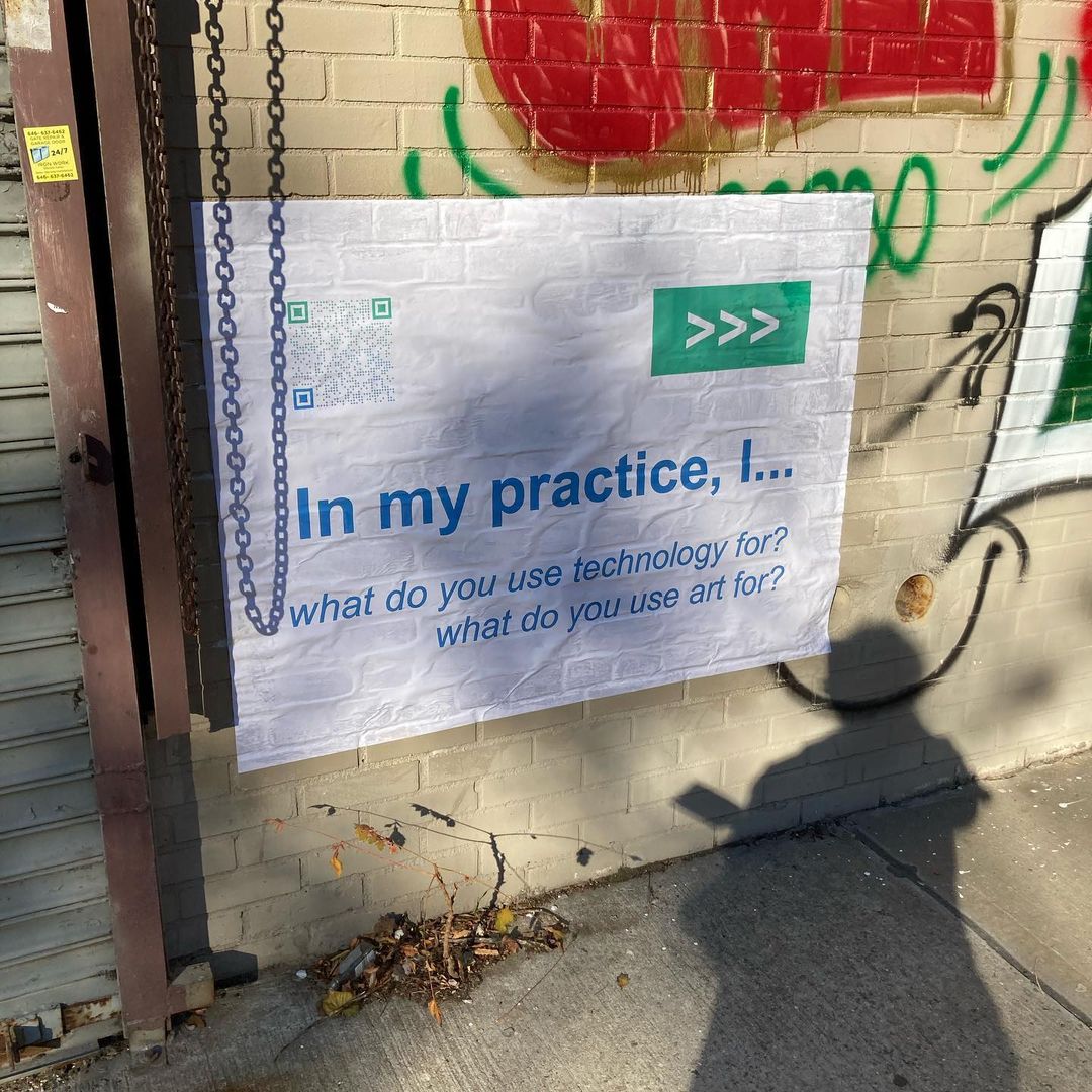
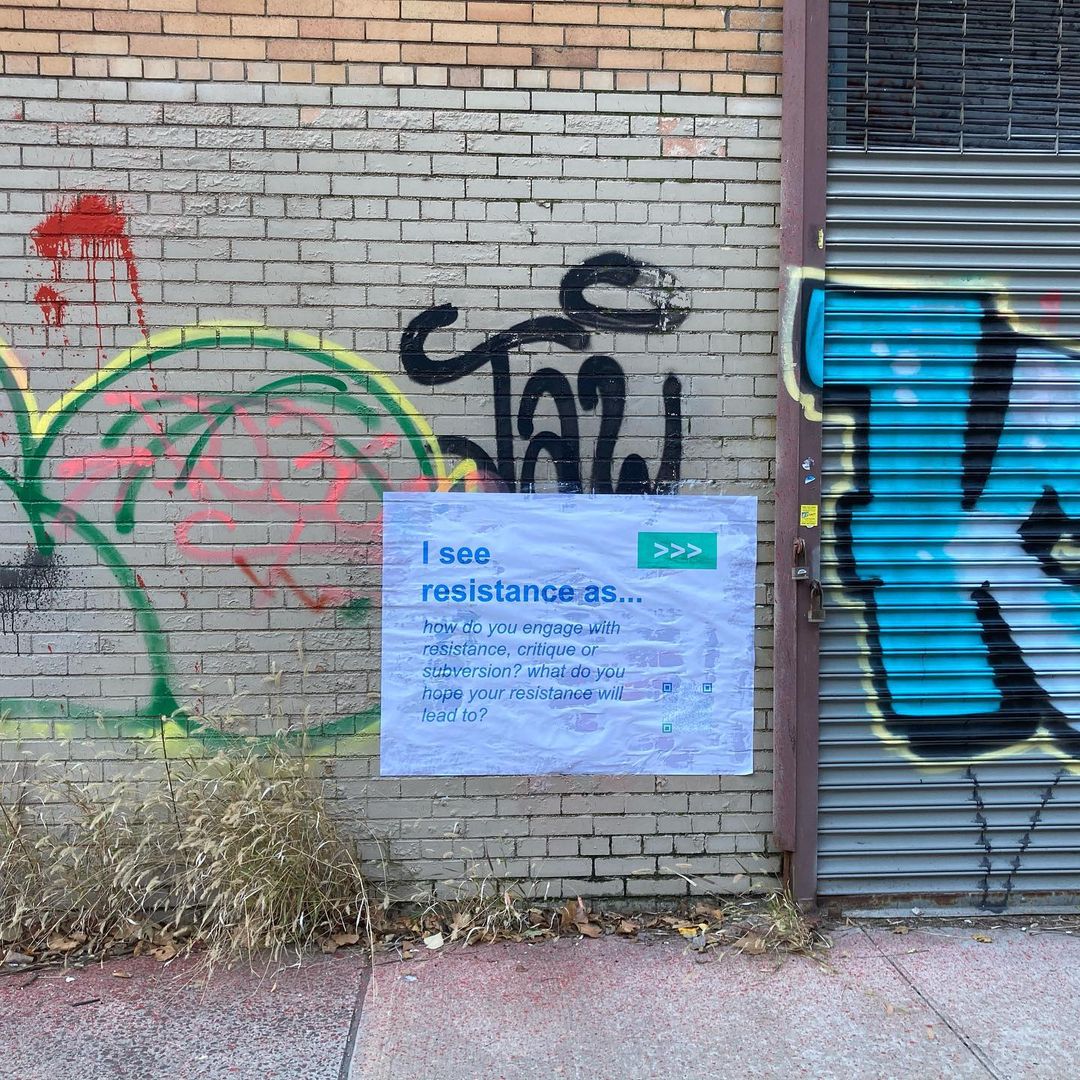
In 2020, under the moniker of the Network (then known as the Strategic Transparency Collective), I produced a public project for the exhibition Take What You Can’t Get, developed for ABC No Rio (New York, NY). The seven guiding prompts from the workshops were wheatpasted onto walls around New York City beginning on Friday, November 20, 2020. Each prompt connects to a website on which selections from the Manifestos are viewable, offering a window into how Network members have approached answering these questions in relation to our work. The placement of the prompts out in the world and away from technology invites viewers to consider these questions in the context of their own lives, and offers a connection to core questions surrounding technology, art, and resistance that, while central to the work of new media artists, extend well beyond this community into myriad and diverse creative practices.


A book entitled We Refuse, We Want, We Commit: The Manifestos for Creative Resistance in Technology was released online in early 2023, and in print (self-published) in mid-2024. The book collects the workshop manifestos generated to date alongside contributions from past participants, and will include new writing and artwork by Tega Brain, Sarah Dahnke, Shawn Escarciga, Caitlin Foley & Misha Rabinovich, Christina Freeman, Jasmine A. Golphin, Lydia Jessup, and Harris Kornstein — along with introductory and overview essays written by me.


The launch of the publication was accompanied by an exhibition entitled We Refuse, We Want, We Commit, which took place at 292 Gallery/Bullet Space (New York, NY), and was organized with support from Christina Freeman and ABC No Rio. Each of the publication’s featured artists contributed work related to the themes of their writing, which was installed among large vinyl renderings of key quotes pulled from their longer text; visitors were also able to access mobile-optimized versions of their contributions directly from the gallery, to engage further with the ideas brought up through the artwork.


The publication was supported by the Next Web Seed Grant, an initiative of NEW INC and Meta Open Arts. Money was used to compensate contributors for their labor and to pay workshop participants in the three sessions run during the granting window; a portion has also been allocated toward the production of the print version. View the online book here, and sign up here to be notified when the print version is available for purchase.
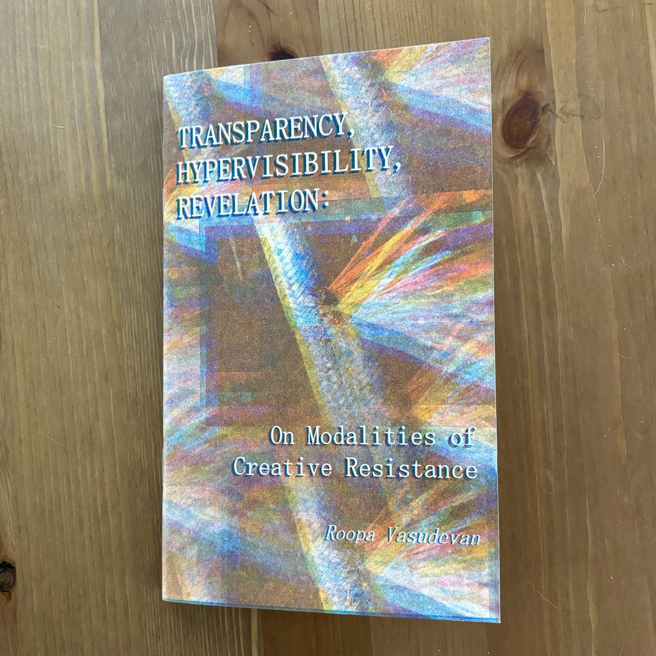
The project also encompasses an independent press launched in 2024, with the release of Transparency, Hypervisibility, Revelation: On Modalities of Creative Resistance — which outlines the philosophy after which the network is named. Click here to order a copy of the zine (3-color risograph print, edition of 100, printed and bound by Risolve Studio).
Visit the Collective website; view the workshop prompts; and read the manifestos here and here. While I originated this project, the eventual goal is to relinquish control and allow it to evolve into a truly cooperative and collaborative network, where all members feel empowered to contribute, adapt, and apply the guiding principles as they see fit.
Selective Attention: Interventions into the Computational Gaze
August 2022 – May 2023
Center for Media at Risk
Annenberg School for Communication
University of Pennsylvania (Philadelphia)
Featuring work by Kelsey Halliday Johnson, Lisa Marie Patzer, and Roopa Vasudevan. Exhibition library curated by Iffy Books.
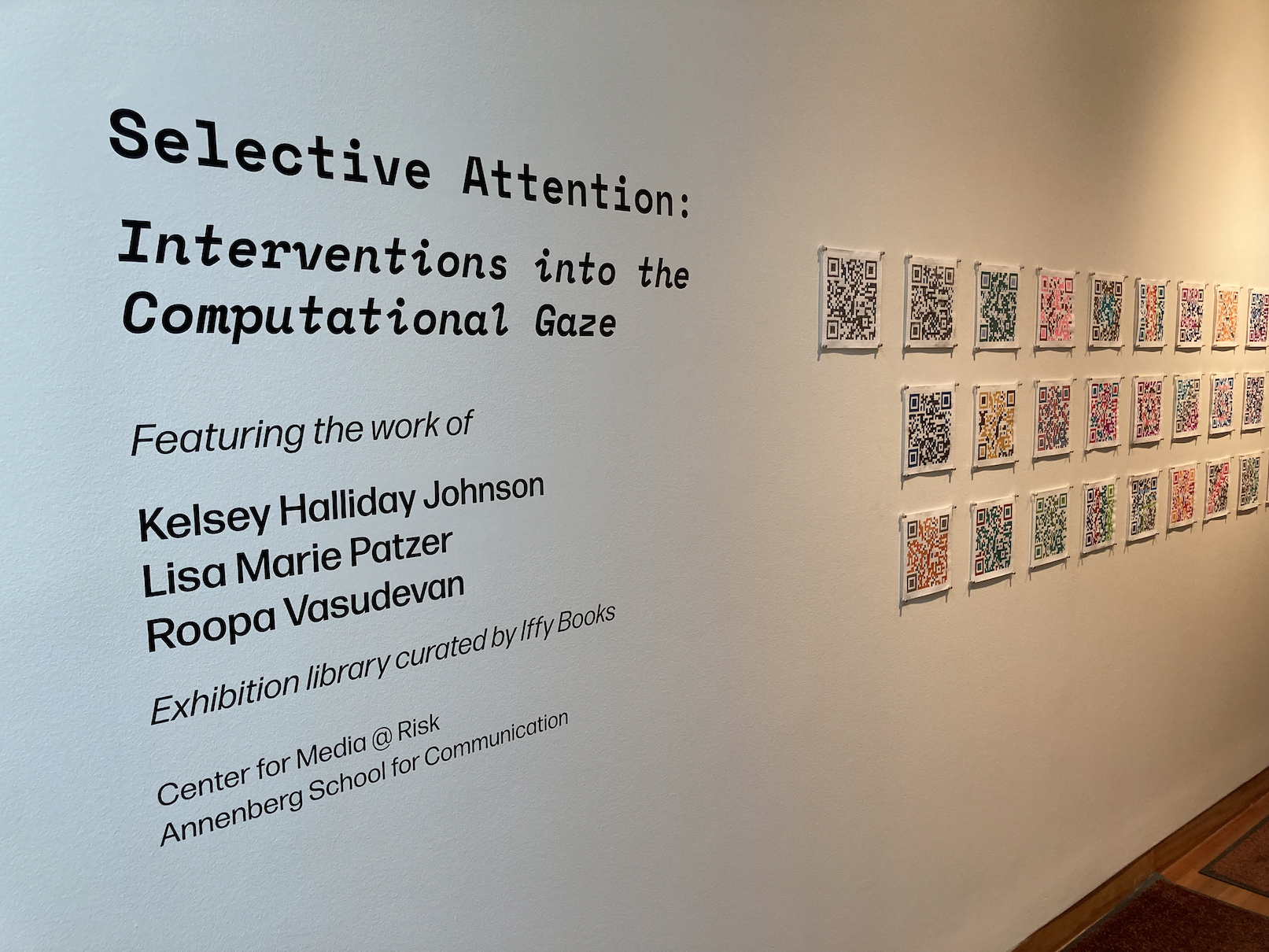

Algorithms and computation are driving more and more of our daily decision making processes than ever before. The digital, in many ways, can almost be considered a filter, guiding the choices we make and the opportunities we are allowed to see, rendering certain practices hypervisible and “natural” and obscuring others.


This exhibition features the work of three artists with deep connections to Philadelphia, who surface tensions between what is visible to the computer eye and what we are able to see and interpret as human beings. The work asks the viewer to consider how the intervention of the digital into practices that have traditionally centered human vision changes the way we see, interpret and understand — and, by the same token, what could be possible if humans insisted on claiming their own gaze within processes that attempt to exclude them altogether.


Exhibition guides designed by Roopa Vasudevan, and risograph printed by Risolve Studio.
Test Patterns
December 2015
A Flux Factory Major Exhibition
Long Island City, New York
Curated by Mattie Hewitt and Roopa Vasudevan; co-curated by Lee Tusman
Test Patterns is a group exhibition that examines the ways in which we interact with technological standards. Technological standards are visual, auditory, and mathematical references usually held by groups of people to define a physical measurement. The works in Test Patterns offer an affectionate exploration of individual and collective agency claimed over technology, while exposing the limitations inherent in “universal” calibration techniques.

From color bars and tones to Pictures of Facial Affect (Ekman & Friesen 1976), the artists of Test Patterns have created their own patterns and standards–and have, in some cases, used pre-existing ones–as raw material to interpret, process, and generate entirely new artworks. This exhibit features work from seventeen artists who respond to technical standards using sculpture, drawing, video, sound art, performance, computation, and other media.

Participating artists included: Tom Burtonwood, Claire Corey, Jason Eppink, Louise Foo, Genevieve Hoffman, Noémie Jennifer Bonnet, Tyler Kline, Patrick LeMieux, Jesse Malmed, Douglas McCulloh, Eric Mika, PARTYSHARD, Martha Skou, Lane Speidel, Cha Tori, A.P. Vague and Sarah Zimmer.

#Bellwether
2016
Custom designed campaign buttons, bumper stickers, T-shirts, rally signs and lawn signs
#Bellwether is a data collection project that examines the language surrounding American electoral politics.
The project examines social media data collected during the primary campaigns for the 2016 United States Presidential election, and asks whether or not we can use it in order to extract a more nuanced or accurate read on the political desires of the voting population of Ohio: a state that is regarded as vital to the endgame of both parties, but whose citizens are often treated as faceless, nameless votes.
Between August 6, 2015, and until July 12, 2016, I attempted to collect every tweet possible that mentioned any of 22 presidential candidates from the two major American political parties by name. The collection process started with the initial debates, and ran up until just before the nomination conventions. I then filtered down the data collected to focus solely on tweets that are from or are concerned with Ohio specifically.


After the tweets were filtered, I ran a variety of algorithmic language analyses on the content of the postings to determine a number of things: sentiment, frequency of similar or identical posts and phrases, grammatical structure, and the like. I most commonly used something called “regular expressions”, which are text-matching patterns that look for specific words or phrases within the data.


I used the results to doctor the campaign merchandise of the Presidential candidates; instead of reflecting the candidates’ curated messages, they represent how they are perceived by Ohio residents. While the objects created are not meant to mirror the data in their physical form (meaning their size or design), the number and types of objects per candidate per month entirely depend on how much and what content I extracted from the total tweets. The design language — color, typography, imagery and logos — mirrors that of the official campaigns as closely as possible.


The objects are exhibited in a monthly timeline, displaying how perceptions of each Presidential candidate shift and change over the course of primary season — just like the content, positions, and tones presented by the campaigns themselves.
#Bellwether was commissioned by SPACES (Cleveland, OH), as part of the SWAP (SPACES world artists program) residency, May 20 - July 29, 2016. It was later shown as part of the exhibition “Star Spangled” at Harlan Levey Projects (Brussels, Belgium). I have written and spoken about the project in several venues, including Adjacent: The ITP/IMA Journal of Emerging Media, Media-N: The Journal of the New Media Caucus, Live Wire Radio, and the American Dream Symposium sponsored by Transformer Station and the Cleveland City Club (Cleveland, OH).
Photo and video documentation from SPACES by Jerry Mann; additional photos provided by Harlan Levey.
Editor’s Notes
2016 — 2020
Legal size (8.5” x 14”) laser printed documents
Faux leather document holders
Trump blather


During his 2016 Presidential campaign and throughout his presidency, Donald Trump used the various communication tools available to him — press statements, speeches and interviews, executive actions, and, most notably, Twitter — to undermine and question the basic tenets of American government. From the right to peaceful protest to the right of all citizens to vote, and even extending to the most basic checks and balances that keep the government functional, he used his public platform to aggressively push for restrictions, eliminations, and interference in the regulatory systems established in United States law.
Editor’s Notes is a series in which I used data collected from Trump and his administration to edit the foundational legal documents of American society. The "editor's notes", footnoted at the bottom of each segment, are composed of text taken exclusively from Trump's own written or spoken archive (such as the now-defunct @realDonaldTrump account, executive orders and memoranda, Presidential and campaign speeches, and selected interviews with the press). I collected the data and sorted this text according to content by utilizing custom software, as well as open-source data collection tools.


The first two iterations of this project, Editor’s Notes (Amendments) and Editor’s Notes (Constitution), examine the entirety the United States Constitution. They are formatted to resemble a Presidential Executive Order, which Trump used frequently in order to enact the more controversial portions of his platform without legislation. Amendments was completed in 2017, and Constitution in 2018.


As part of SOHO20 Gallery’s 2018 Residency Lab, I held several “Open Editing Sessions” in which members of the community were invited into the gallery to edit landmark Congressional documents and Supreme Court decisions based on provided Trump data, and how they thought he would change the laws if he could.


Editor’s Notes was shown as part of the exhibitions Reuptake (2017, Little Berlin, Philadelphia, PA); the 2017 Fl3tch3r Exhibit (Reece Museum, Johnson City, TN); 20/20 Hindsight = 40 Years (2018, SPACES, Cleveland, OH); and Pop-Up Studio: Roopa Vasudevan (2019, Haverford College, Haverford, PA).
Photo documentation by Jerry Mann, Emily Bucholz, Rachel Vera Steinberg & Roopa Vasudevan.
You Can’t Be Your Best When You’re Being Bugged
2021
Series of 3 8.5” x 14” risograph prints
Text message hotline
A collaboration with Melissa Langer
You Can’t Be Your Best When You’re Being Bugged explores our limitless need for control, containment of other species, and the darkly comedic and complicated language of eradication/violence in local pest control marketing. The project adapts marketing language from pest control services in the Philadelphia region and beyond to hold a mirror to us humans.


Who’s the pest? You be the judge. Text us at (215) 874-6788 to find out more.


You Can’t Be Your Best When You’re Being Bugged was created for the exhibition Future Ecologies, on view at Vox Populi in Philadelphia, PA in September and October of 2021. The risograph printing was done by Risolve Studio.
In Preparation for Takeoff
2020
Single-channel video (runtime 30 minutes)
4 digitally generated prints


In Preparation for Takeoff was made using a collection of 60 global airline safety videos, pulled from YouTube. The prints were created by running screenshots taken from the videos at certain key points through a custom algorithm that selects the most common red, green, and blue values at each pixel, and generates a new image with the results; the video is edited to demonstrate disparities in how this information is presented in its original contexts.
Together, this work seeks to examine how universal public health and safety information is often overtaken and muffled by economic and cultural motivations.


In Preparation for Takeoff was created for the group show Asking for a Friend: Vox Populi’s New Member Takeover, at Vox Populi (Philadelphia, PA), January/February 2020.
Photo documentation by Raúl Romero.
Composites [Series]
2015 — 2020
Digital prints
Generated through custom software written with Processing
A series of computer-generated pieces created through the analysis of many different photos, portraits, or images. Source photos are evaluated pixel by pixel, and the most commonly occurring red, green and blue values are used to create an entirely new image.
Works in this collection:
In Preparation For Takeoff
Composites (Trans-Siberian)
August 9—22, 2016
Created as a China Residencies #slowtrain resident.
These works were generated while traveling along the Trans-Siberian Railway (Mongolian route) from Moscow to Beijing.


Because my journey crossed multiple cultural areas (Western Russia, Siberia, Mongolia and China) I used this residency to conduct a detailed examination of the similarities and differences between train compartments and design. During the journey, I attempted to take compositionally identical photos of sleeping compartments, seating areas, dining cars, and train exteriors and stations. I also took selfies throughout the journey while I was on board the trains. After my journey was complete, I creates a series of composite images to combine all of the photos together.


The Trans-Siberian Composites were exhibited at Wujin in Beijing, China, as part of Independent Art Spaces Beijing, 2016.

Composites (Political)
2016—present
Created from images sourced from Wikipedia
During the summer of 2016, I was working on an extremely politically driven installation in my hometown of Cleveland, Ohio, which ran concurrently with the Republican National Convention’s presence in the city. As a side project, I began running my composite portrait program on images of people in political positions in the US.
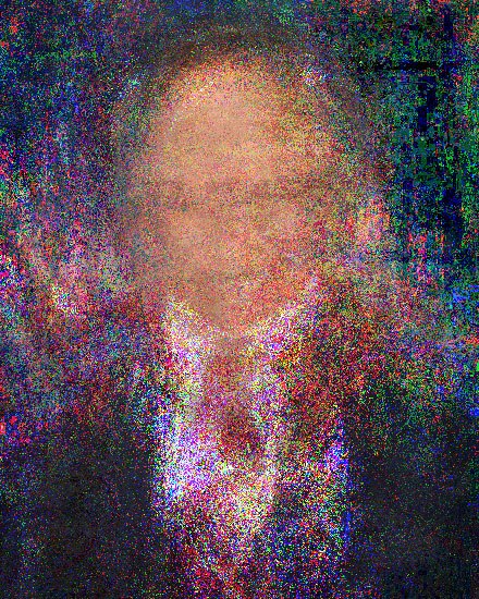
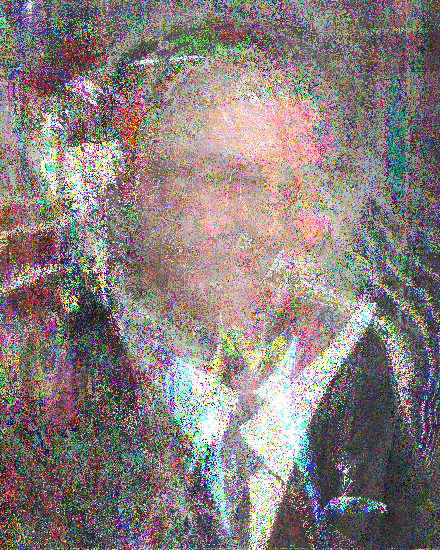
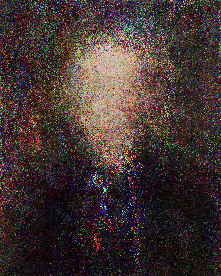
The first few images created were of Presidential candidates both in 2016 (the most recent election year at the time) and 1984 (the year of my birth), as well as everyone who has ever held the office of the President since the founding of the country (depicted above). The results were eye opening; the "most common pixel RGB value" procedure, while very technical sounding to most, produced portraits that showed the stunning lack of diversity among American politicians aspiring to the Presidency, even in this day and age.

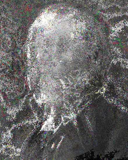
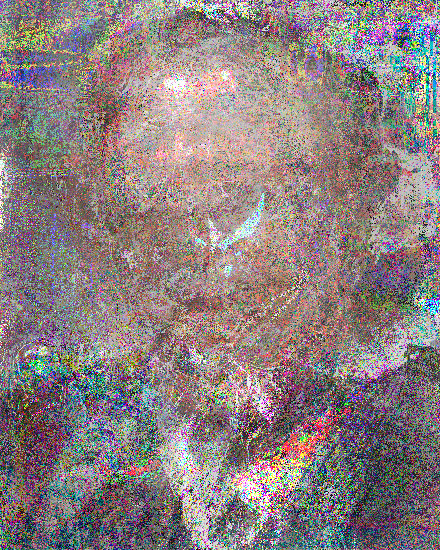
This evolved into the series Composite Candidate, a 9-print series of portraits of presidential candidates during significant elections in United States history: 1800, 1860, 1912, 1932, 1960, 1980, 2000, 2008, and 2016 (1800, 1912 and 1960 depicted above).

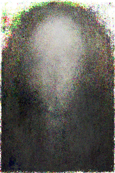

I later expanded into composite Congressional portraits. Composite Congress is a 6-print series of portraits of congressional sessions during pivotal moments in United States history: specifically, the 1st, 16th (Missouri Compromise), 75th (Second New Deal), 88th (Civil Rights Act of 1964), 99th (1986 Immigration Reform and Control Act), and 115th (current) US Congress (1st, 75th, and 115th depicted above).


In each iteration, the project tracks both the evolution of the physical makeup of the people who have chosen to run for the highest office in the country, as well as the shifts and changes in the composition and technology used to create the portraits themselves. Both series were shown as part of the 2017 Fl3tch3r Exhibit (Reece Museum, Johnson City, TN).
Composite Fluxer
2015
Created from images and text sourced from the Flux Factory website


Who is Flux Factory? This work attempted to answer that question by algorithmically compiling all of the photos submitted by all past and present Flux residents into a single entity. The results reveal common and uncommon traits possessed by the community that Flux had grown over the 21 years of its existence.
The portrait was exhibited alongside a composite artist biography, created by running the written biographies of all Flux residents through a Markov Chain to generate new text.


Composite Fluxer was created for the 2015 Flux Factory Artists-In-Residence exhibition, which I also organized.
Project Archive
Projects completed between 2012 and 2015.
HANDS UP
2015 (a collaboration with Atif Ateeq)
LED lights mounted on plywood panels, frosted plexiglass
Arduino, custom Processing software, Microsoft Kinect
Strobe lights
HANDS UP is an interactive installation that explores law enforcement's relationship with people of color in the United States.
The installation is meant to be experienced alone. One at a time, viewers walk behind a curtain into a room containing a large wall of flashing red and blue lights. They hear the sounds of sirens and the voices of police telling them to put their hands up. Once they comply and their hands are in the air, a gunshot is heard, several blinding strobe flashes are triggered, and the noises disappear. The viewer is shaken by the sudden light and noise, and left in a chilling void of silence as they exit the space.


HANDS UP simulates the experience of being approached by the police in a heated, confrontational manner. Similar interactions have resulted in the shooting deaths or brutal attacks of unarmed minorities throughout the United States, which have been increasingly covered by the mainstream media in recent years, and each of which has since contributed to the ongoing debate about the state of race relations in america. The piece directly places visitors in the chaotic and overwhelming moments before such an incident occurs, and invites viewers to contemplate being faced in such a way in the real world.


HANDS UP was originally exhibited at Flux Factory (Queens, NY) as part of the 2015 LIC Arts Open. It was covered widely by both art and mainstream press outlets in and beyond New York City, such as the Daily News, Reuters, Hyperallergic, ArtNet News, and PBS NewsHour.
Photo and video documentation by Humai Mustafa, Atif Ateeq, and Roopa Vasudevan.
Craigs Shopping Network
2015
Generative video created with Processing and Craiglist RSS feeds
Text messaging application (built with the Twilio API)
Craigs Shopping Network is a generative home shopping network culled from "for sale" ads pulled off of New York Craigslist.
Sale items and visuals are gathered in real time from Craigslist's RSS feeds, and are displayed complete with lower thirds and computer-generated voiceover. Viewers are able to inquire about items that interest them by texting a phone number onscreen, which automatically relays their contact information to the owner of the posting.


As we increasingly shift towards the Internet as a means of communication, commerce and exchange, “As Seen on TV” means less and less to us as we spend more and more time online. CSN is an experiment in bringing this new mode of transaction into the antiquated marketing methods we’ve relied on exclusively in the past.
Craigs Shopping Network was created as part of STROBE NETWORK at Flux Factory (Queens, NY).
All American Girls
2012
Aida cloth, embroidery floss, wooden needlepoint hoops
Patterns generated with Processing, using 2012 US Presidential election data


All-American Girls is a series of cross-stitched panels depicting women's voting patterns in the 2012 United States Presidential election. The project juxtaposes the very traditional and stereotypically “feminine” craft of needlepoint with evidence of increasing female activity in American politics.


The number of colored stitches in each candidate's name corresponds to the exact percentage of women who voted for that candidate in the selected state. Each pattern was generated with Processing, using data from CNN exit polls taken on Election Night (November 6, 2012). The patterns were then each embroidered by hand.


All-American Girls was shown as part of the 2012 Interactive Telecommunications Program Winter Show (New York, NY); the Data Visualization Showcase at the 2012 Strata conference (Santa Clara, CA); and TEDxNYU (2013).
Hate Couture
2013
Cotton silk, tulle, fusible interfacing, plastic boning, wire, yarn
One week’s worth of hate speech from Twitter, Reddit and YouTube
Fabric patterns generated with custom software written in Python and Processing
Hate Couture is a series of high-fashion garments created through analysis of the usage and context of hate speech on the Internet.
Language is a key device used to ostracize and dehumanize groups of people based on criteria that are largely unchangeable: race, gender, sexuality, religion. In real life, the use of hate speech has traditionally been a universal taboo. But how much attention do we really pay to it online, where everything we say is divorced from traditional social consequences? Hate Couture is an attempt to examine the use of hateful language on the Internet.


One week of hate speech against a single demographic was scraped from Twitter, Reddit, and YouTube between March 25-31, 2013, and analyzed using algorithmic language processing and sentiment analysis to determine the severity of each instance.


Each comment was assigned a sentiment score, which was used to place it on a 5-shade spectrum of a single hue; the lighter the color, the more benign, educational, out of context, or re-appropriative the usage was, and the darker the color got, the closer the context is to the speech's original, disparaging and dehumanizing meaning.


A visualization of the entire week was then printed on a bolt of fabric, the length corresponding to the total volume of text collected. In collaboration with a fashion designer from the group attacked, a single garment was then constructed from the entire length that was inspired by the impact of the language itself. The voluminous, impractical, and cumbersome nature of the clothing is meant to reflect the sheer volume of the data found online; the anonymity of the Internet, which allows people to use hate speech more freely than in real life; and the burden that this language places on those it is used against.
Special thanks to the fashion designers that I worked with over the course of this project: Timothy Brucato (“LGBTQ” garment, pictured, pink); Avery Reed (“Women” garment, pictured, lavender); Ari Fulton (“African-American” garment, fabric pictured, grayscale); Ruann Ibrahim (“Muslim” garment, fabric pictured, green).
Hate Couture was my thesis project at the Interactive Telecommunications Program at NYU. It was later shown as part of the ITP40 archival exhibition in 2019-2020.
Grillz
2014
3D printed polished gold steel plated mouth grills
Velvet pillows; acrylic and plywood bases
MP3 players, audio and headphones
Digital prints
Grillz is an exploration and analysis of the usage of language in mainstream hip-hop lyricism, with particular attention paid to mentions of money and income.


Individual songs are algorithmically analyzed for references to extreme poverty—the projects, drug dealing, prostitution—as well as extreme wealth—cars, cash, jewelry and the like. Mentions in each category are scored according to relative distance from words of the opposite polarity; the closer together a poverty reference and a wealth reference are to each other, the higher the score, and the number accumulates the more references there are in close proximity.
The resulting landscape formed is extruded into a 3D shape and printed as wearable grills: jewelry designed to fit over one’s teeth, and which have become inextricably linked to hip-hop culture over the years as a symbol of over-the-top, ostentatious wealth.

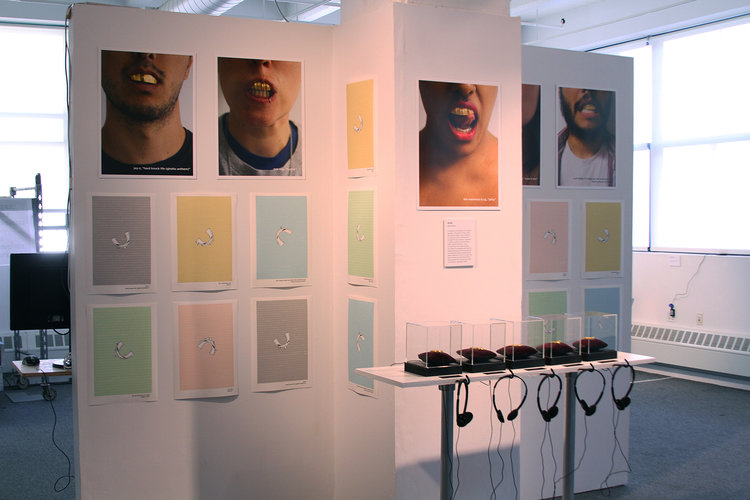
The language was processed using custom software (and with the assistance of my own PyGenius Python module), and the models were created in Processing, with the assistance of the Geomerative and Modelbuilder libraries. The pieces were 3D printed in polished gold steel by Shapeways.
Grillz was featured as part of the exhibitions Office Hours (DUMBO Arts Festival 2014, Brooklyn, NY); Heavily Scripted (2014, Little Berlin, Philadelphia, PA); Death By Art (2014, Death By Audio, Brooklyn, NY); Physico Electro (2015, The Art Association of Jackson Hole, Jackson, WY); and the 2015 Strata Hadoop Conference (San Jose, CA).
PyGenius
2014
Python module
PyGenius was a Python module that returned data from rap and hip hop songs in a clean, easy-to-read and understand format that allowed for the data to be used in other projects. It served as an unofficial API for Genius (then known as Rap Genius).


Users were able to access song lyrics, album lists by artists, annotations and notes about lyrics' meanings, album release dates, and metadata about artists and their recordings.
PyGenius could be installed via setuptools or pip on the command line, or by downloading the source code. PyGenius’ development was halted due to the availability of an official Genius API beginning in 2015.